Three mini duplexes in one flat / Barcelona
A central apartment in Barcelona grows without expanding thanks to a renovation by vilablanch that ingeniously maximises the spaces and transforms the use of the attic, which now houses three mini duplexes.
Curiously, with three staircases you gain more space than with just one!
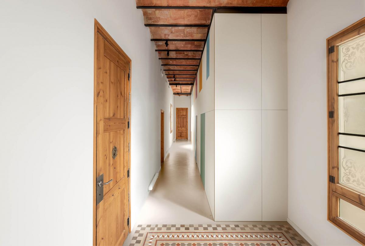
THE ASSIGNMENT
Located in a building in the Eixample of Barcelona, from the early s. XX, the house was renovated in the 90s under very modern architectural criteria for the time.
The commission was born of two very clear needs: on the one hand, the clients detected that the house was conditioning their way of life, because the distribution that worked so well for them in the 90s no longer adapted to their new needs; on the other hand, they needed independent workspaces for each member of the family. The assignment came with a request: the clients did not want to give up the mezzanine, as it was a space visually connected to the house and offered them a sense of openness.
INTERIOR ARCHITECTURE PROJECT
ANALYSIS
After analysing the strengths and weaknesses of the house, we realised that the house needed to be rethought: el altillo era una larga pasarela (1.8 m de ancho x 11 m de largo) very non-functional, the area of the apartment with the most natural light -the one facing the street- was barely used, there was no hall, since it was occupied by the mezzanine stairsno había recibidor... At the same time, an excess of materials coexisted to create visual chaos (iron, glass, stainless steel, beech wood, dark parquet, coloured walls, etc.) and masked the original architectural elements of value.
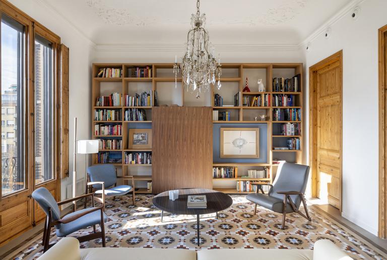
However, there were aspects to enhance such as the structure of the mezzanine (it was very well built and allowed a permanent connection with the house) and the original architectural elements that had been maintained (Nolla floors, Catalan vaulting and ash woodwork).
KEY POINTS
The intervention carried out by vilablanch has two key points:
1) Rationalising the use of the spaces and maximising them without demolition: new uses are given to them and existing structures are made the most of. The clearest example is the loft -previously not very functional and wasted- which now houses three mini duplexes.
2) To give the original elements back their full prominence: this is achieved by eliminating the excess of existing materials and incorporating a neutral and sober materiality that establishes a respectful dialogue with the pre-existence.
1. RATIONALITY
Rationalizing the use of spaces is a premise of our study to reach the distribution that best suits the family and its needs.
The loft is closed and divided into three mini duplexes
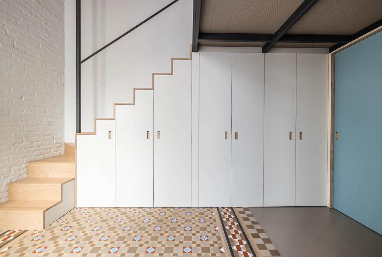
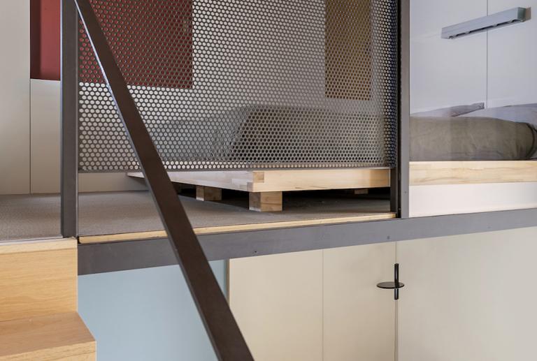
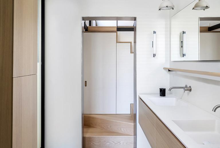
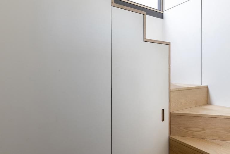
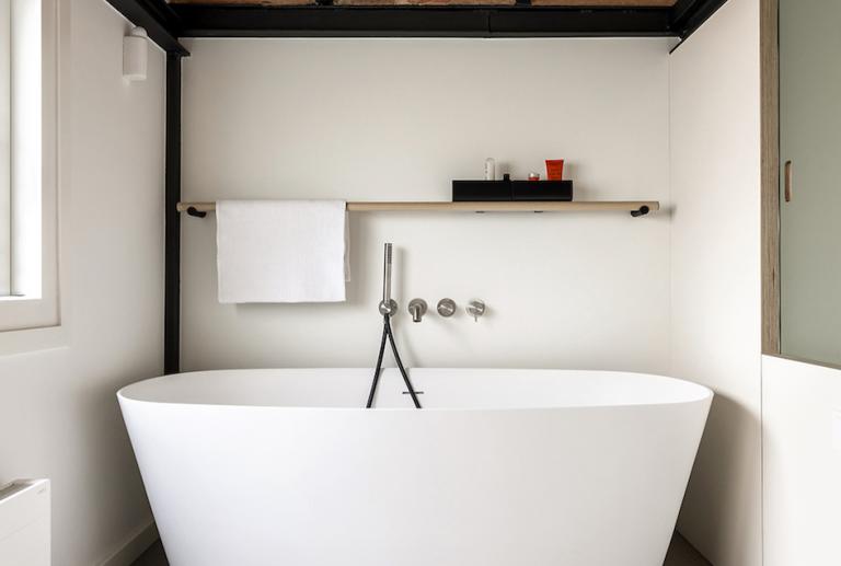
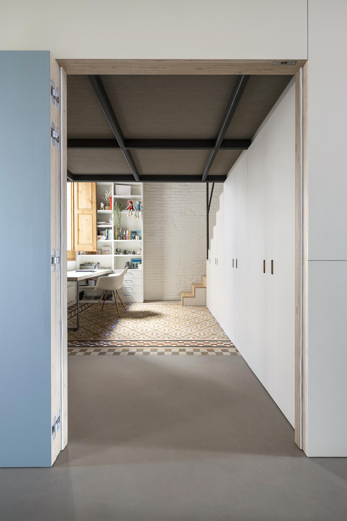
The powerful iron structure of the mezzanine is maintained, but it is given a new use by making a "dress" inside and out, with a lining of HPL boards. The mezzanine is divided into three independent areas, each with its own staircase: two give access to the "duplex bedrooms" of the girls, with the study area below, and the third is in the en suite bathroom of the main room, giving access to the bathtub area. The three stairs hide, in their structure, built-in wardrobes with a large storage capacity.
Work areas are separated from resting areas
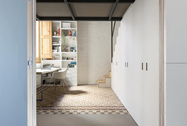
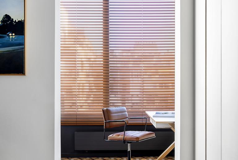
A work area is created for each one: the mother's study is located in the gallery that overlooks the courtyard, the office of the father is next to the living room, and the girls have their own space on the ground floor of their room.
The day area is recovered as a key space in the house.
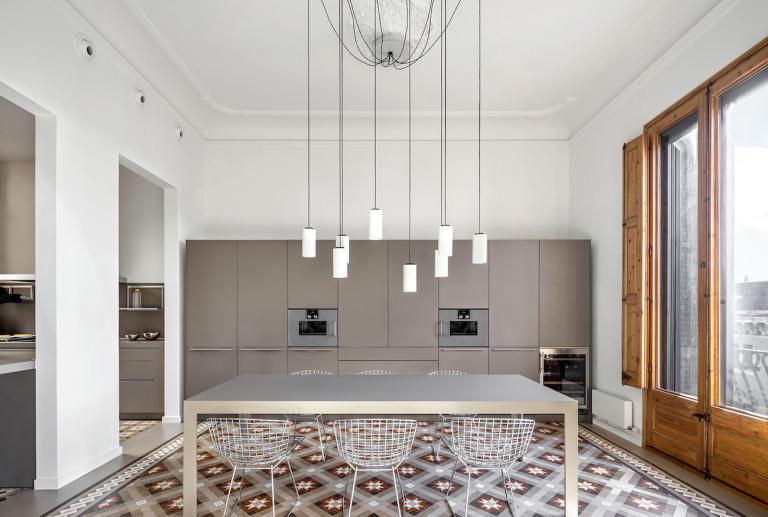
At the front of the house, an open kitchen is created connected to a large living room bathed in natural light. The new distribution allows them to enjoy that part of the house that was previously forgotten: they sleep in the darkest area and the brightest area is enjoyed during the day.
No lost meters
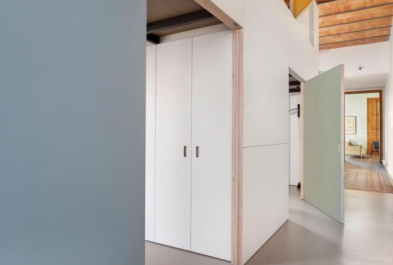
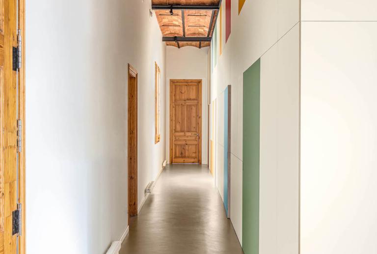
Now, there are not lost spaces but gained spaces. They win a cozy and spacious hall that welcomes them home, a "duplex room" for each daughter, a courtesy bathroom, and an office for each of them.
2. NEUTRAL MATERIALITY
For vilablanch, materiality is subordinated to the architectural value of the space. The more value the space has, the more discreet our intervention should be.
With this premise in mind, the actions that were carried out were as follows.
A light enclosure for a powerful structure
The iron frame of the mezzanine was solid and well executed. Thanks to this, no structural reinforcement was needed, and it was possible to work with a dry and light material to close it: HPL boards (high pressure laminated phenolic wood boards).
This same material was used on the access stairs to the three mezzanines and in the cupboards located under the stairs. Windows were opened to the corridor in all the upper rooms to preserve the visual connection with the house.
Continuous flooring in substitution of parquet
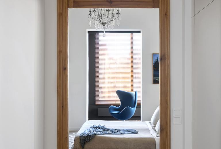
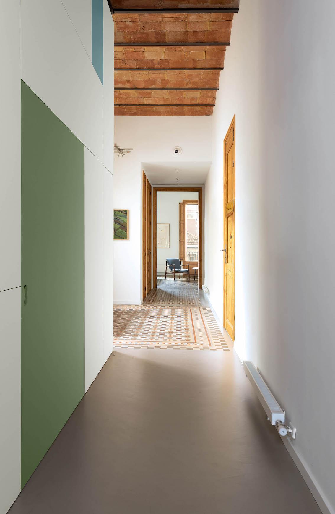
On the floor of the house the original Nolla mosaic is preserved in a very honest way. The wooden parquet that was in certain spaces is replaced by continuous pavement, unifying all the areas where there were no original tiles. This same material is used in the bathrooms.
Neutral colours
So that all the prominence falls on the architectural elements of value, neutral colors are applied on the floor and walls. A stone tone is chosen for the continuous flooring, an off-white for the mezzanine enclosure and white for the walls. Only a few touches of color are included on the doors and windows of the hallway, in tune with the color palette of the original Nolla mosaics.


