Divina Vanidad / Barcelona
A new concept of beauty center
The challenge of this project was to create a new concept of sthetics with innovative solutions and specific designs for the real needs of a manicure and pedicure Centre. The image should be fresh and very contemporary to transmit a sense of a centre with a high-end service and quality at the same time.
Project of Interior design and execution of work. Barcelona
These were some of the requirements of the owners of the aesthetic center:
- Make the most of the structures and facilities of the original premises, originally an office on the street, with a rectangular floor plan of approximately 50 m2 distributed on a rectangular floor.
- The budget should be as tight as possible, maximizing the space and without major works or interventions that would involve a large investment.
- The distribution had to take advantage of the space and, at the same time, it had to be practical and ergonomic to ensure the comfort of the clients and the maximum operativity of the beauticians.
- It was necessary to create two zones, one of manicure and one of pedicure, with 3 or 4 seats per zone, plus the counter, and a small part of showcase or product exhibition.
At the distribution level, the aim was to make the most of the space and also ensure the view from the entire front showcase.
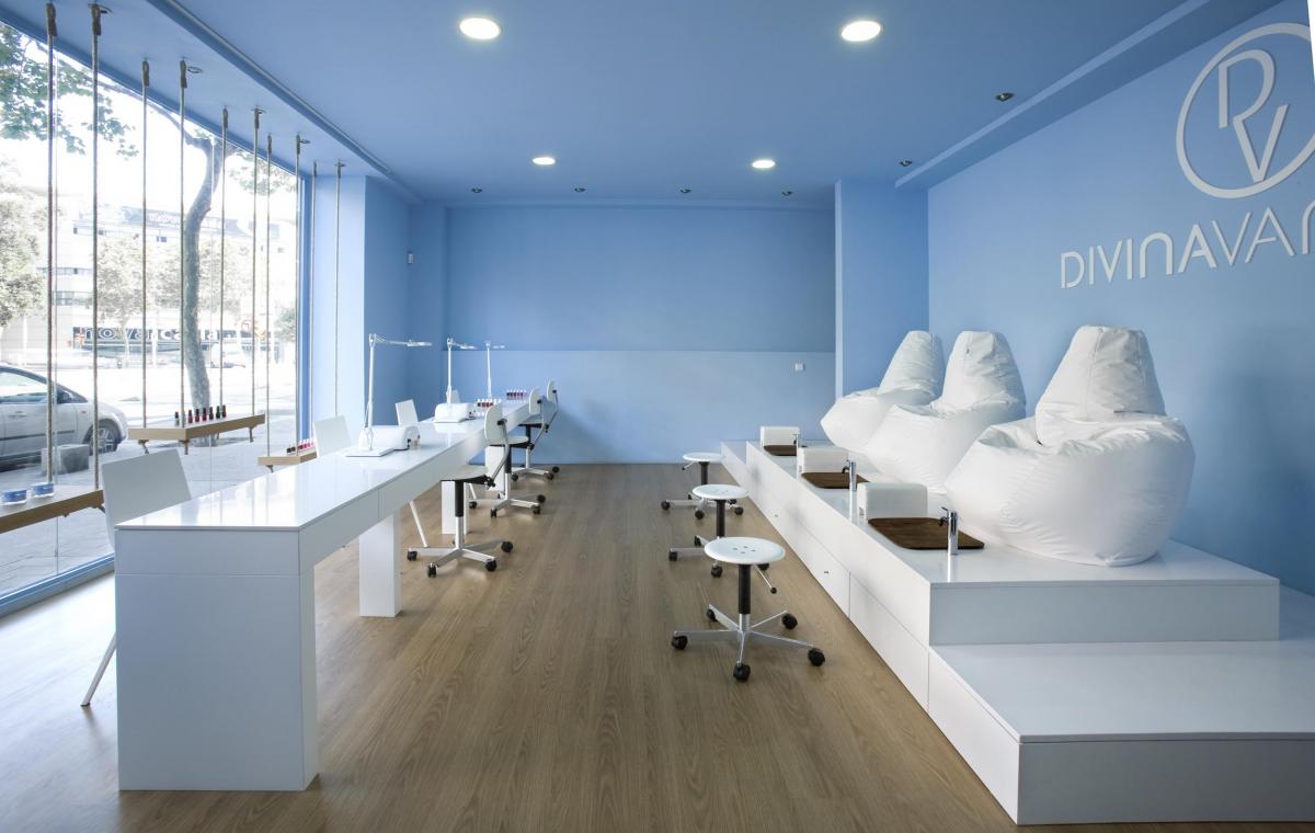
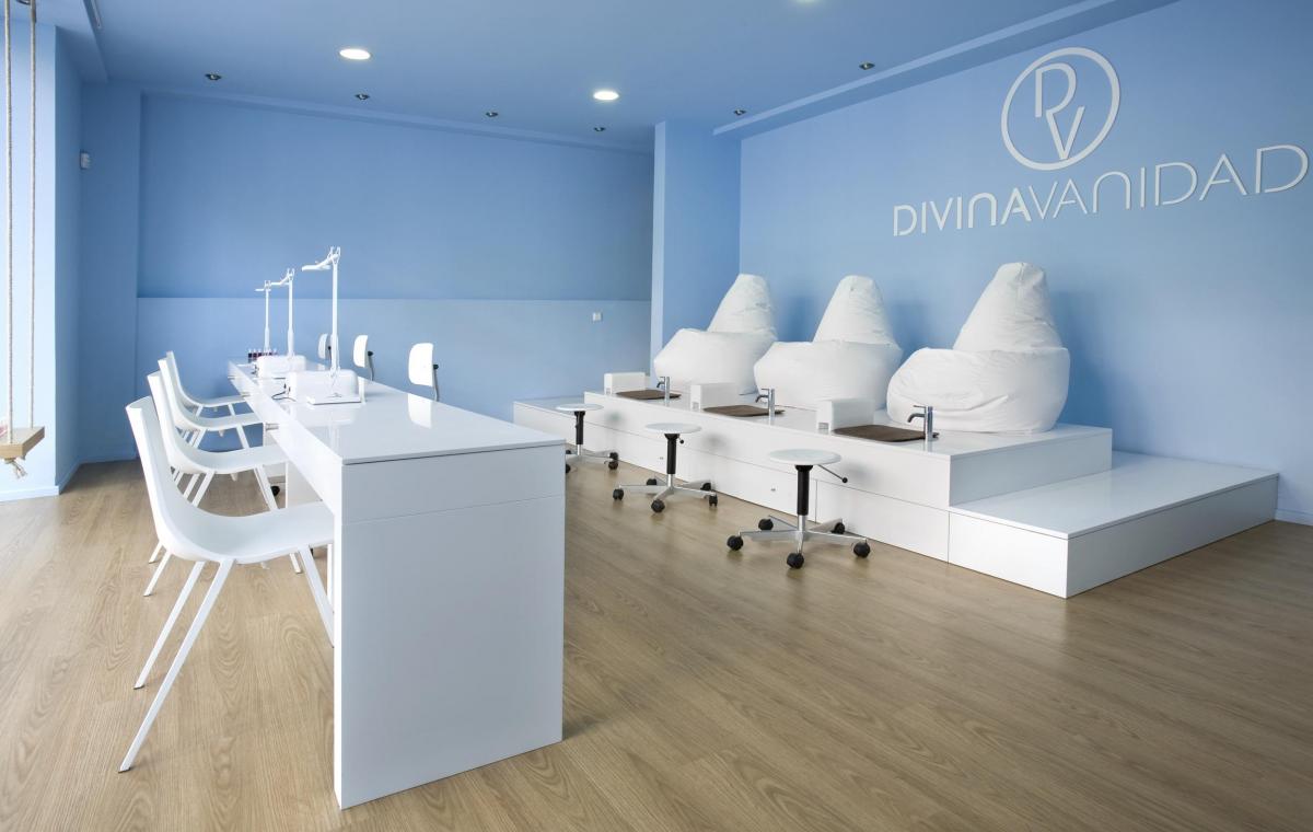
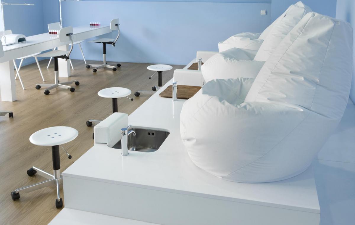
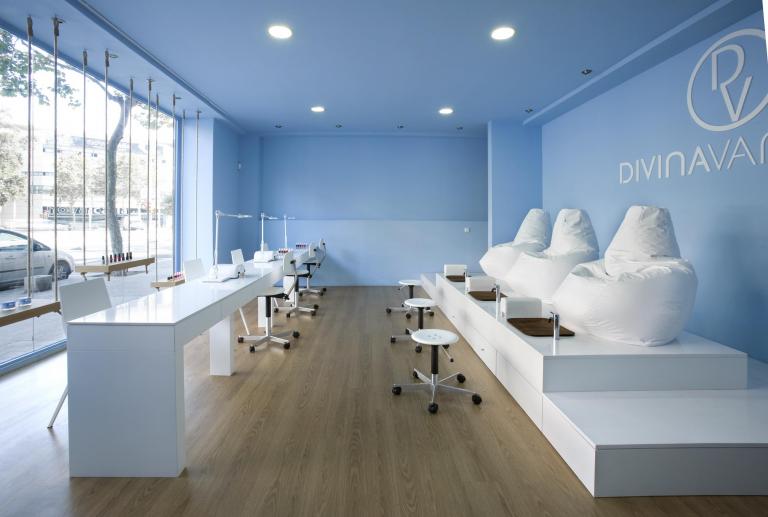
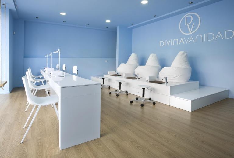
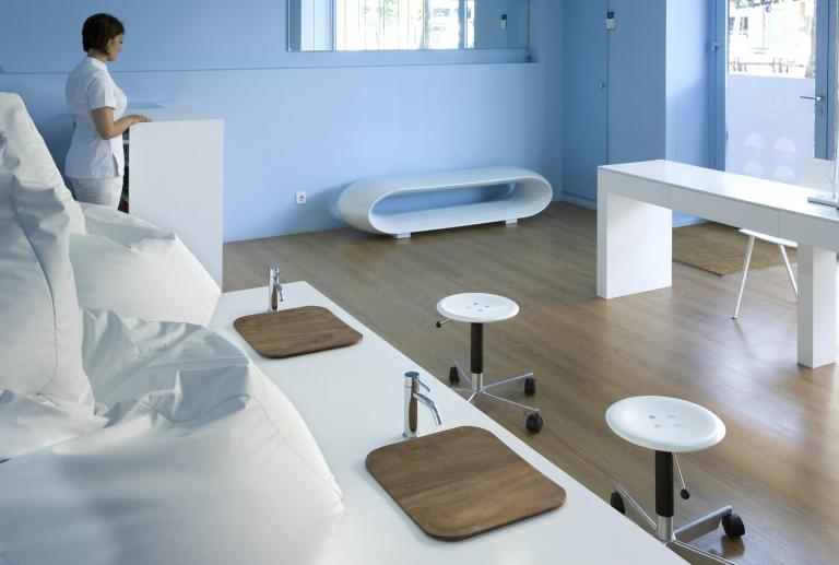
The solution was to locate the two work areas as two large parallel areas: a bar in first position for the manicure and a platform-stage in the background where the pedicure zone is located. This distribution is the best way to organize the space, ensuring a good circulation of customers and leaving the beauticians in the center of the room that can move freely between one work area and another.
A bar for the nails
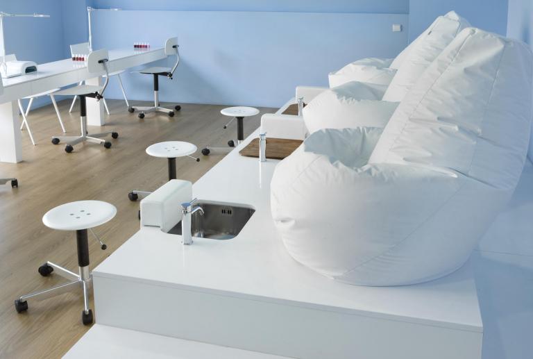
The originality of the project is in the area of manicure: it was designed as a linear bar where four seats are succeeded and where you can offer a fast and quality service with the client and beautician on both sides of the bar.
A platform for the pedicure area
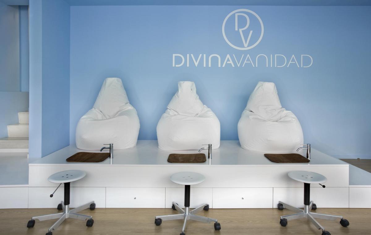
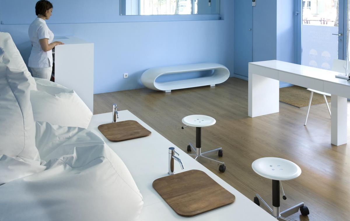
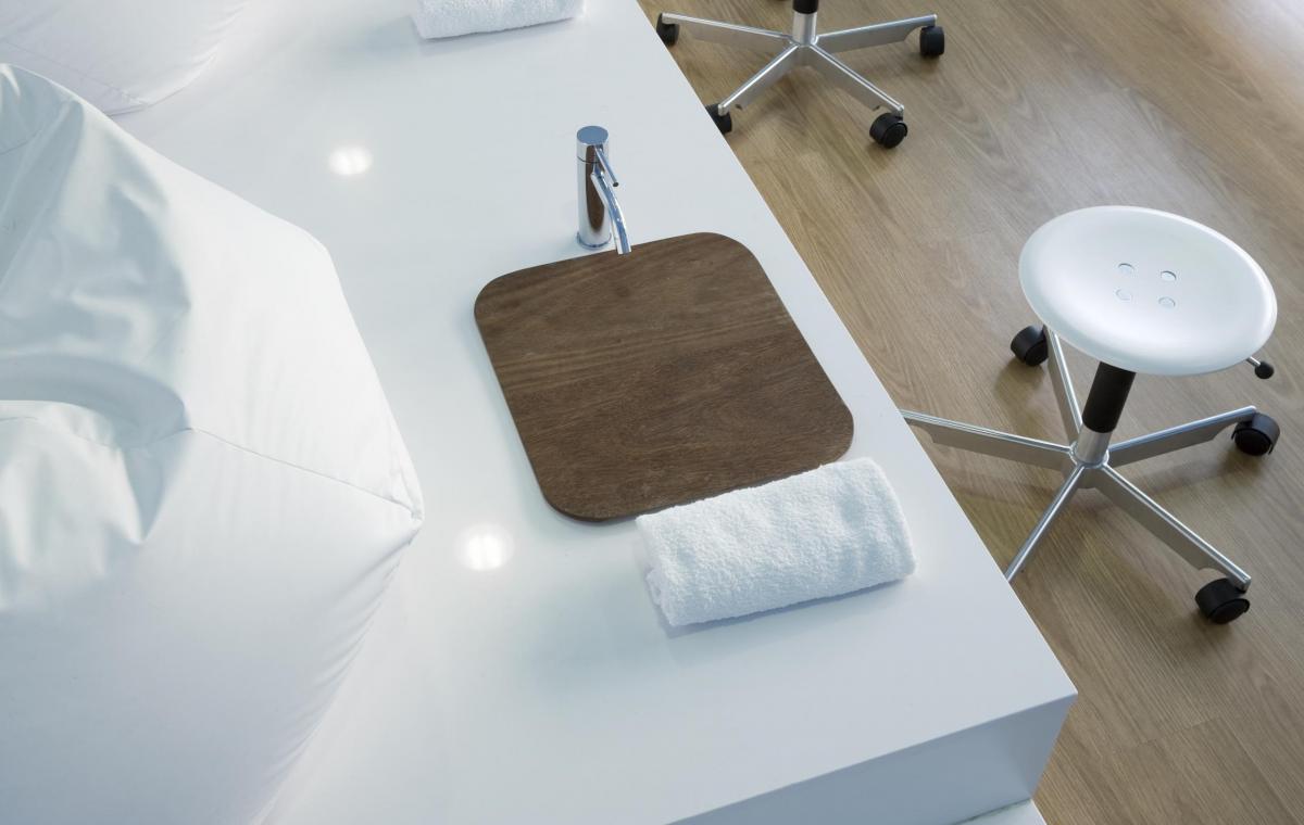
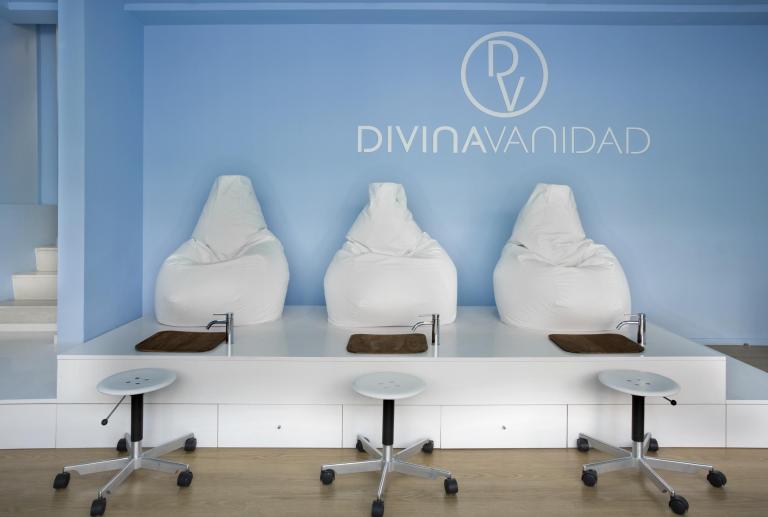
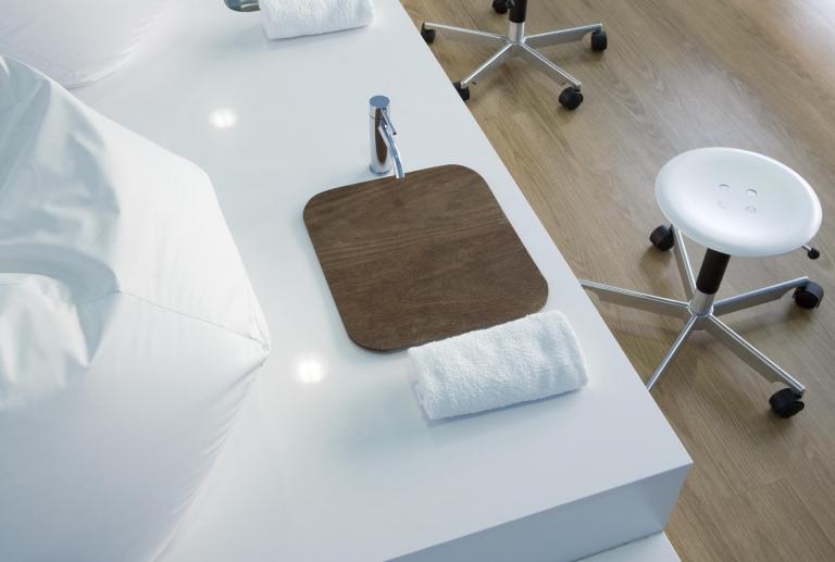
Just behind the bar, presiding over the space, a stage stage 2x 5 m long was designed where the pedicure zone is located. The three positions of pedicure are marked by three stainless steel sinks, embedded in the step, that ensure the maximum ergonomics and comfort of a pedicure service: washing, frontal vision of the foot and horizontal situation to paint the nails. Three large white puffs serve as a seat and enhance the aesthetic informal and young but at the same time comfortable and level that characterizes the rest of the project.
Blue and white
For the color, it was looking for an intense blue that gave the feeling of "being in the sky", wraparound, relaxing but not childish or too soft. The whole painting was painted like a very enveloping box, of the same tone. The pavement is parquet, and the rest of the furniture (both made to measure as the exempt parts) are bright white. The blue and white duo also plays with the name of the room "Divine Vanity" and with the idea of being in the "sky", creating on the one hand a clean and relaxing environment (blue) vain and sophisticated (bright white).
Hidden Installations
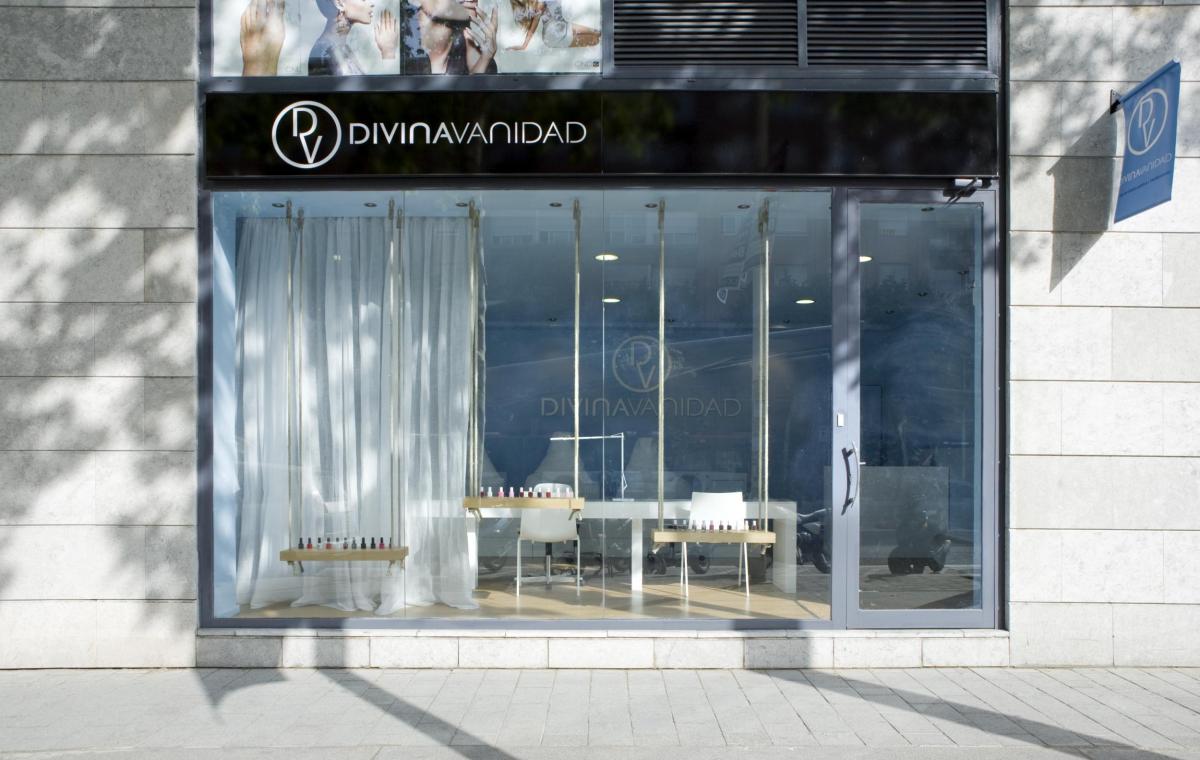
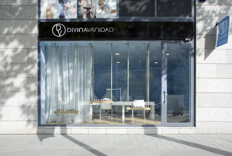
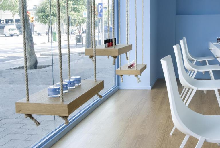
To create a clean and linear environment all the facilities are hidden inside the bar and the walls that leave a small niche on both sides where to expose the product if necessary. The rest of the space has a small counter, a seat at the entrance and a mirror. Even the showcase has been made with three swings of rope and wood that play with the idea of suspending in the sky. It is a good resource for a showcase that should not compete with the interior of the aesthetic center. Only a light curtain of thread allows to create intimacy to a part of the room, at the same time that allows to glimpse what happens inside the living room.


