Hair Salon "Compagnia de la Bellezza" / Barcelona
A new hair salon concept
The challenge: creating a new concept in hair salon design, providing innovative solutions suited for the specific functional requirements of a modern hairdressing salon. Vilablanch´s interior project displays an elegant and contemporary design aesthetic, appropriate to the city of Barcelona.
The Italian group "Compagnia della Bellezza" wanted to start their project in Spain with the opening of an emblematic show in Barcelona. The brand's flagship store should reflect the group's experience and working methodology, and the personal experience of the classroom owner, Claudio Bucci.
The room should be inspiring for the future salons of the group in Spain and also serve as a training center for future franchises.
Bringing the model of the Italian hairdresser to Barcelona was a challenge and the image had to be warm, elegant, modern and attractive for the public of the city: demanding, well-informed and in search of a first-class service.
These were the requirements of the order:
- The hairdresser had to have four functional spaces: the reception or waiting room, the washing area, the dyeing room and a cutting room.
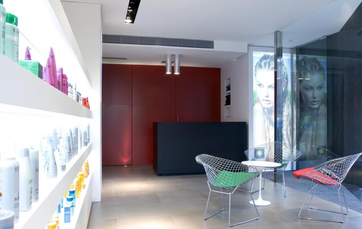
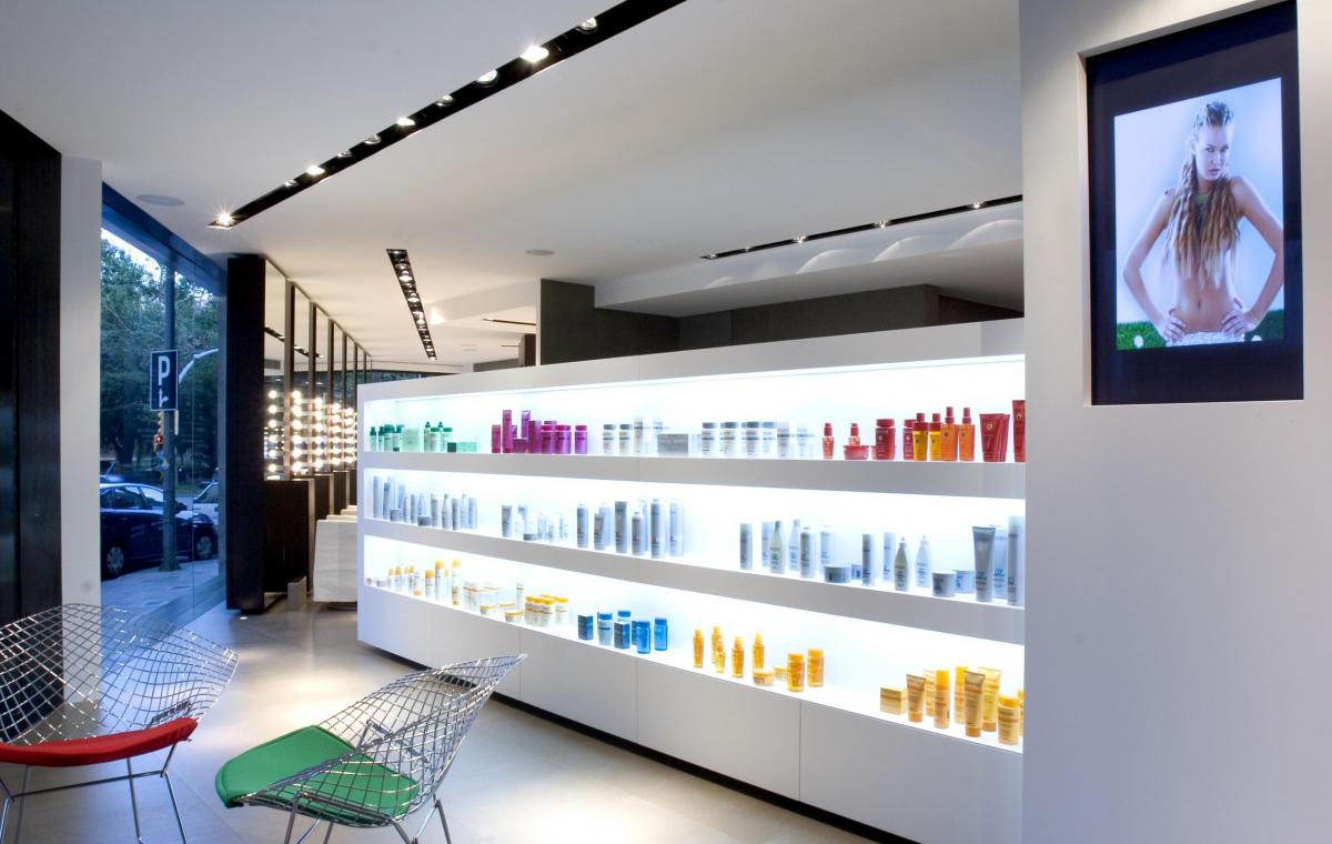
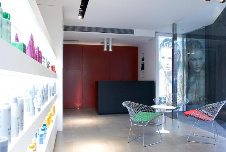
- The reception should be spacious, pleasant, open.
- The area of dyes should have a privileged treatment. The treatment of hair color in Compagnia della Bellezza is very sophisticated and requires plenty of space.
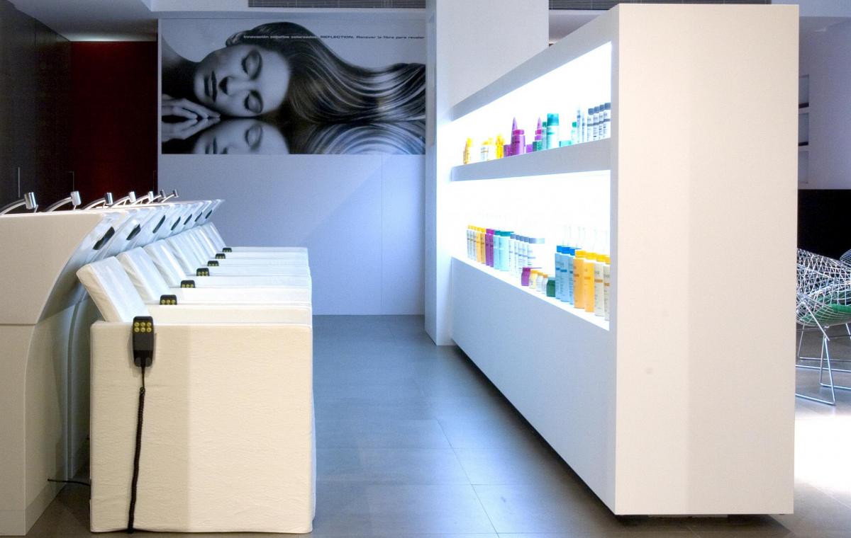
- The washing area should be conceived as a relaxing environment, with treatments for hair, chromotherapy, aromatherapy and massages.
- The temperature control of the room should be differentiated for each zone.
- The lighting project had to be studied conscientiously to achieve adequate light in hair and face.
"This room had to reflect everything I had learned in my twenty years as a hairdresser in Italy and as the owner of three salons - it had to be the living room of my dreams, and the best of Barcelona."
Claudio Bucci, hairdresser and salon owner
The interior design project has studied solutions to the complex requirements of a beauty salon, offering appropriate functional and aesthetic responses to each area.
- To achieve current and modern environments were used sober colors and few materials: natural iron, dark wood and gray pavement.
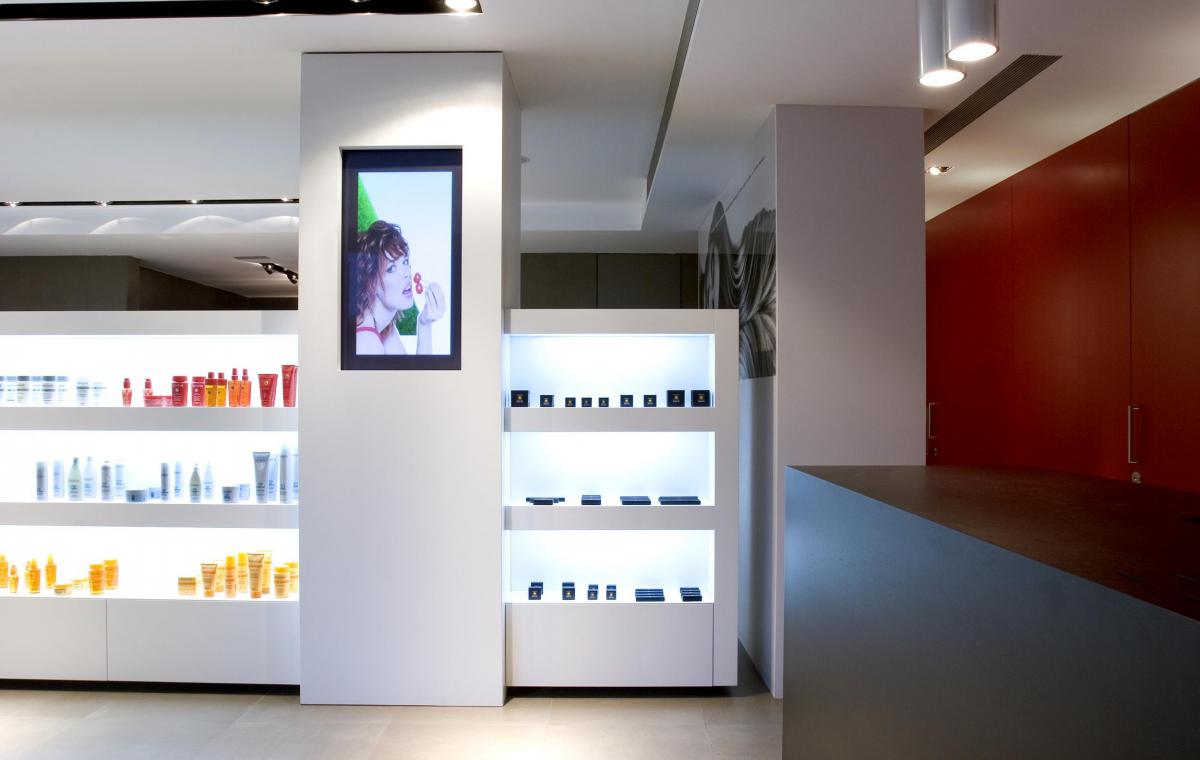
- All the walls, and even the ceilings, are of white color and only the wall of the reception has painted of red.
- The pavement and walls of areas exposed to moisture are made of porcelain.
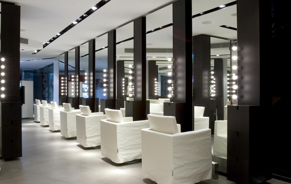
- The dark wood vanities have been custom designed, from floor to ceiling, and incorporate lighting.
- The doors are pivotal, without frames and integrated to the walls.
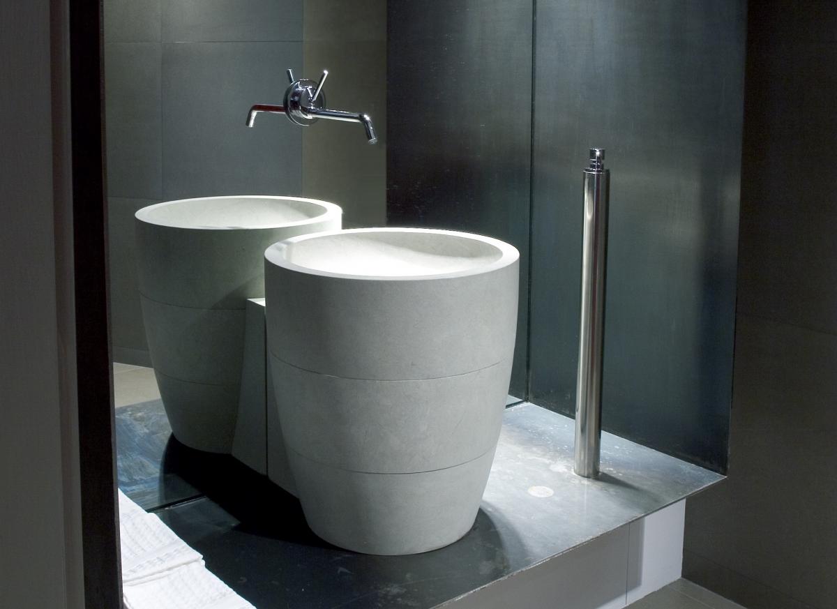
Walls and floor are of the same material, a gray porcelain that forms a neutral and warm box. The sink, like a totem in natural stone, is framed with an iron hornnina that remembers the treatment of the exterior windows.
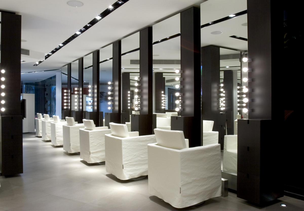
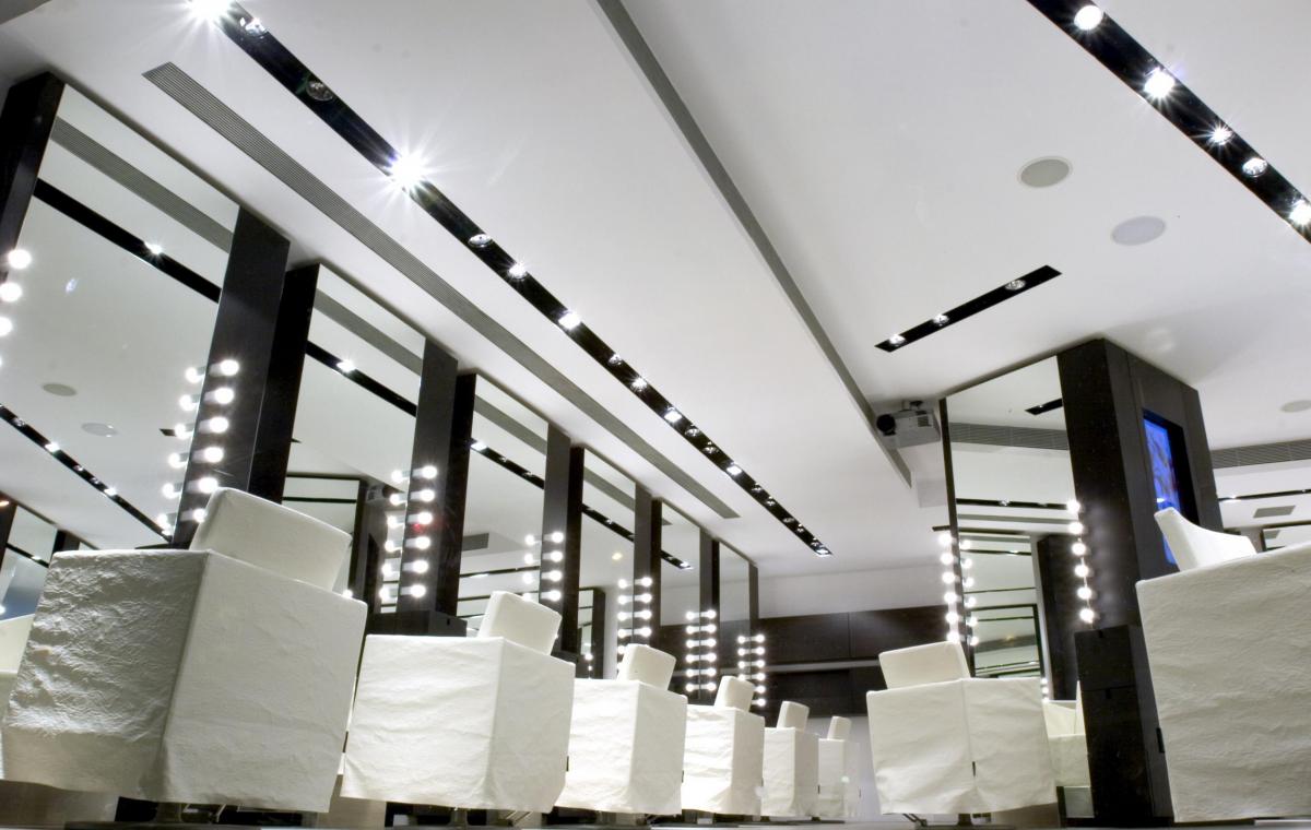
A double illumination was proposed. On one side zenithal light, to illuminate clients' hair from above, with a mixture of warm and cold light. And by the other front light from the furniture toilets to illuminate the client's face with a warm light.
The overhead light is completely hidden in the 094 program of Viabizzuno. This system allows us to create a flexible installation of light, with a very refined aesthetics.
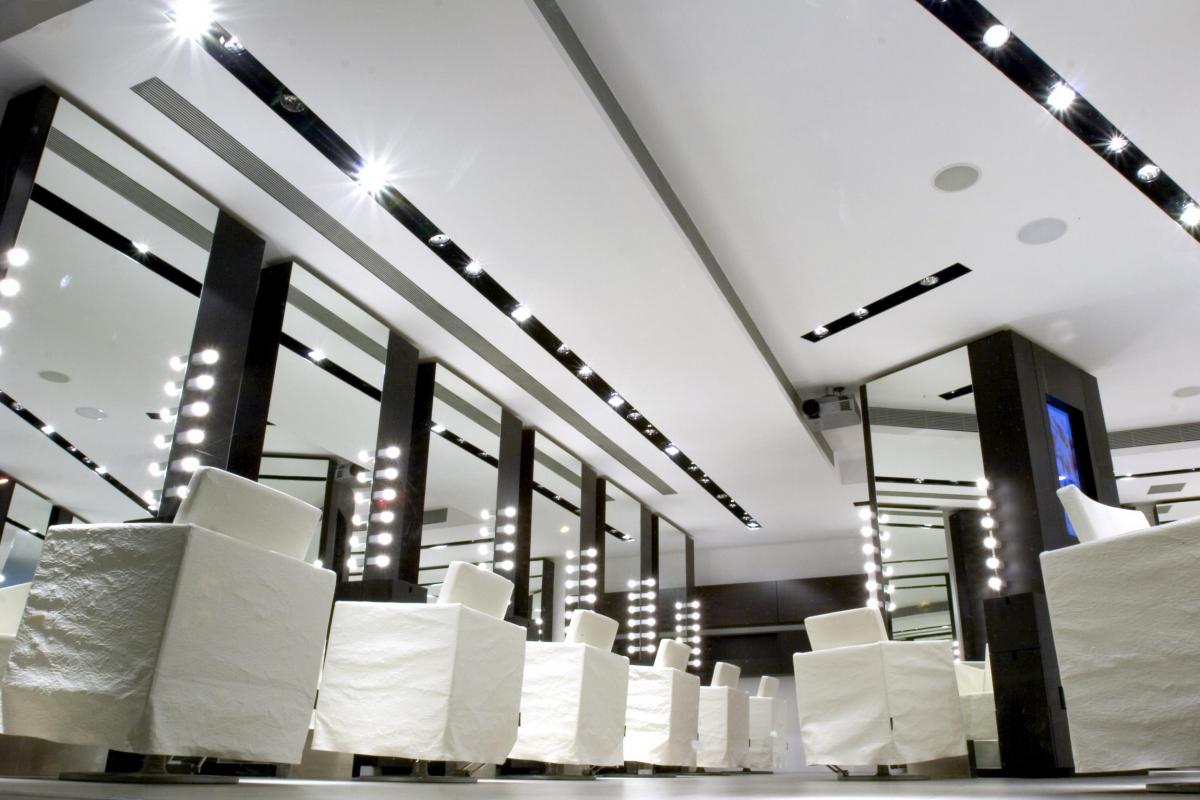
The cutting area is considered as an atelier, in perimeter layout, in the center of which is the master hairdresser. The toilets, located around the perimeter of the space, create privacy for users.
In the center, there is a furniture designed to measure with two workstations, one for the hairdresser and one for the makeup artist. This furniture houses two plasma screens. The walls of this area are white.
The vanity units, made of dark wood, go from floor to ceiling, which reinforces the sensation of height in space. They are furniture with mirror, electrified and that incorporate front light for optimal illumination of the client.
As the cutting zone is warmer due to the operation of the dryers, a specific cooling circuit was created for this zone.
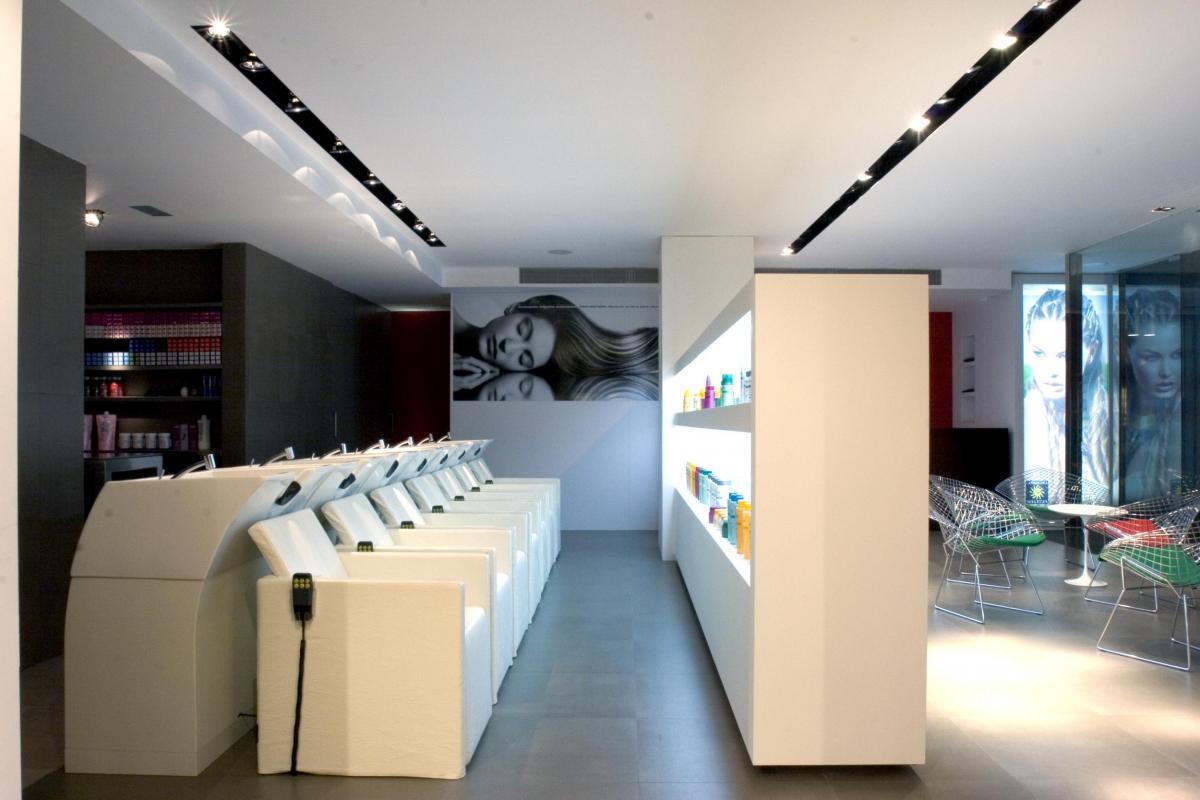
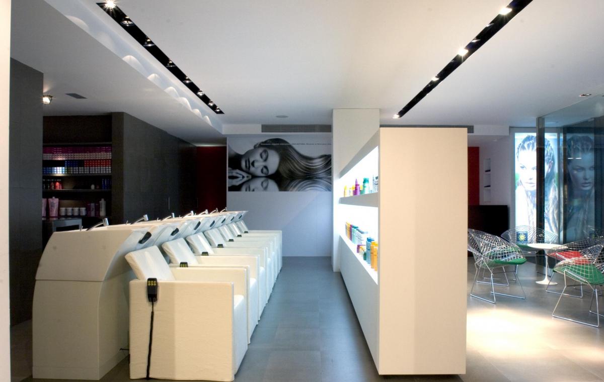
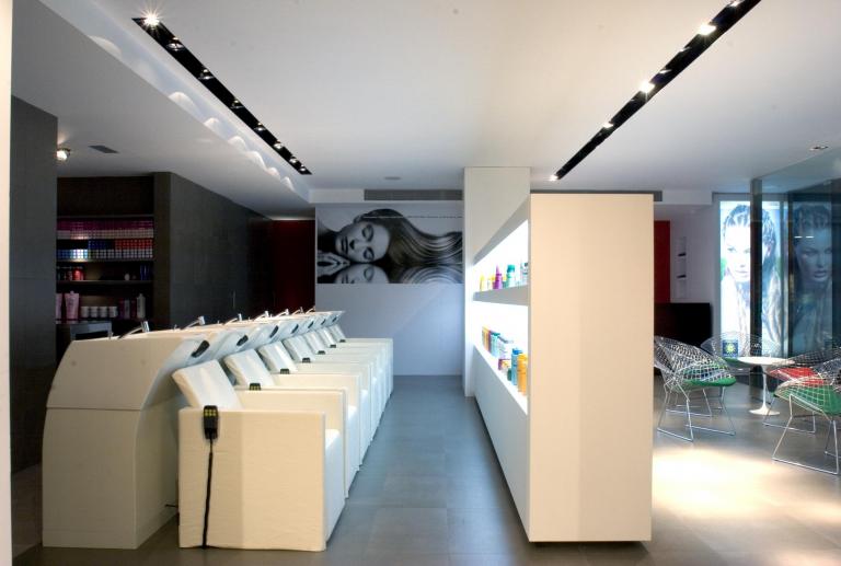
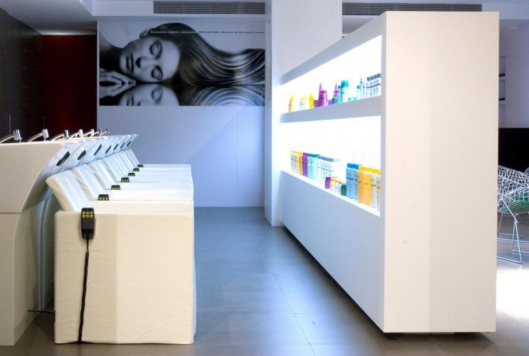
The washing area, adjacent to the reception, enjoys a certain privacy as it is separated by the display cabinet. From the washing area, the hairdresser shows the customers the products that will be applied in their treatment.
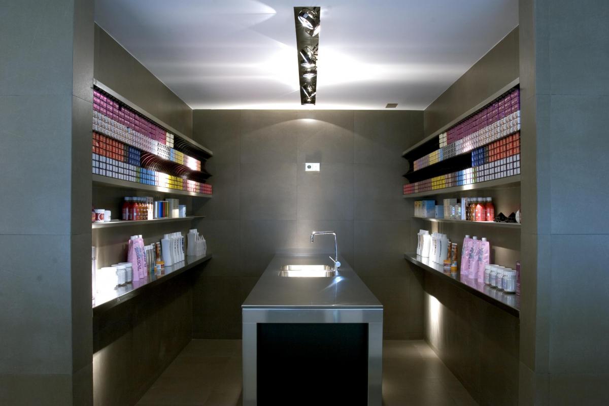
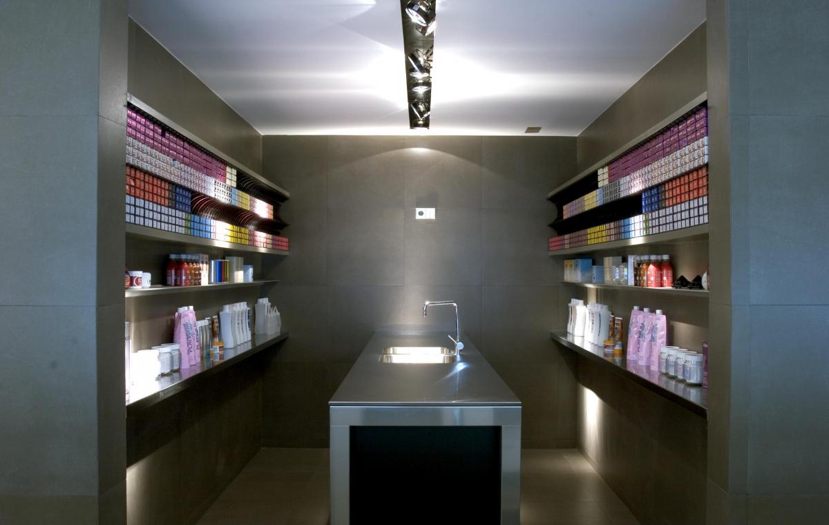
The zone of dyes, contiguous to the area to the washing, is raised by an island in steel, with drawers suspended in black laminate.
It is an innovative concept in the world of hairdressing since, for the first time in Spain, it is considered as a laboratory of color in which work with 251 colors. That is why it has been conceived as a space with a differentiated aesthetic but at the same time, functional: comfortable and accessible shelves for the storage of dye products and a central work table.
The walls of the wash area and dyes have been coated with the floor material to protect them from splashing water and dye. The large steel island and shelves stand out on a monochromatic background.
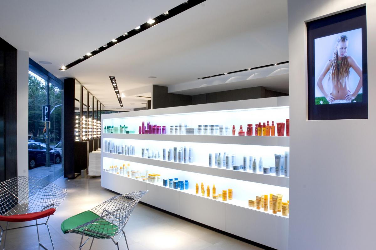
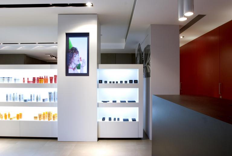
The reception and waiting area are separated from the laundry area by means of a display unit, also designed for the space.
The furniture, lacquered in white, has on each side three horizontal slots illuminated, for the exhibition of products and a plasma.
Its functionality towards the waiting area is the exposure of the product for sale and towards the washing area is the storage of the products that are used in the interaction with the customer.
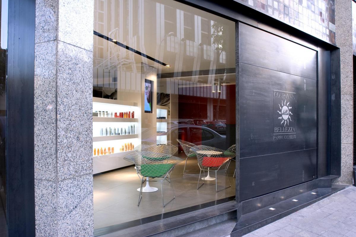
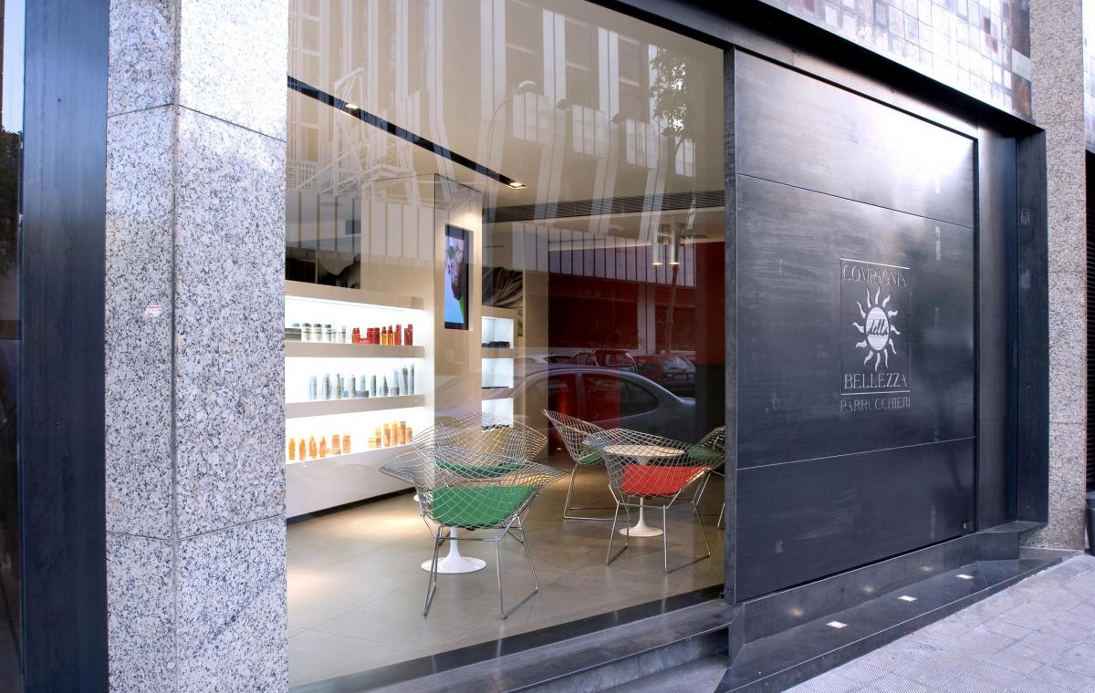
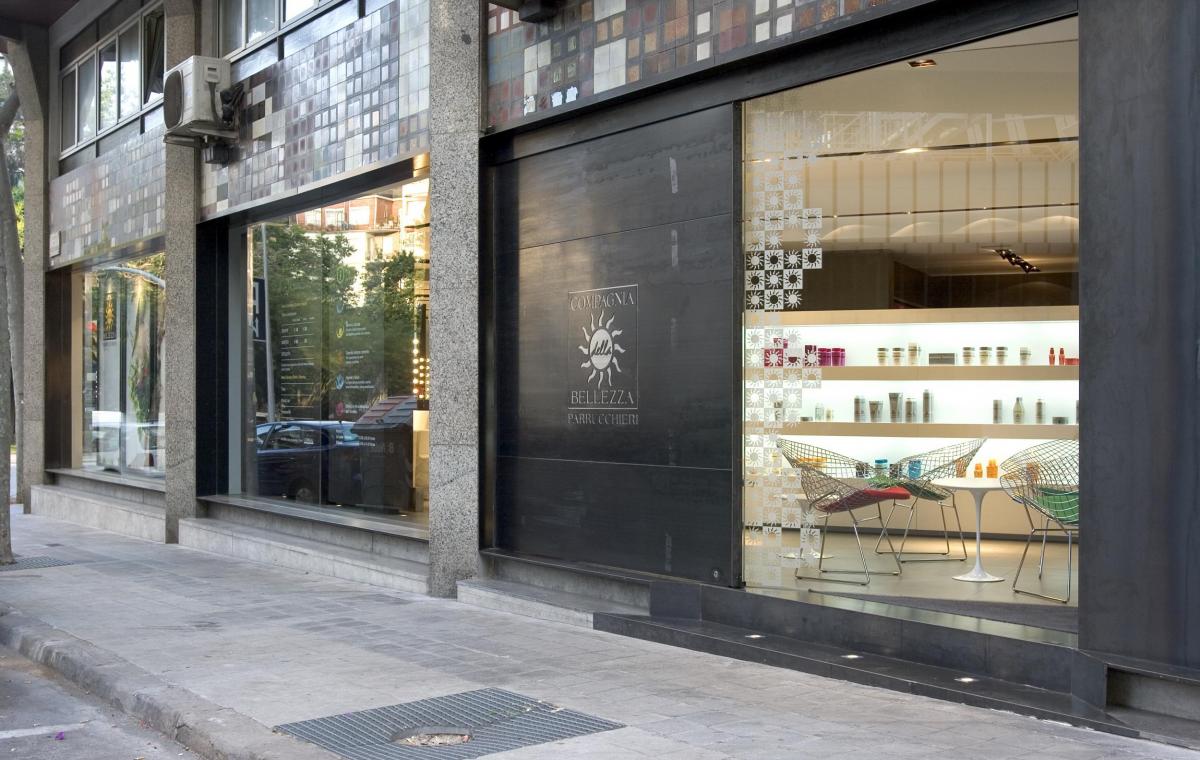
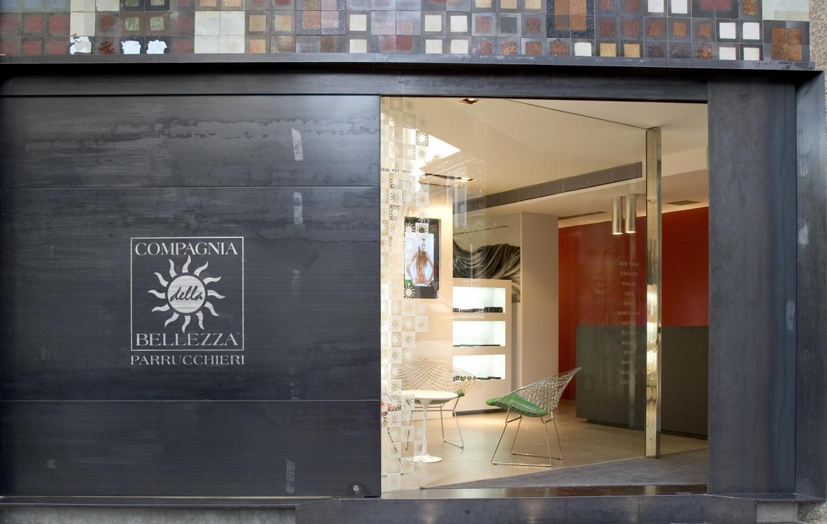
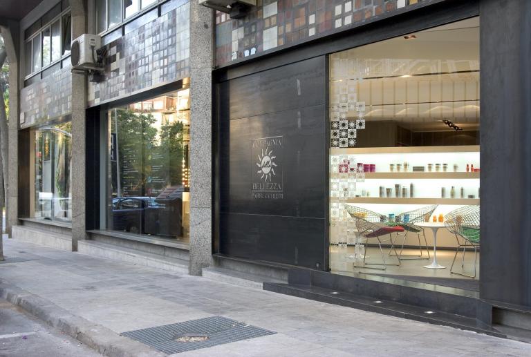
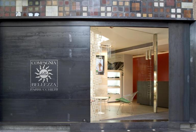
To the place is accessed by a large sliding door of 230 x 240 cms in natural iron, with the logo of the company drained, on another plancha of brushed iron.
The outside crystals are directly embedded in the wall. An iron structure creates a visual effect "tunnel" framing the image of the interior.


