Antiquaris Hall 2008 / Barcelona
Old and contemporary. Experimentation and contrast.
Is which the best environment to show pieces of antique shops? Have place the antique in contemporary spaces?
vilablanch we wanted to take up this challenge and tackle it with an innovative and experimental approach. Place antique pieces in a contemporary setting allows to give force and personality to the space and make the antique vedaderas players.
When the interior designers of vilablanch, the management of the Antiquaris Hall and the Barcelona Guild of Antique dealers tackled this joint project for its 2008 edition, they provided different and complementary visions and needs that enriched it.
- For the Antiquaris hall in Barcelona it was necessary to show that antiques can have a place in a modern home, and that old pieces and pieces of contemporary design can coexist in a way that not only does not bother, but also reinforces the value of the others. Its target audience was not only a traditional collector who creates retro atmospheres set with antique pieces, the Antiquaris hall wanted to reach even a younger audience, a lover of modern design and art.
- For vilablanch the challenge was the reverse. How to create rabidly contemporary environments that support old pieces? How to create the mix in a way that is attractive for both an innovative audience and contemporary design lover, as well as a more conservative audience, who loves old pieces?
- As the old pieces are rich and diverse in materials (various woods, fabrics, metal), the contemporary environment should be as homogeneous as possible.
- The materials of the furniture elements of contemporary design should not compete with those of the old pieces. Therefore, modern elements could not have finished wood. Finished elements were chosen in lacquered wood, plastic, or metal, clearly differentiated from the materials of the old pieces.
- The color of all contemporary elements and the container box (walls, floor) should be white, to ensure maximum prominence to old pieces, rich in textures, materials, and colors.
- The only elements that would bring color would be the old pieces.
The project had to start from basic premises:
- Space should look like a modern, contemporary space.
- The individual protagonism should be for antiquarian pieces.
- The result must be harmonious and beautiful.
- The mixture, the contrast, had to find a visually soft, natural, non-forced solution.
- The old pieces had to be singular and strong, besides having a great quality as object of collection (by time, by value, by make).
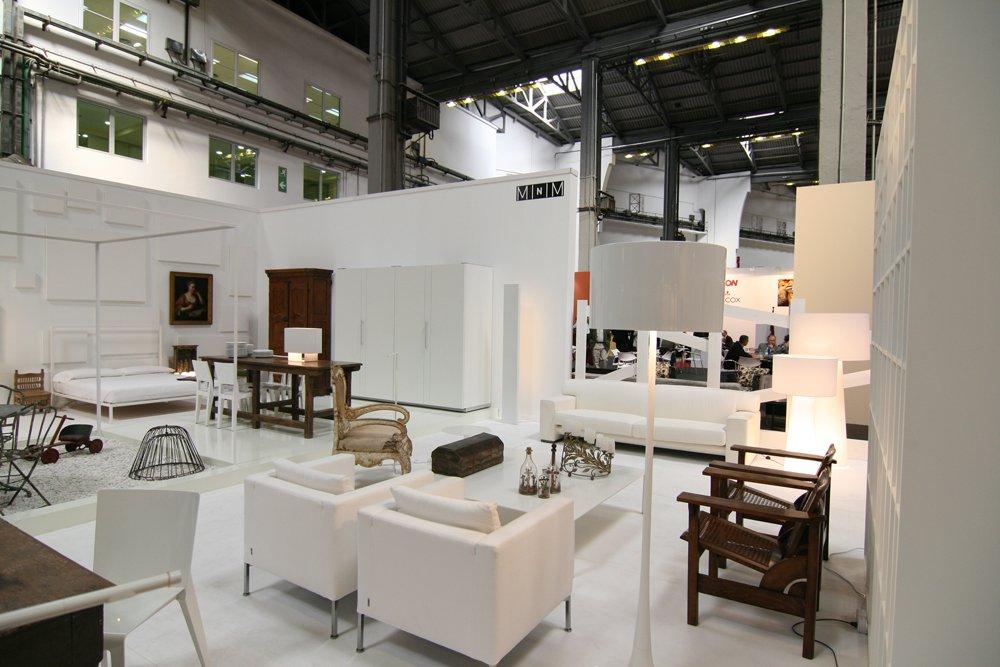
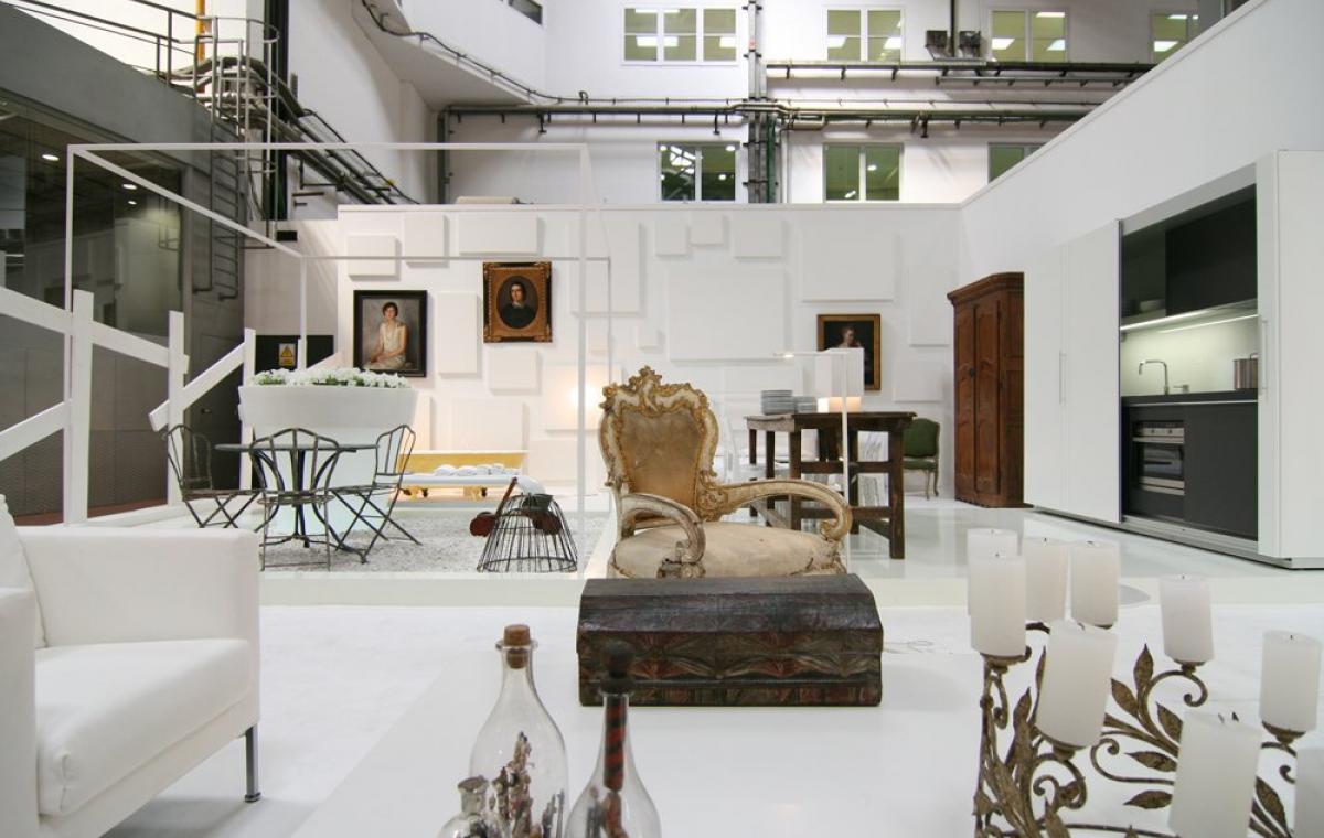
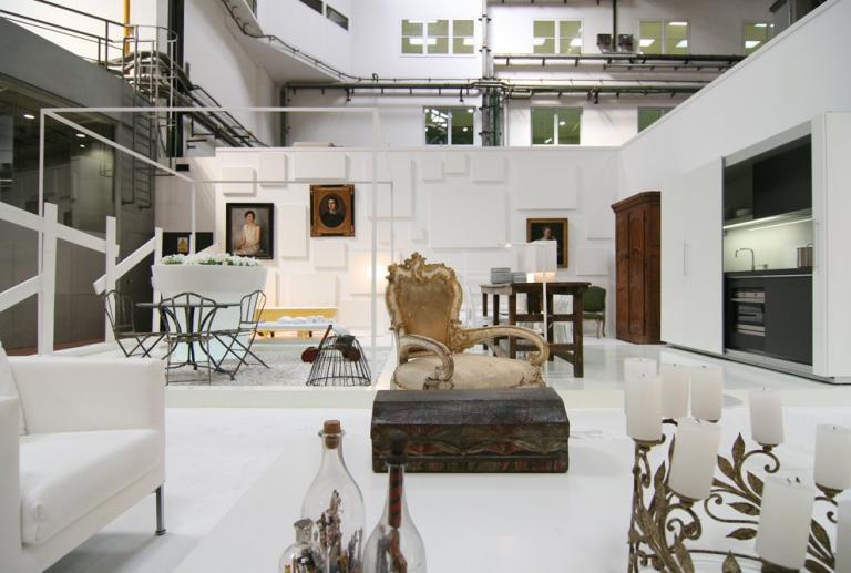
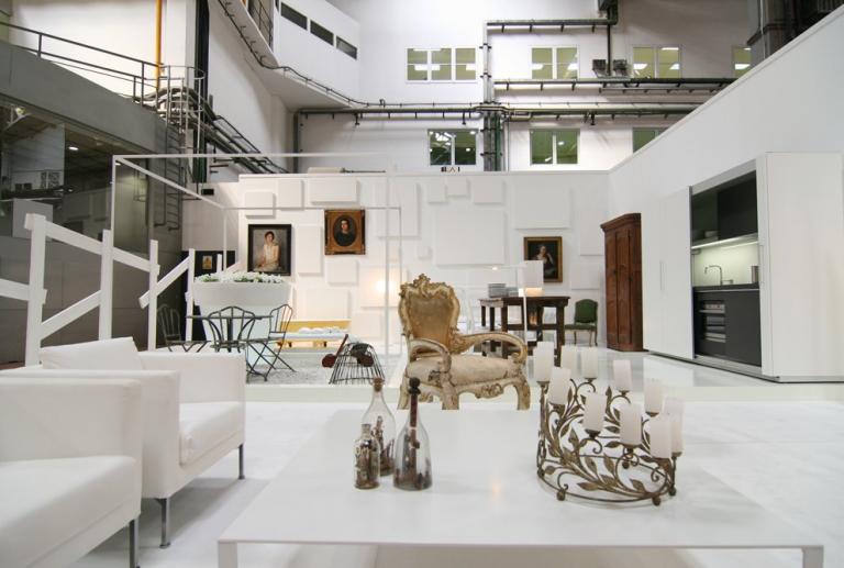
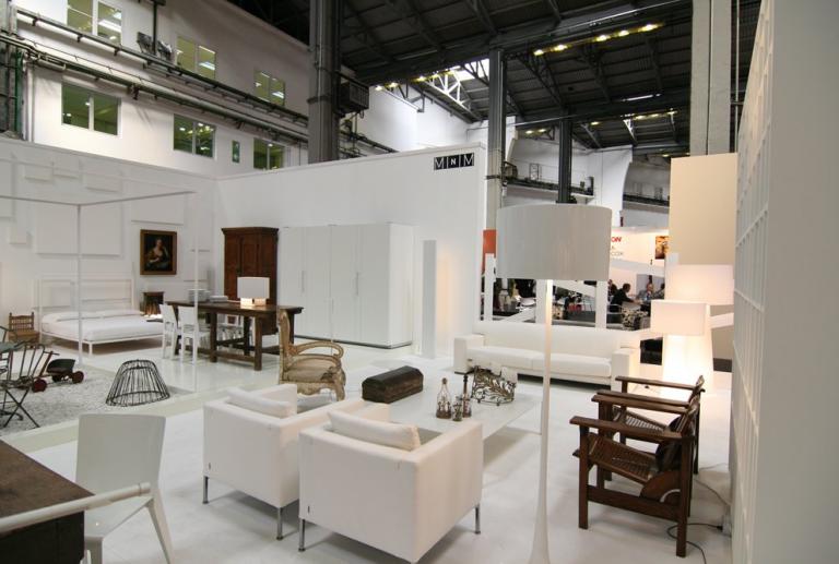
All the real spaces of a house were created: kitchen, bedroom, living room and even a garden, under a very light structure that simulates a pergola.
The different areas of this virtual house were unified with the absolute presence of the white, which neutralizes the spaces to guarantee the protagonism of the old pieces. Even the books were white.
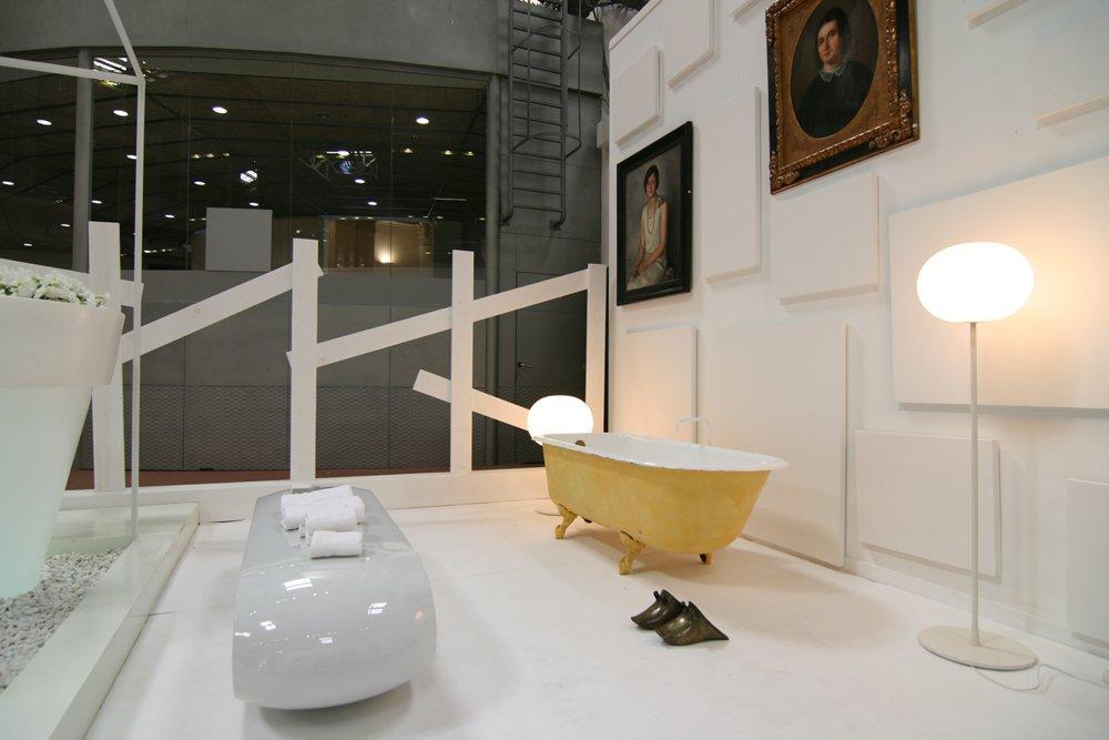
For the space that simulates the bath has been placed an old leg bath, enameled in yellow. As support, the Bank Loop Serralunga. The lamps are the Gol-Ball model of Flos.
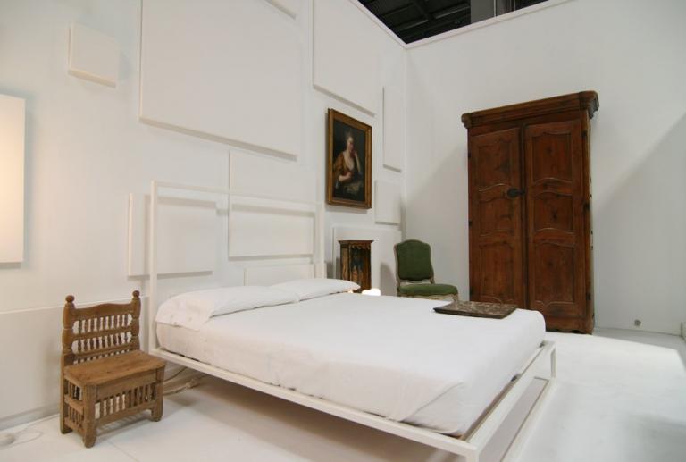
The bed in the night area is the Zanotta Mini.
Como piezas antiguas:
Capilla madera policromada S. XVIII.
Butaca francesa de terciopelo verde.
“Retrat de senyora escrivint”. Attributed to Jean Francois de Troy. (Paris, 1679-1752).
"Dama”, oil on canvas 71 x 56, by Federico de Madrazo.
“Retrat de Senyora” 1828, by Antoni Vila Arrufat.
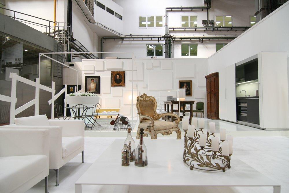
The kitchen is the Diva Tivali model, a design with sliding doors and an exempt cabinet structure, specially designed for small spaces or open distributions, and that allows to open or hide the cooking zone according to the needs.
The chairs are by Mr.Bugatti and the lamp on the table is E15.
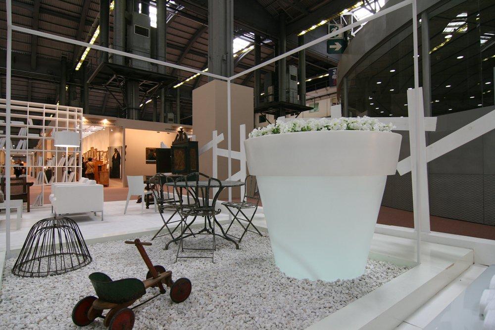
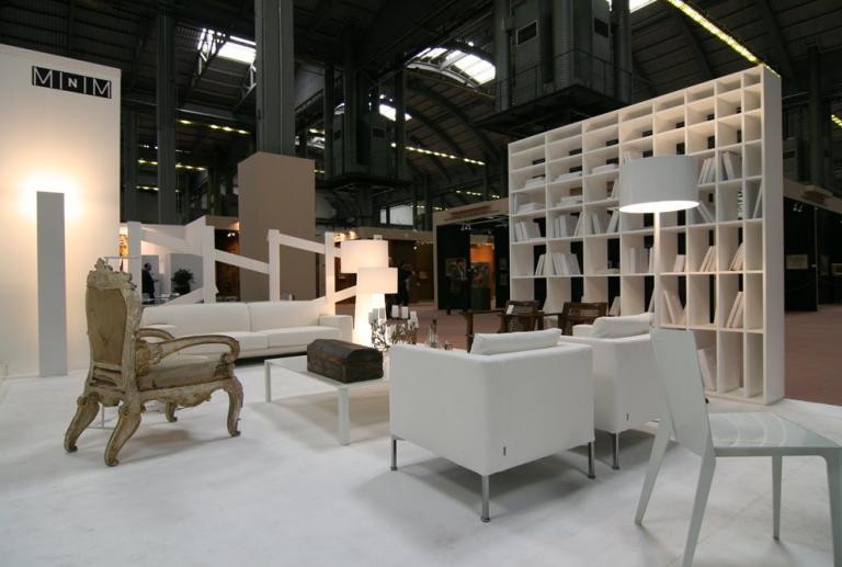
At the entrance of the space is the living room, with the Vintage sofa of Living Divani and, opposite, arranged in parallel, two seats model Box of the same firm. On the side of the installation, white bookcase and two lamps of different heights, by Capellini. The coffee table is Molteni's Less model. In the garden, flower pot Vas-One of Serralunga.
As antique pieces: Italian throne chair (18th century) with fragments of original polychrome, articulated Mallorcan chairs with three positions, Art Deco style (s.XX), Italian chandeliers (18th century) and bottles of "marinier" with scenes of Calvary on the coffee table, and wrought iron garden table and chairs are French (early 20th century).


