Green house in La Fatarella / Tarragona
Sustainable architecture and interior
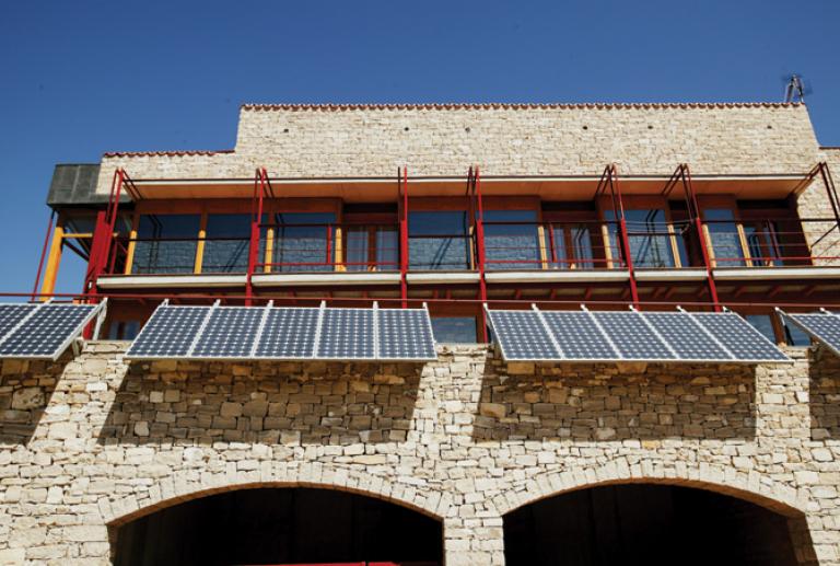
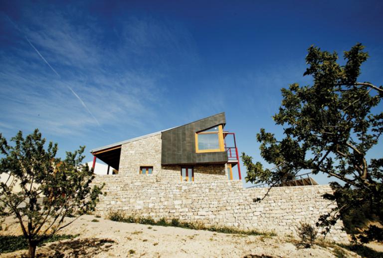
This stone house was built with the more traditional methods and the latest green technologies: solar plates, collecting rainwater and heat insulation. The proposed interior design project by estudio vilablanch have wanted to let uncovered all the structural elements to highlight the richness and texture of natural materials.
The architects María del Mar Solà and Alfredo García Ferrer designed the project of the house, its structure and the constructive finishes, outdoor and indoor (stone walls, visible building walls, metal structure, enclosures, staircase) and the systems of utilization of solar energy.
The order made to Elina Vilá and Agnès Blanc, from the studio vilablanch, was to define of the non-structural finishes, such as the continuous pavement and the compositional definition in colors and in the special organization.
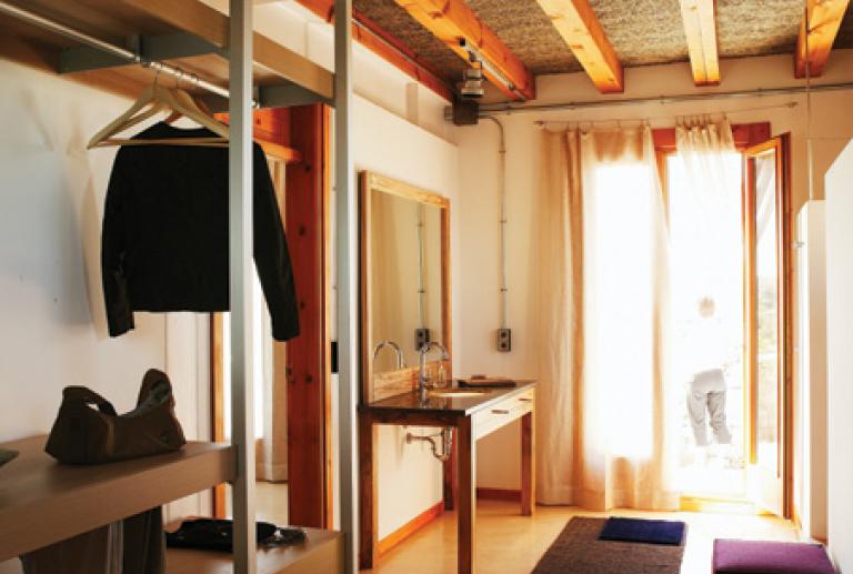
The design, distribution and finishes of the kitchen and of all the furniture were defined, as the illumination project and electric installations. Are also incorporated in the project the decorative elements such as curtains, rugs and decorative lamps.
The house is located in La Fatarella, a small agricultural village in the province of Tarragona, and is surrounded by a land of some hectares where is located an orchard, a chicken coop and two feixas (terraces) of cultivation of almonds and fruit trees.
The house is constructed in two floors of the building and an inferior floor as a cellar. The interior plant and its cellars in arch are visible from the field, because in the side of entry of the house the cellar is buried. The two floors used for living, have access to the parking space and the cellar. The useful living zone of the first floor is of 190 meters squared. In the second floor, there is a total of 160 meters squared of dwelling.
As a basic idea, in the interior has been left in sight the constructive and structural elements such as dry stone, bricks, iron structure, wood joints and insulating vegetable fiber.
This makes the interiors, as the exterior, really rich on textures and materials, but that this variety is not superfluous or artificial, but natural, respecting and leaving on sight the constructive system.
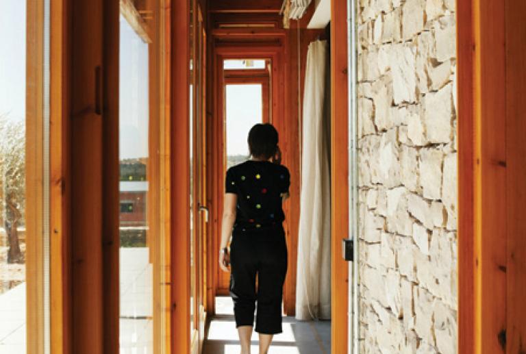
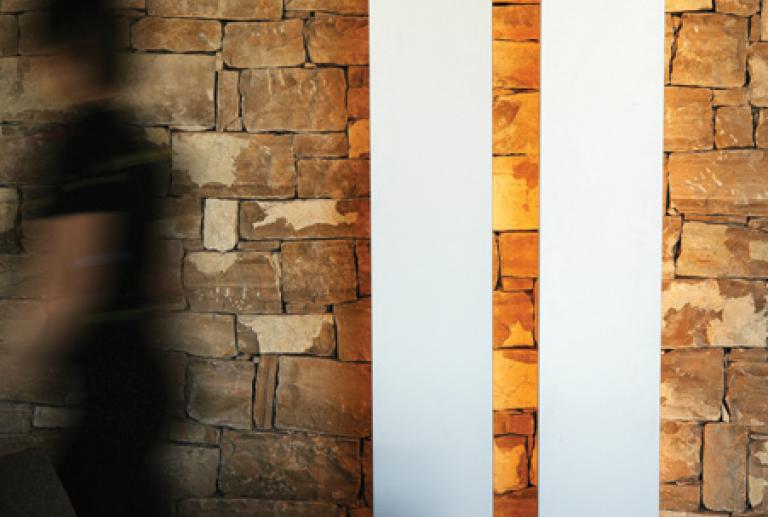
The condition was to preserve the original idea of the house, based on the utilization of the dry stone as a constructive element, and in the interior walls has also been left the stone without covering in most part of the house.
The pavement is neutral, continuous, of Portland, of an important thickness and dark grey color. The color and thickness are due to the utilization of the pavement as a thermic reserve and heat accumulator. For the bathroom and the bedroom is used a continuous pavement of varnished wood chip.
“The interior design project should preserve the original idea of the house, the utilization of the dry stone as a constructive elements, and left in sight the structural elements” Agnès Blanch, interior designer and project manager.
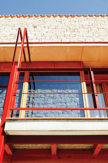
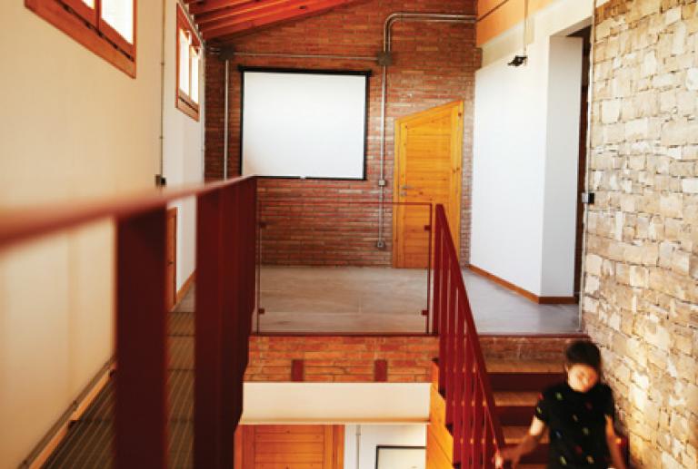
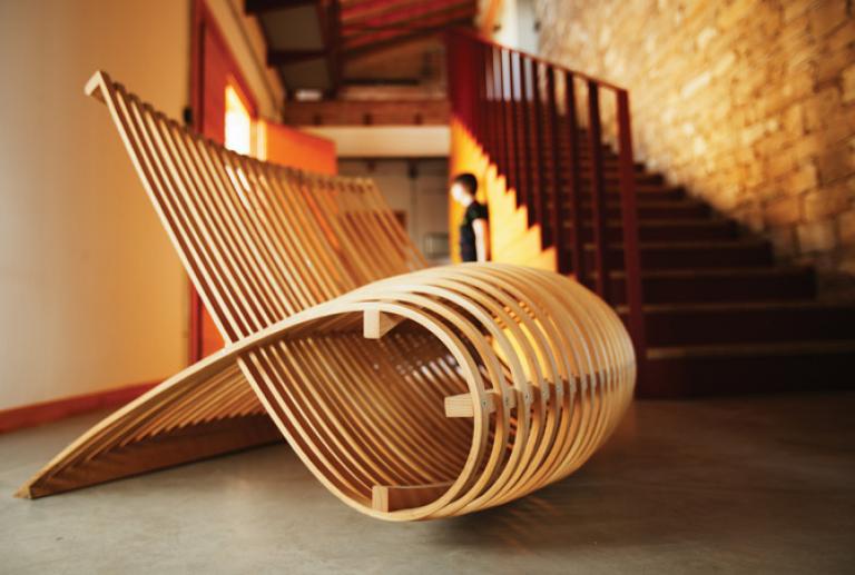
In the entrance of the house, we place the hall of 6 meters and double height. At the end, the wall of stone is silhouetted by the staircase of pine wood, with railing and iron riser painted in red garnet color, as the exterior iron structure. The illumination in the steps of the staircase, project a vertical light that highlight the irregularities of the stone, creating a theatric effect.
When going up the stairs you access to a landing, which can be used as a polyvalent zone, such as audio-visual room, or group work.
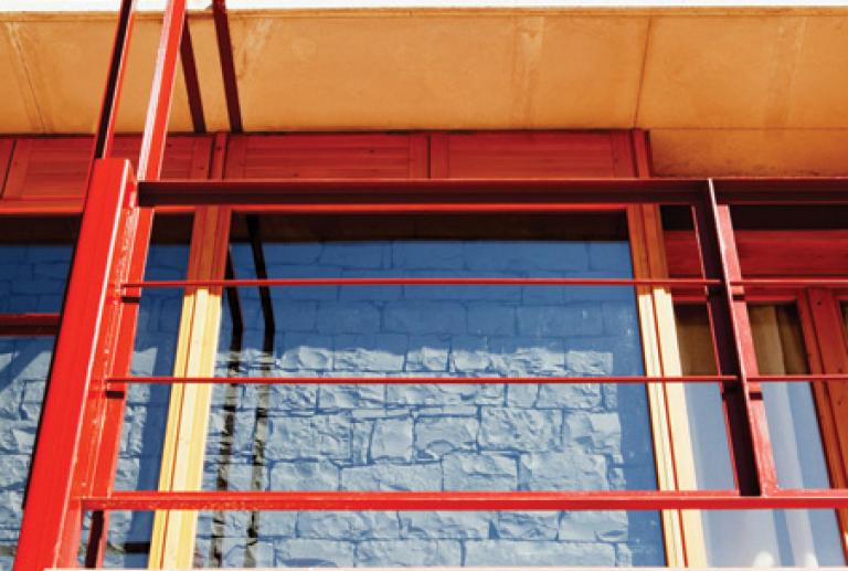
From this space you access to an iron gateway with a grid zone, sustained by the frontal wall of the house. This gateway is used to access and clean the glass of the frontal windows of the house. The structure has the grid pavement to make it lighter at a visual level.
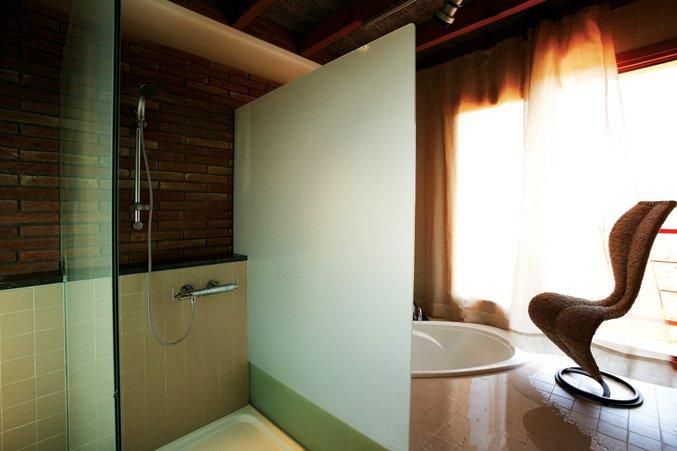
The bathroom space is zoning with three glass screens, which separate the three zones with different heights in an ascendant way to the exterior, like looking for natural light.
In backlight, the sensual and insinuating silhouette of the S chair, designed by Tom Dixon, for Cappellini.
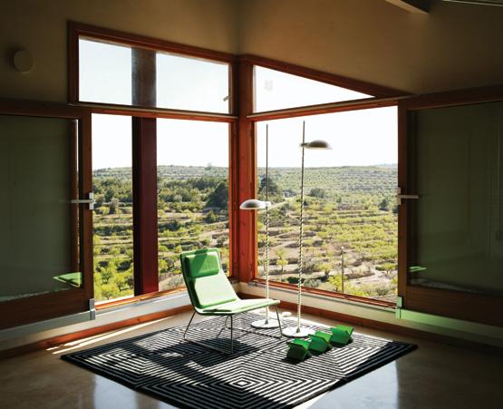
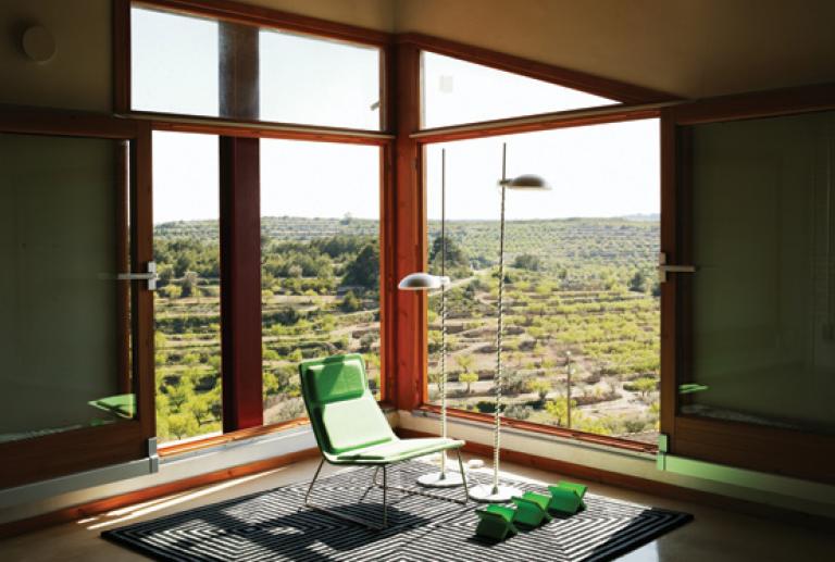
It is an open space in consonance with the nature of the zone. It has created a comfortable lecture and contemplation zone. The colors have been chosen taking into account the natural environment. The wood tones (parquet) and the leaf green (in the Low Pad armchair from Cappellini and the crosses) predominate.
The huge windows on sliding rails have a double opening system. The first system allows ventilation, with a folding opening at the top of the window. The second system slides the windows to the lateral, totally opening the space to the bucolic landscape of Tarragona’s fields.
The lamp Luxmaster of Flos and the VP I rug of Verner Panton. The chair is the model Low Pad by Cappellini.
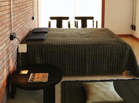
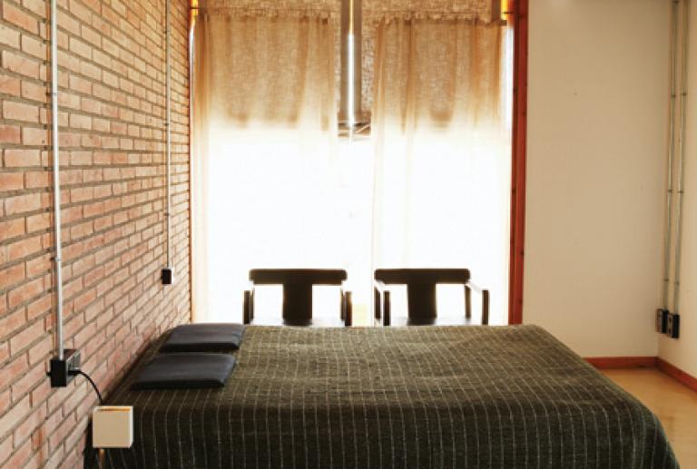
To create a warm and quiet zone, there were used natural finishes of wood and vegetal fiber in green tones.
The armchair and the table are from Casamilano, in wengue solid wood, and accentuate the sensation of comfort and security. Over the night table, the design lamp by Mario Nanni for Viabizzuno. The bedspread and the pillows are from I+I.
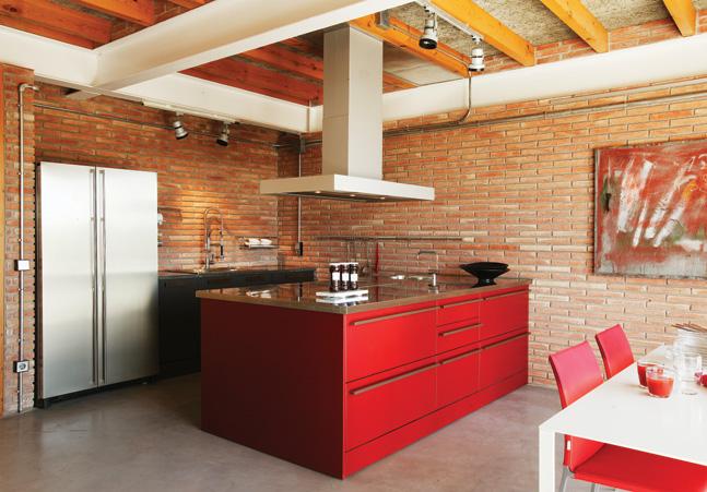
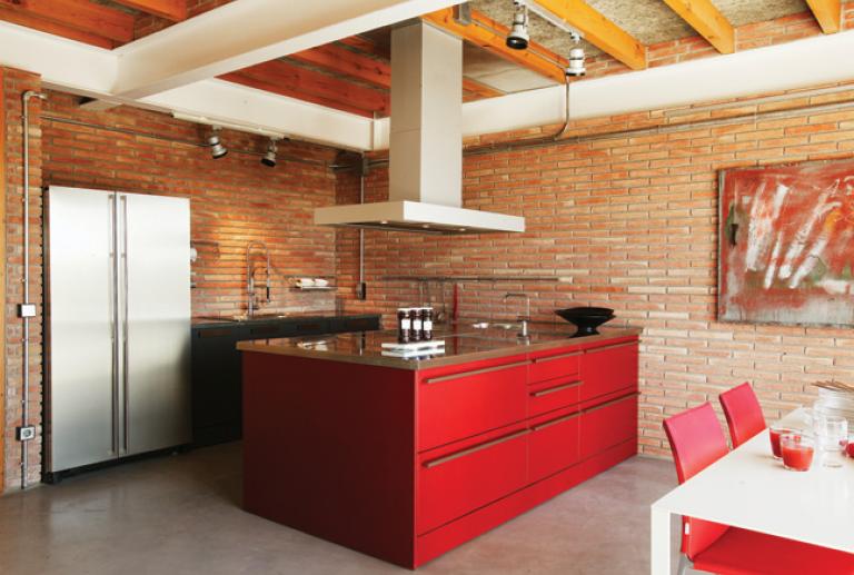
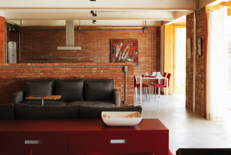
The kitchen, from Dada, has been designed as a huge volume lacquered in red that is located in a side of the gallery that creates the day zone.
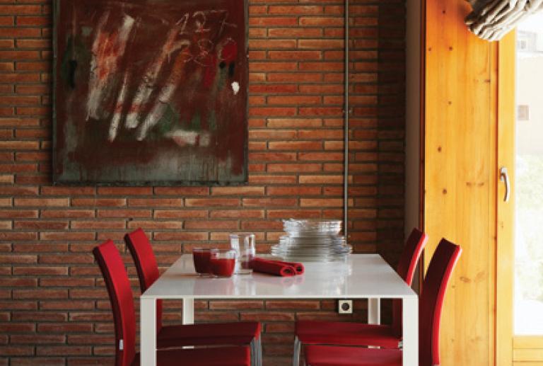
The big island has the cooking area, with a suspended hood by Gaggenau. The water zone and the storage have been places creating a plant in U shape that closes the island, to secure the maximum functionality in the work zone. The fridge of the Amana’s firm is made of stainless steel, double door. The rest of the elements combine the black and the red, which can also be seen in the dining room/office chair’s located in front of the cooking island. The chairs are the model Lia from Zanotta and the table is the design Less from Molteni.
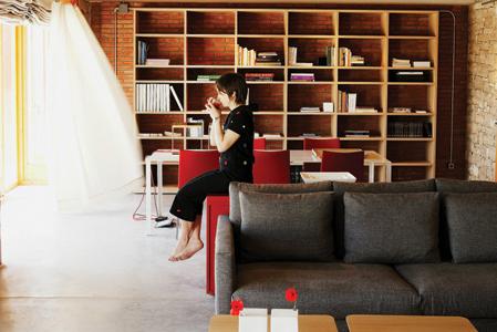
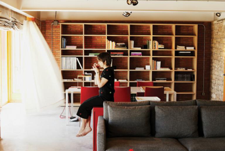
In the ground floor, a huge container, like a loft, collects some functions inside the same space: cooking, resting, eating, sharing, working, reading. This big container is zoned by the distribution of the furniture, which is very geometric, with straight and pure lines, in an organized disposition with respect to the structure.
The shapes and the colors of the furniture play with the structural elements of the dwelling. The white of the joints of the first floor are repeated in the iron lacquered tables and in the two Viabizzuno’s lamps, with a rectangular shape vertically oriented. The oak of the Molteni’s shelve in the studio of the center tables in the living room zone, are a reminder of the stony tones of the wall. In the living room, the sofas Box from Living Divani have been chosen in grey, matching the pavement tone. The rug with red tones from Verner Panton unifies the living room with the other two spaces of the floor, creating the sensation of a unique space. By last, the red from the metallic exterior structure is used in the island of the kitchen, in the cabinet model Sistemi from Cappellini and in the chairs in the dining room and in the studio.


