Stately apartment in Eixample / Barcelona
Modernism: contemporary restoration.
This project of interior design became a noble floor of the Barcelonian Eixample to a modern, functional and comfortable housing, without losing the singularity of the modernist architecture, or the strength of the original decorative elements on the floor.
The interior design project should respect to its maximum all the decorative modernist original elements of the dwelling plus give the house the following zones:
- A big living room, confortable and bright, equipped with a good audio system and a home cinema.
- A big kitchen, well equipped, pleasant to work in and with the possibility to eat in it too. Moreover, it should be accessible from the living room.
- A suite zone for the couple, with a bathroom, walk-in closet and a private library, also equipped to listen to music.
- Children’s room with an independent bathroom
- A youthful room with an independent bathroom
- A studio and a guest room.
It is a typical flat of the Barcelona Ensanche, with a surface of 250 meters, richly ornamented and well conserved. During years, it was the headquarters of the editorial Icaria, so the floor wasn’t used as a home. This facilitated its conservation, since there were neither bathrooms nor modern kitchens, but the original ones.
- The flat is located in a 3rd floor, which make it brighter.
- The height is important (4,2 meters) and the coated of the ceilings are of huge value.
- The original floors are peculiar, since its design does not change from one room to the other; it keeps one unique motive, in this case floral, in the entire house.
- The original carpentry is made of wood and it well conserved
- The electricity and water installations needed to be updated
- There were no heaters
The interior design project of the vilablanch studio started with two axes: the functional necessities that the project should cover to achieve a distribution appropriate to the necessities of the owners and all the derivate of the unique characteristics of the dwelling that should be respected during the reforms (hydraulic floors, cofferdams ceilings, wood carpentry…)
According to the project’s philosophy the studio took a few decisions:
- Conserve to the maximum the original elements.
- The new elements, as well as the reform, should not compete with the original modernist elements of the flat.
- To differentiate to the maximum the new elements from the original ones, in a way that the contemporary furniture or the new elements incorporated by the interior design project did not tend to imitate the modernist ornaments of architecture of the original flat.
- The new installations (electricity, water, acclimatization) should respect the limitations imposed by the items to keep. For that, the installation of under floor heating was discarded, that would have involved raising the original pavement, or the air conditioning by conducts, which would have involved to lower the roofs during the reform and to hide the cofferdams.
- The interior design project should limit the materials to be used in the reform, in a way that were incorporated only noble materials, that would not compete with the modernist elements: basically oak wood, steel and white lacquer.
- The wall and ceiling colors should be white, so, once again, the protagonists were the pavements, doors, cofferdams and stained glass.
“The philosophy of this interior design project could be summarized in a sentence: we had to make a respectful intervention to such an extent that at the end of the reform it could seem that nothing had been done, except to paint in white and place the contemporary furniture”.
Elina Vilá
During the elaboration of the Project, so much time was dedicated to think about the perfect distribution of the floor. The generosity of the space and the complex functional requirements, planned in the project, made this part especially complex.
Night zone
The night zone raised complexity for the existence of an attic. It was decided to divide the stance in two, originally dedicated to the kitchen and two bathrooms, one in a squared shape that would serve as a room and one in shape of L that will serve to the room located in the attic. The access of the stairs to the sink was closed and the old sink, amplified, was turned into a walk in closet. The rest of the zone under the attic was used to harbour the bathroom of the suite zone.
Day zone
In the interior design project some different possibilities were contemplated for the distribution.
Let’s start by analyzing the possibilities of the kitchen’s distribution.
- Stance 1 living room (maybe unifying it to stance 6). Stance 2 dining room. Stance 3 kitchen. The disadvantage of it was that the living room was not important enough and the distribution followed a more conservative criterion with separated living and dining room.
- Turn stances 1, 2 and 3 in the unique stance for the living-dining room, locating the kitchen in the stance number 5. In this variance of the project a huge living-dining room was created, but the kitchen was poor.
- Unify the stances 1 and 2 for the living-dining room, locating the kitchen in the stance number 3 (maybe unifying it to stance number 5). This variance of the project offered the equilibrium between an important living-dining room and a kitchen with important dimensions, with a structure that allowed the communication between the kitchen and the living room.
Finally, the third option was chosen for the day zone. It was decided to close the door between the living room and the stance number 6. The living room is big enough and this stance is used as a studio-guest room. The stance5 was dedicated to an office zone.
Original state
If we analyze the original distribution we see that, dividing from the exterior, we have three stances (1, 2 and 3 in the plane) with its respective balconies to Ausias March street, communicated between the with doors.
The central stance (2) goes to the hall of the dwelling. The other two stances go to small spaces, one (5) with window to the courtyard of apples and the other (6) with a precious window overlooking to the staircase of the estate.
The hall takes us to the left part, a first space (7) and to what was the original kitchen of the dwelling (8).
From the hall or from the kitchen you get to the sink (9) and to a stair that communicates to the old room for the service (10), with a small bathroom.
Later, another door communicates with a stance of low height (11) and after one stance with balcony to the apples courtyard (12).
From the right side, the hall shows a magnificent window that goes to the staircase of the estate, and then there is the door that gives access to the dwelling, a closed and a last stance (13) from which you can access to a gallery (14) that also sees the apple courtyard.
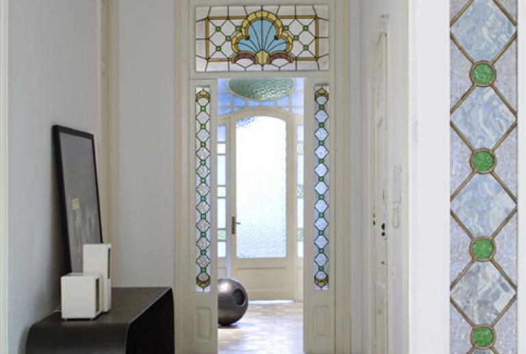
As it is typical in the Ensanche of Barcelona, the entrance is located in the middle and the living in developed in both sides. At the entrance, a hall zone with a table of steel designed by the interior designers of VilaBlanch for the project.
The wide hallway, with magnificent windows, as a central axis of the dwelling. Connects the light of the left, from the outdoor, to the right, the apple courtyard.
To the left side is found the day zone, from which we will start the explanation. To the right and the center of the house, the night zone.
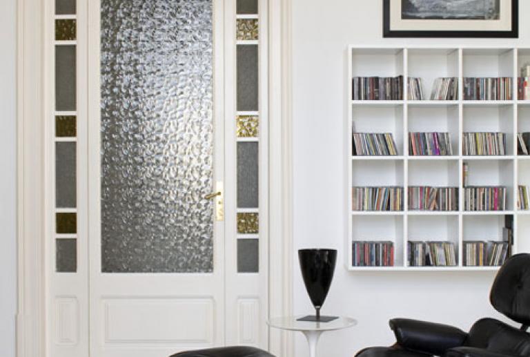
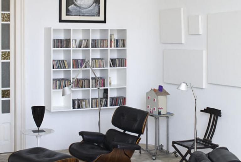
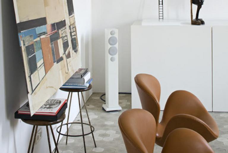
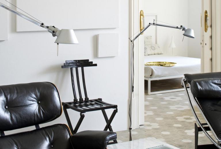
The room next to the bedroom is for the library and the music zone. The shelf was designed with the system 505 of Molteni. Two classic pieces, the armchair Charles Eames, with the ottoman and the Chaise Longue Le Corbusier complete the elegant and classic atmosphere of the room.
The music system is a high-fidelity reference equipment from the brand Belcanto. The UTOPIA speakers, from Focal Jmlab, of Werner Barcelona.
This room gives access to the gallery, with a Saarinen table and Tulip chairs, of Knoll. From the gallery you can enjoy the view over the apple courtyard.
The zone under the loft was used to locate a closed walk-in closet (old laundry area), a vanity area, and bathroom with shower.
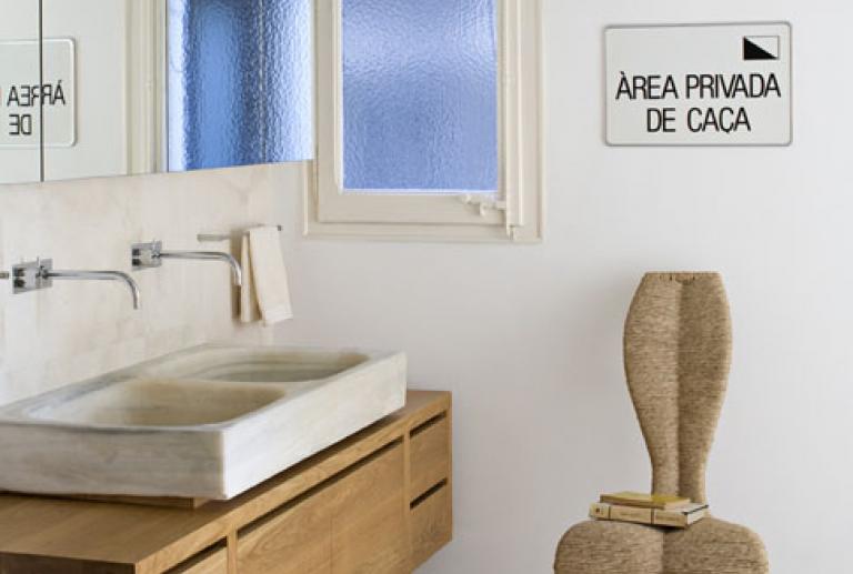
The vanity area, with a hanging piece of furniture, oblong, executed in natural oak, a design by the interior designers of vilablanch for the project. The double stone sink is the original from the kitchen of the house. The faucet is Vola.
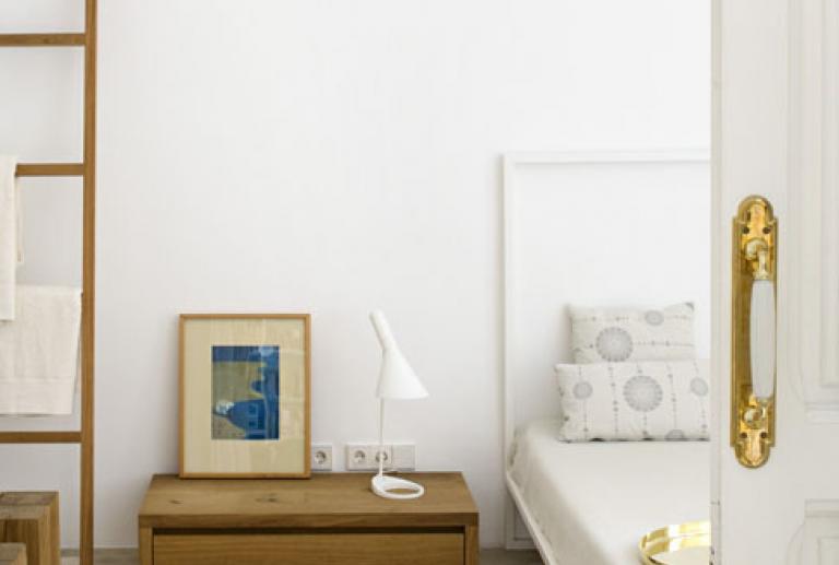
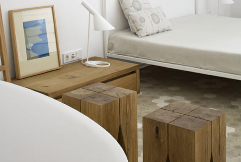
The main room is a wide and luminous space, in which all the elements in white, but the hanger, drawer and stools from e15 in oak.
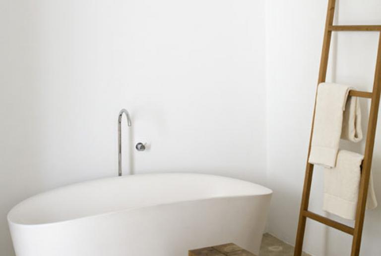
The bathtub is the model Tine from Sanico and works as a white sculpture in the stance. Next to the bathtub, there are stairs and stools in natural oak from e15. The bed is the model Mini from Zanotta.
The illumination in the ceiling is the model Cilindro, from Viabizzuno, and the lecture lamps AJ from Louis Poulsen.
The hallways that lead us to the children’s room, with a piece of furniture design of the interior designers of vilablanch for the Project and a closet. The room gives way to a Children’s bathroom squared shape and with orange ceramics. The bathroom furniture is also customized design.
After, we access to the guests bathroom L shaped, grey stone. These two bathrooms occupy the space of what was originally the kitchen of the house. This is reminded by an iron structure hanging in the wall, part of an antique kitchen equipment that has been left there as a memory.
From that bathroom, and also from the hallway, we access to the stairs that lead us to a youth room of 20 meters squared. The direct access from the room to the bathroom allows the double use, as a guest room and as a private bathroom for that room, if the access from the hallway is closed.
In front of the office zone is found the studio. In the stance is located an iron table, designed by the interior designers of vilablanch too specially to the project. The legs of this table are old wheels recovered from an industrial machine. Over the table is the computer and the printer.
The room has a sofa-bed from Living Divani, what allows using it as a guest’s rooms and studio. The illumination is guaranteed with a double lamp Cilindro, from Viabizzuno.
A stance next to the kitchen is used as a scullery zone. There was located the old pantry of the dwelling, that was moved from the old kitchen, and a line of low furniture from DADA with a laminate countertop.
This furniture contains a wine conservator, a dishwasher and a water zone. One of the shelves next to the door that leads to the hallway has the washer and dryer machines.
This stance allows isolating the clothes zone from the smells that the kitchen produced. Is also used as an iron area.
The illumination is through two lamps TALES, from TTT.
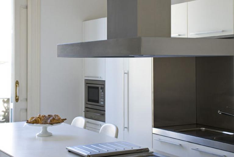
The kitchen is located in the stance next to the dining-living room and the balcony to the street.
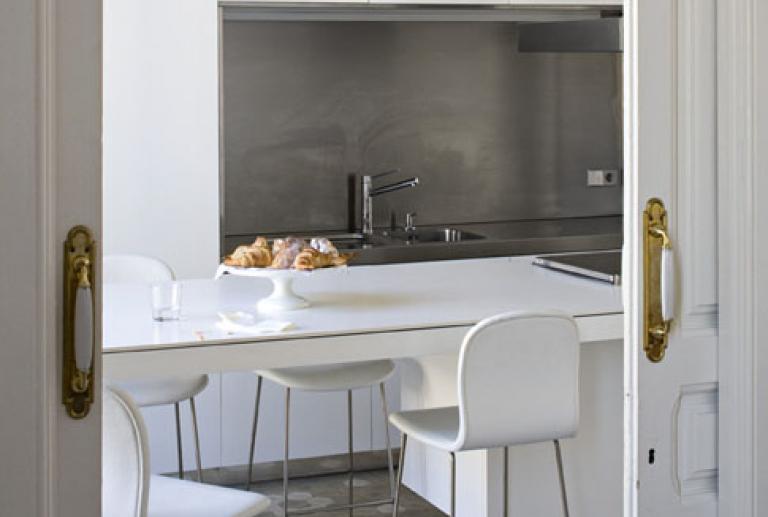
It was designed as a big island of the model Banco, from DADA, that is characterized for its modules of hanging furniture. This island kitchen, only supported by four legs, has an envelope in laminate all thickness with a zone to eat (up to six people) and contains the cocktop: Teppanyaki, Grill and induction by Gaggenau. The oven, of 90 cms, also from Gaggenau, is integrated in the island. The stools are Tate, from Cappellini, in white skin.
Behind the island, is configured a zone of columns in shape of “O”, with a niche in stainless steel as a work and water area.
In the left side is located a column that holds the microwave and the plate-heater from Gaggenau, and the technical column from DADA, a module that can contain all the small home appliances connected and that offers a work area that can be closed and perfectly integrated with the rest of the furniture.
At the right from the steel zone, the fridge from Gaggenau of 90 cms wide in its interior, integrated also in the kitchen furniture from DADA.
All the furniture is lacquered in matt white.
The Gaggenau hood was located with the conduct left in view and painted in white, orientation that facilitates the best the extraction. This placement in cheeky appearance is practically invisible in the space thanks to the color treatment.
The illumination was solved with the Cilindro lamp, from Viabizzuno, and with the fluorescent light over the columns.
The dining-living room is a wide space of 8,3 meters of deep and 5 meters of wide, and with two balconies to the street. In the living room, is conserved a joist as a vestige of a partition that was eliminated. To achieve the continuity of the pavement, the zone of the partition was placed the original pavement removed from another zone of the house.
The joist is used as a support of the home cinema projector, and the projection is made directly over a white wall. A container furniture unit Hi-fi from Cappellini hosts all the audio and video equipment.
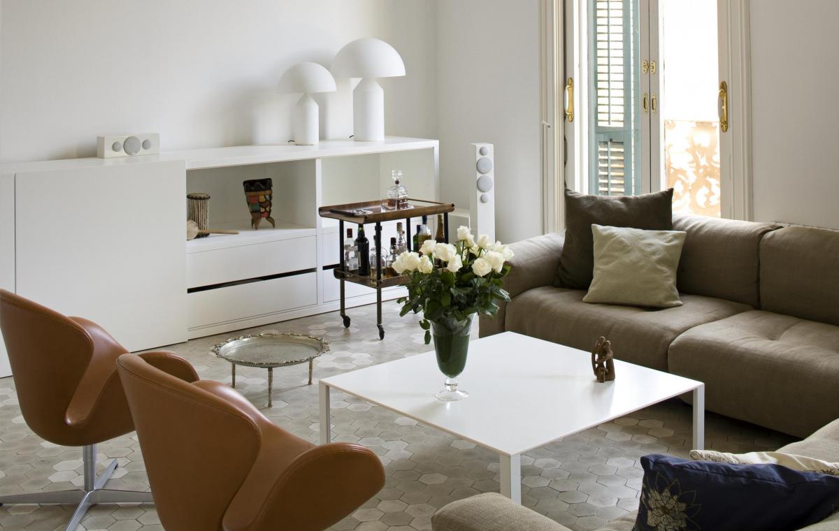
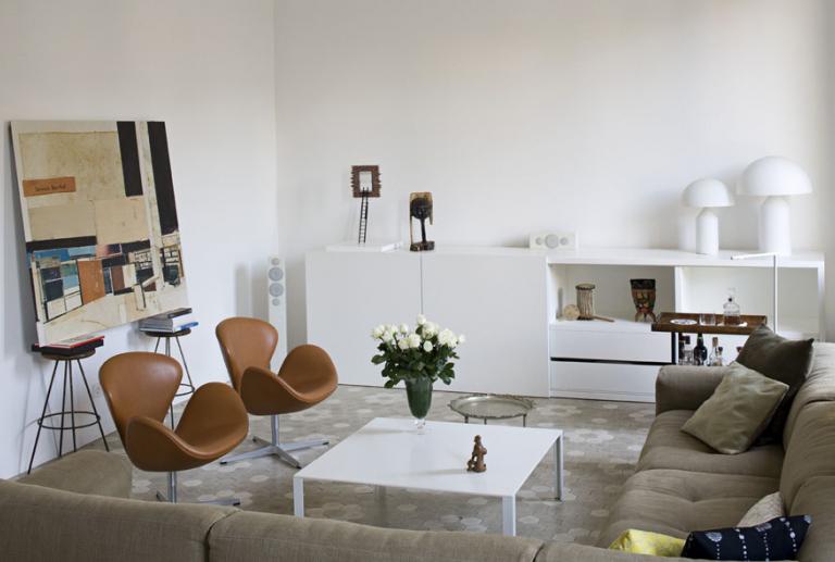
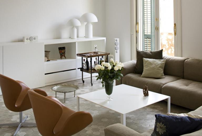
The sofa in shape of L, the Softwall model, designed by Piero Lissoni for Living Divani, creates a comfortable area, closed by the Swan armchairs, from Fritz Hansen. In the middle, the center table Less, from Molteni, in white. Behind the sofa is left a clear area that gives continuity to the hallway.
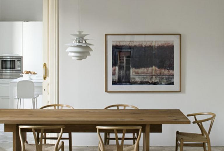
Behind this zone, is located the dining table, from e15, in natural oil oak wood, and the chairs from Carl Hansen. The lamp over the table is Snowball, design of Poul Henningsen from 1950 and produced by Louis Poulsen.
The illumination is completed with two lamps Atollo model from Oluce, which give a very theatric light. The acclimatization is guaranteed with a split with heat pump. The heating is reinforced with electric radiators. The speakers of Monitor Audio, are from Werner.


