Mediapro Offices / Barcelona
An open, dynamic workspace with a powerful personality.
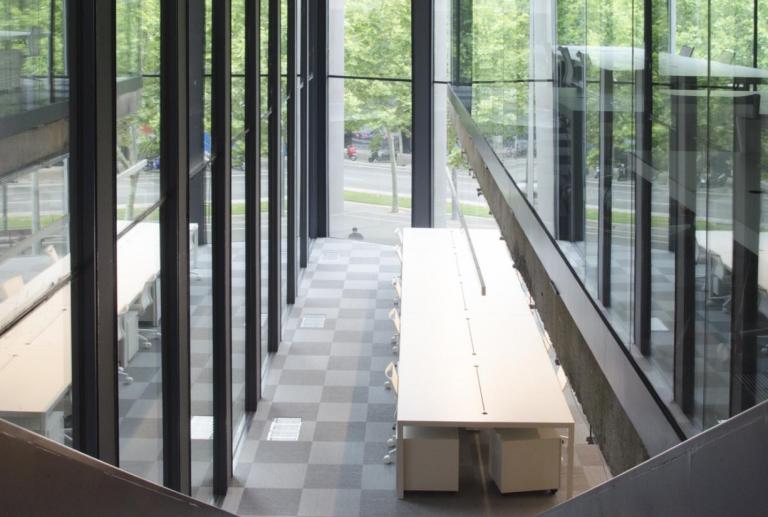
The offices are in the Mediapro headquarters designed by architects Carlos Ferrater, Patrick Genard, and Xavier Marti. The building, located in the 22@ district in Barcelona, features interiors with open-plan floors that allow for enormous flexibility given the absence of pillars. Each floor has plate glass windows that extend along all the outer walls, providing pleasant natural light and excellent views from any point within the building.
vilablanch was commissioned to design functional offices in a two-level, open-plan space located in the Mediapro building in Barcelona. The clients wanted a workspace with powerful personality that avoided enclosing workers in cubicles and broke away from conventional aesthetics. They wanted office spaces that would encourage contact among co-workers while also providing enclosed offices for management.
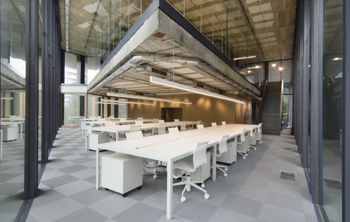
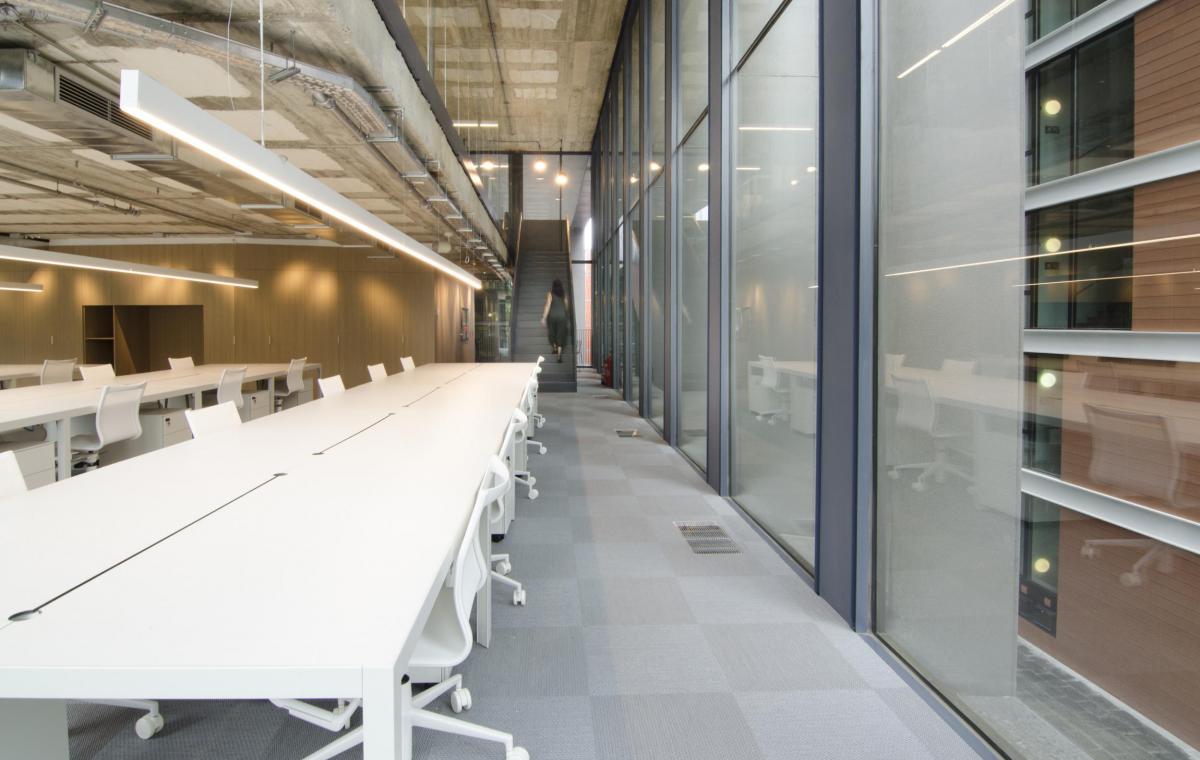
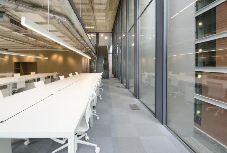
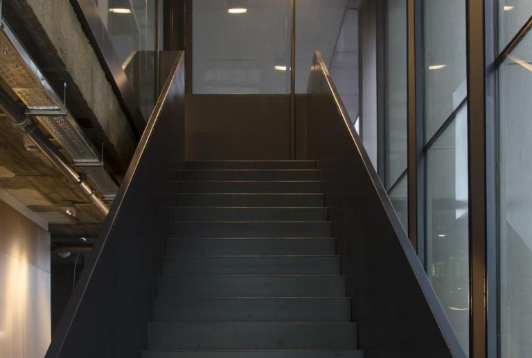
vilablanch studio designed the offices in two dynamic, open-plan floors connected by a large iron staircase.
The interior design project included several efforts:
- On the lower floor, a large, airy, light-filled space was created; it continued on to the second floor by a staircase.
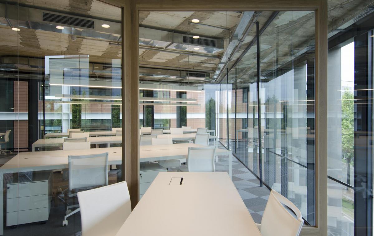
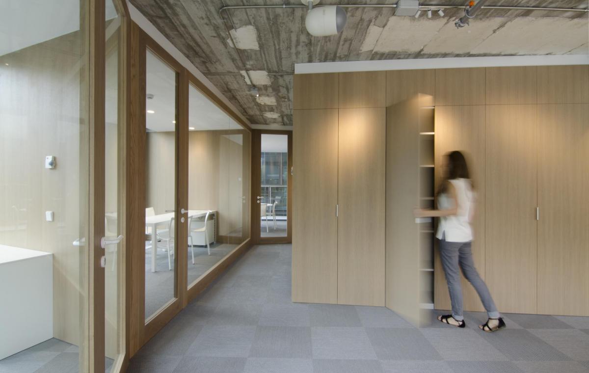
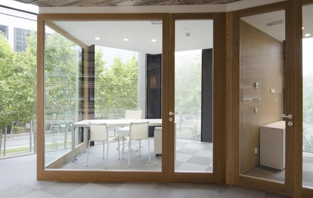
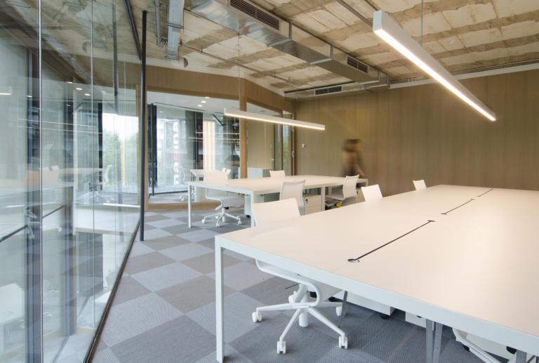
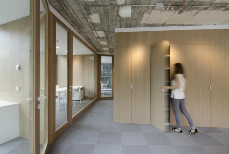
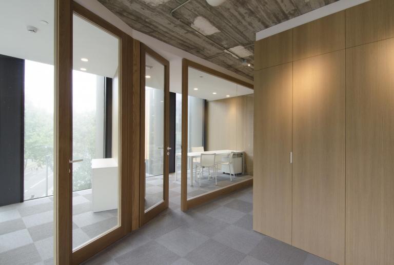
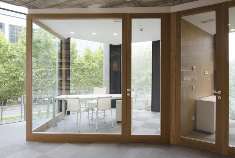
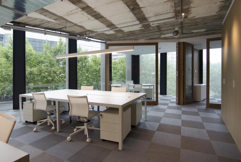
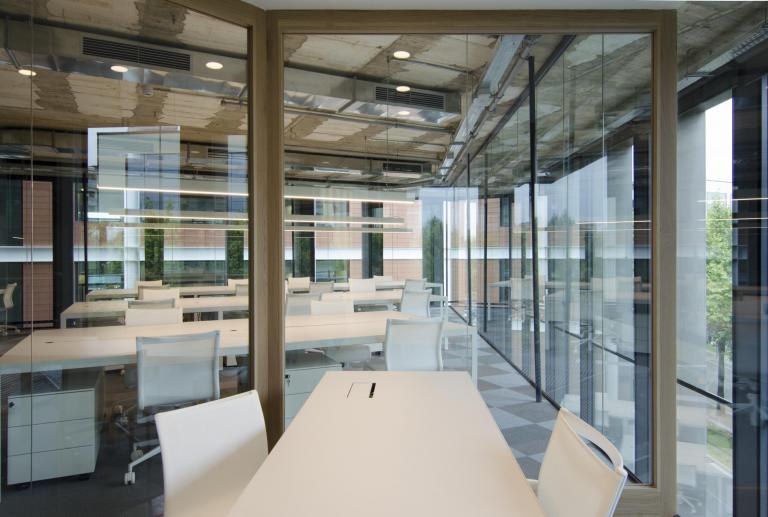
- Only five of the areas were enclosed: the three management offices, the meeting room, and the bathrooms. Except for the bathrooms, all of the other rooms have large glass doors that reinforce the work philosophy of ongoing connectedness.
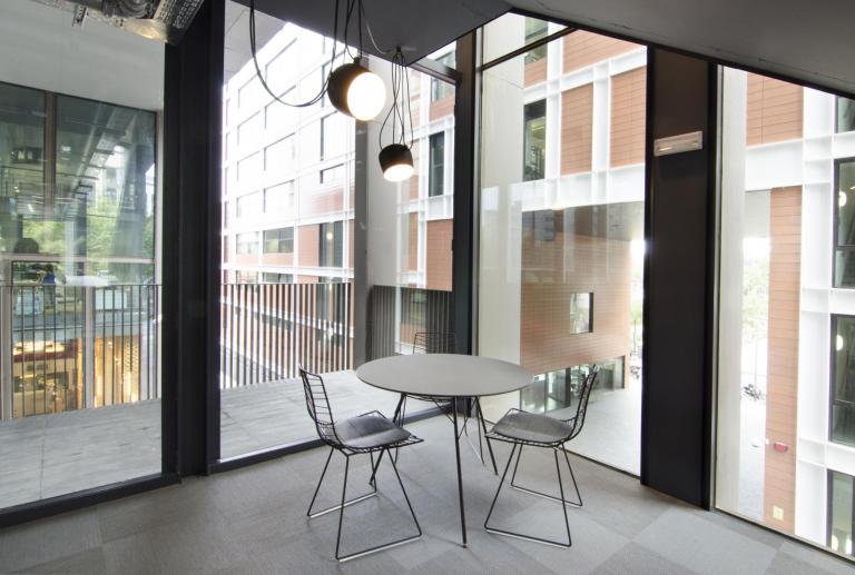
- A coffee and snack area was created on the first floor, making use of the space under the staircase. This cozy, enveloping space invites workers to take a break and engage in conversation.
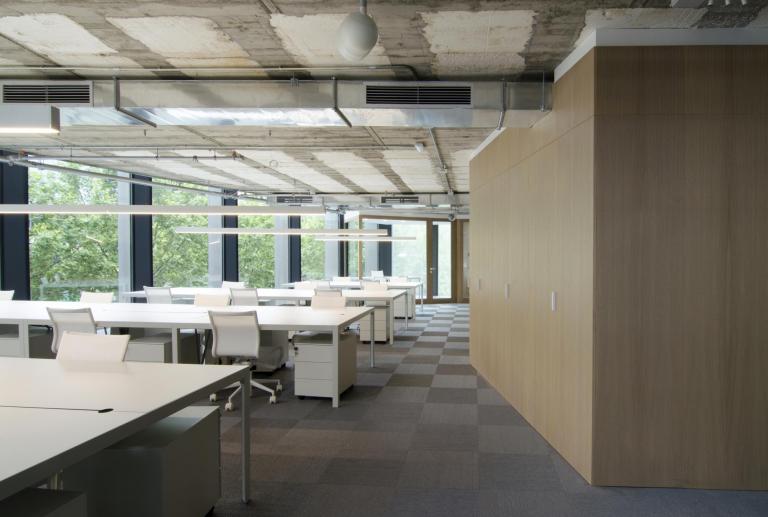
- A large oak wood box was erected in the center of the floor, articulating the entire space. The box contains the bathrooms and all the storage cabinets. These cabinets were designed to store the office equipment, supplies, and assorted items (printers, files, coats, fire extinguishers...) so that the open space remains uncluttered and well organized.
- The vertical elements (partitions and central cabinets) follow a zigzag pattern that livens the space up and breaks the rhythm of the right-angled furniture.
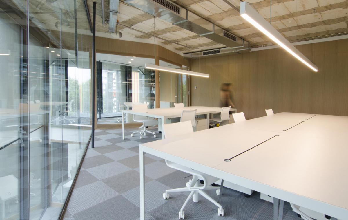
- The only freestanding furniture pieces are the desks, the chairs, and the hanging lamps. White was chosen to strike a contrast with the other colors in the space. The desks are placed in rows in order to create workgroups. This idea is reinforced with the overhead lighting, which follows the same linear, continuous pattern.
- To create a workspace with a distinct personality, the choice was a contemporary look, using fine hardwood (primarily oak) and leaving the building's structural elements exposed (ceilings, windows, utilities, etc.)


