Промышленный лофт в центре Барселоны / Барселона
Реабилитация, реутилизации лофта и проект интерьера в промышленном стиле.
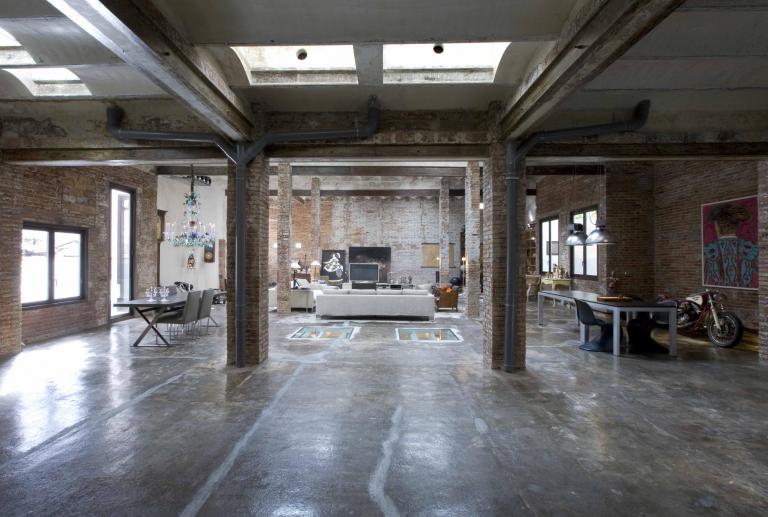
The loft is located in a building, in the Ensanche of Barcelona, from 1930. Occupying the back part of the ground floor, with a surface of 800 meters squared, divided in two floors. A big rectangular floor with windows in both sides and six columns aligned two by two.
It seems that the space was constructed to house the stables of the property. Later on, was occupied by the workshops of the press and even some neighbors remember that the basement of the loft was use as a refuge during the bombing of the civil war.
The loft is located on the ground floor of a building in the center of Barcelona. Benito Escat, from Invest Pedralbes, made the restoration work of the space and the interior designers of the vilablanch studio and Mercè Colomer conceived the space distribution and the furniture.
The order that they received from Benito Escat was to create a studio that was habitable with the minimum budget possible and recycling the maximum of elements, from the structure to the original furniture that the owner had.
The style had to respect the characteristics of an authentic loft: a unique and open space that had a very industrial look.
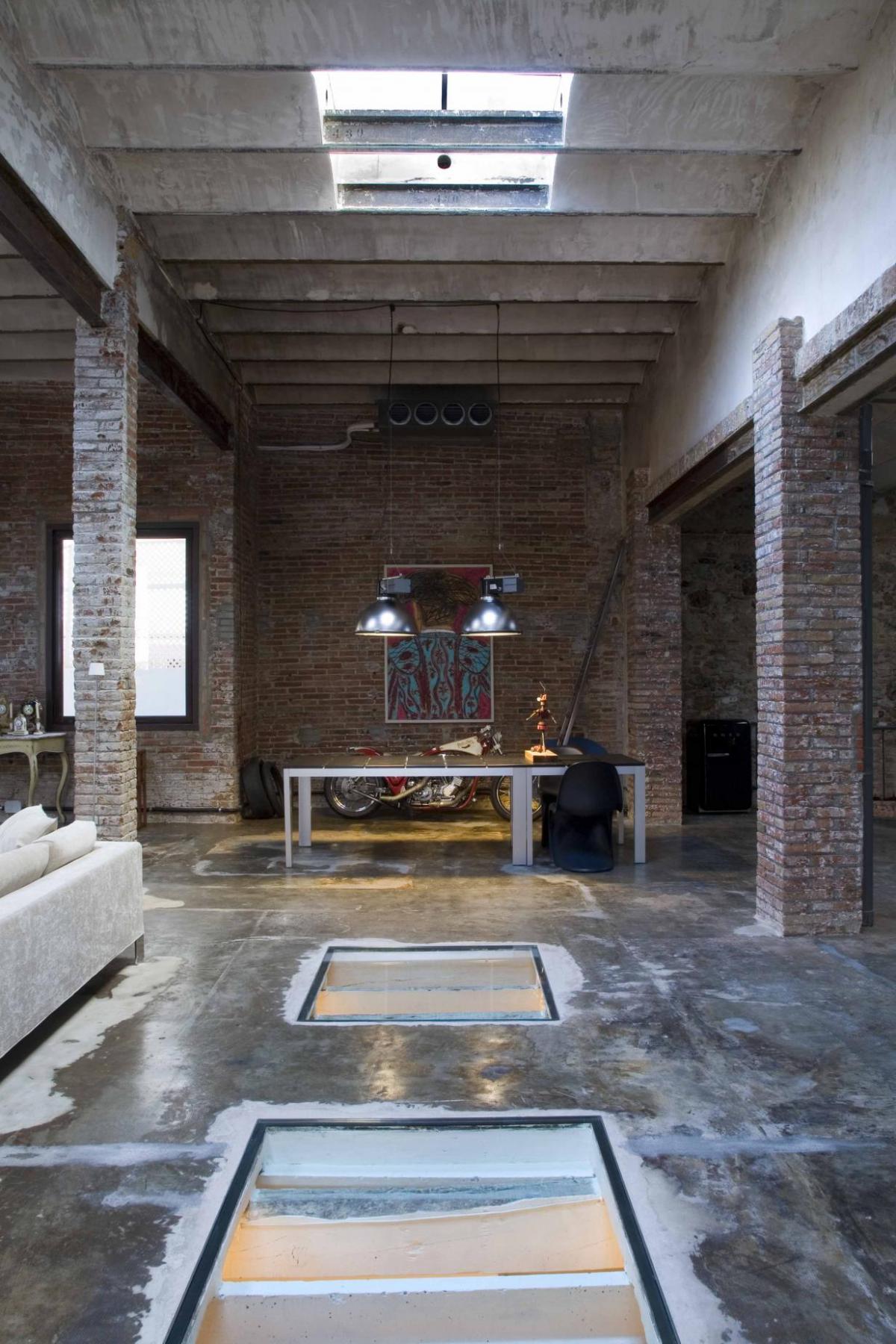
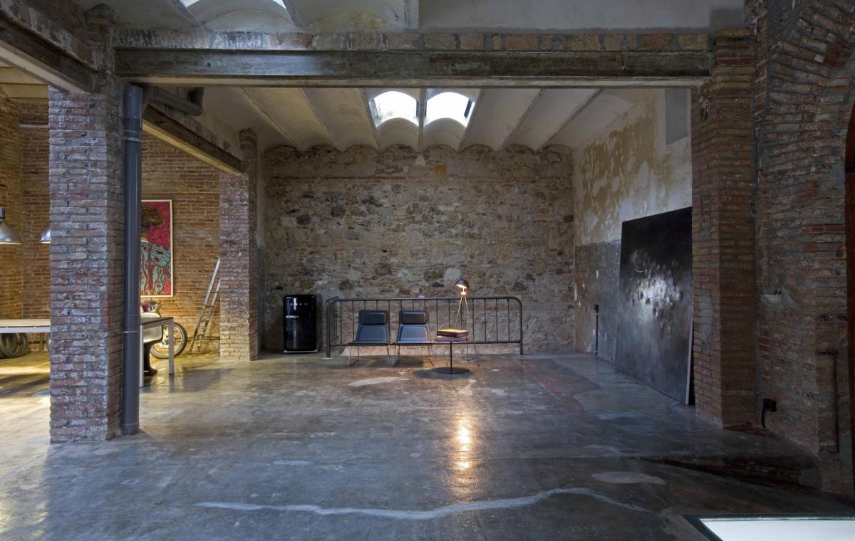
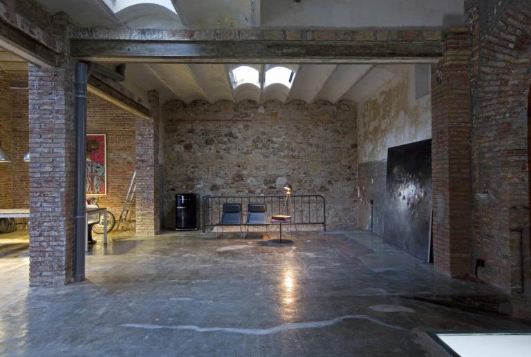
The restoration was basically based on cleaning all the interventions that this space has suffered and to get back the original structure, leaving only the traces and scars of the passage of the years and of the people that had lived there before.
- The walls, ceilings and floors were cleaned, removing the plaster and cement layers. The fake ceilings were removed, that gave way to the original lofts with vaults, and the plasters and beams were eliminated.
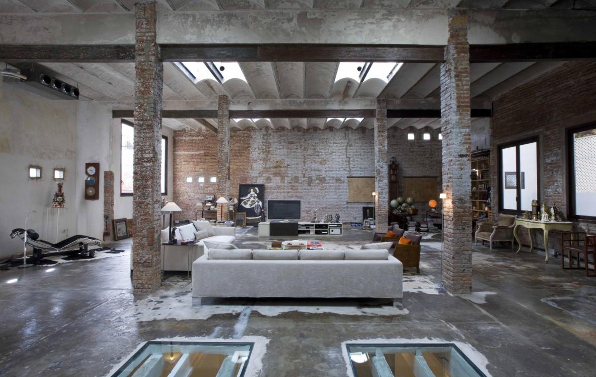
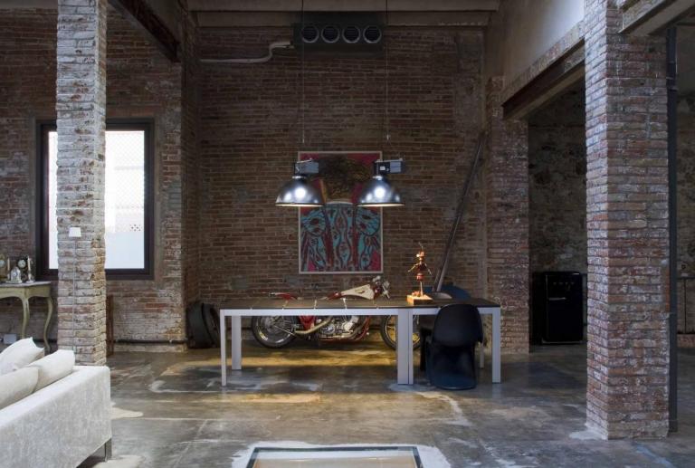
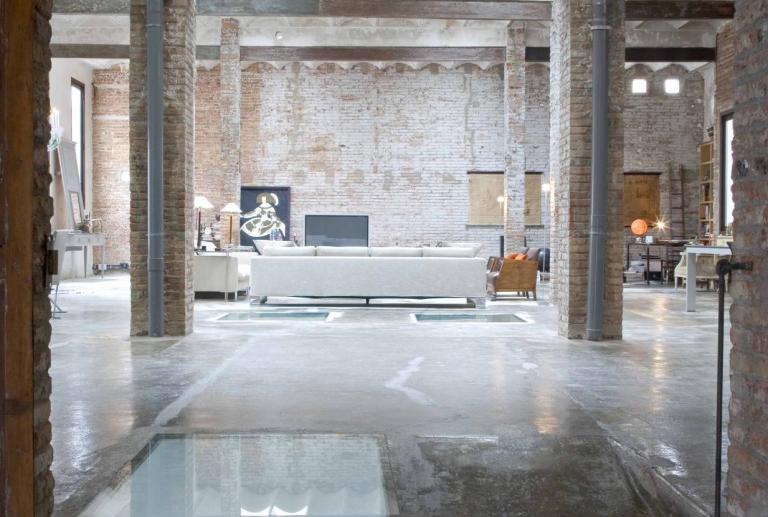
- The floor was left as it was, with a grey cement base and some remains of other paints.
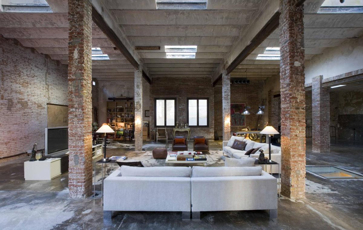
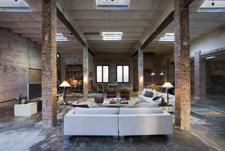
- The brick walls were recovered and were flatten with a latex layer that protects them from humidity and dirt.
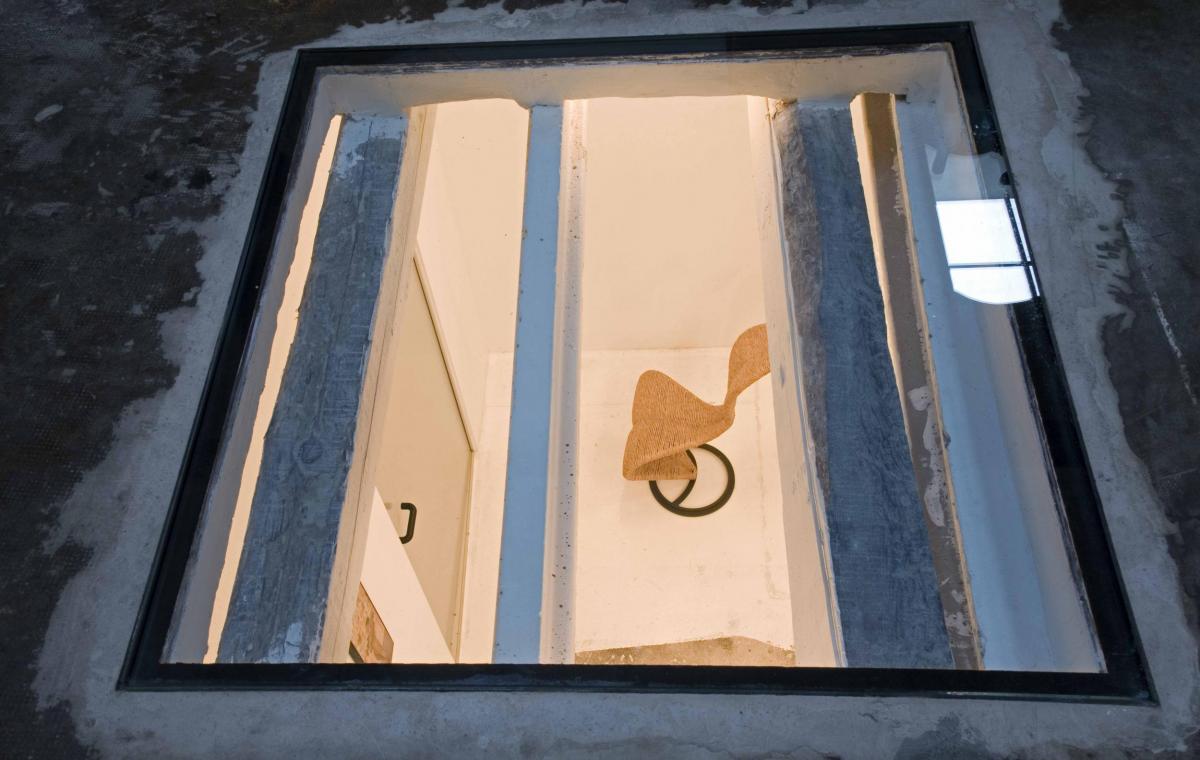
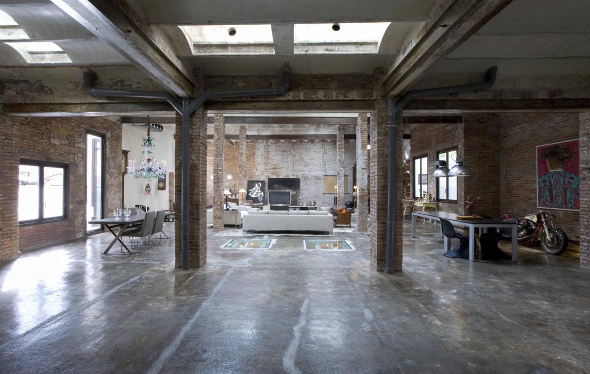
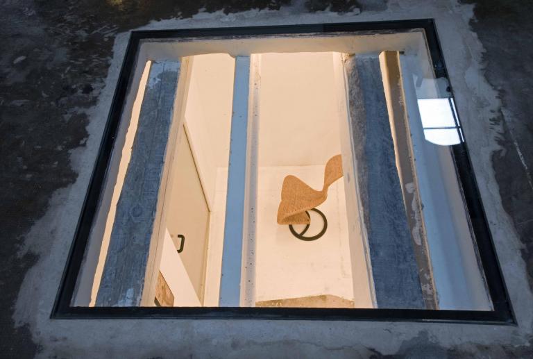
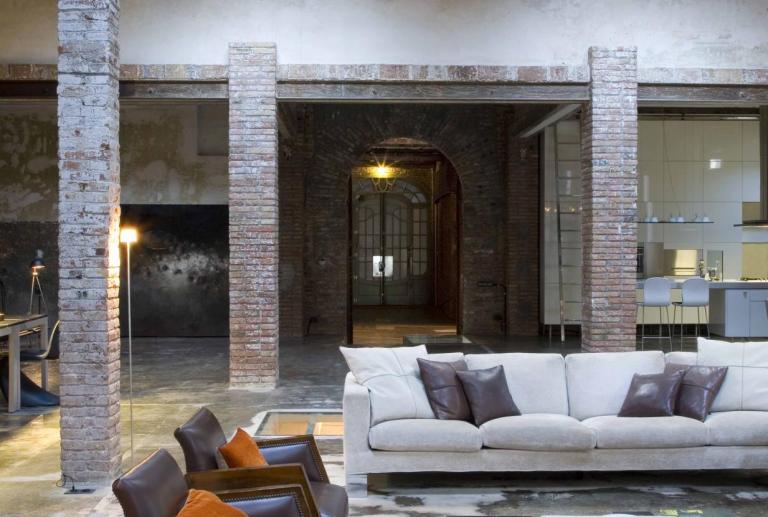
- The six brick columns were left in sight and there were open new crystal skylight on the floor of the first floor to illuminate the basement.
- Using the hole of an old elevator situated in the entrance door, it was placed another crystal skylight with crystal steps too.
- All the light and water installations were left in sight, with huge pipes that cover the ceilings of the entire house.
With the original structure left in view, the first challenge was to make, a place so big, habitable. How to turn a space so diaphone and industrial, functional and at the same time nice and warmth?
The other big determining from the owner was that we should use all the furniture, lighting, complements and art pieces that he already had in the past dwelling. Pieces were not added nor discarded. An authentic recycling project was made for every furniture piece and other existent complements.
The owner had singular pieces and different object collections, which reflected the different periods of his life and some of his inquisitiveness, all of them needed to be in a prominent place. Among others we can find antique watches collection, another of world balls, antique books and a Harley Davidson motorbike (winner of the North American championship in 2007), which is his favorite piece, and that is located in a special place next to the meetings table.
According to the interior designers of vilablanch studio what its seems to be the easiest part, distributing furniture in a big surface, was not.
The common thing to do is to divide into zones with walls but, in this case, if the pieces were located close to the walls everything would have been seen empty. Moreover, the six existing columns divided the place in micro areas and it didn’t help to create a fluid distributions.
After researching and studying which could be the best distribution in this huge space, we saw that the solution was to do a radial distribution, from the center to the outside. To distribute the space from the big central part, the resting area.
The solution was to put the living room in the middle, with two sofas, the armchairs and a TV sideboard, and to distribute, around it, the other living rooms less important, as small attention spots, a small office with the world balls aside, another with the books, a corner with the chaise longue…
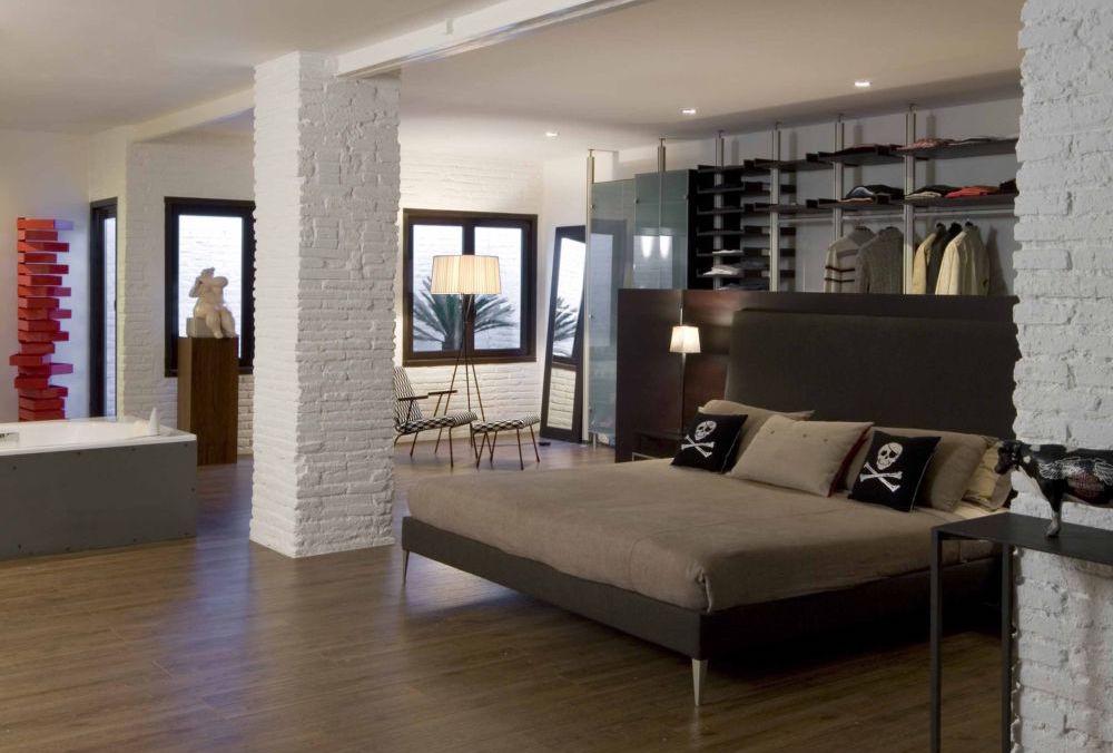
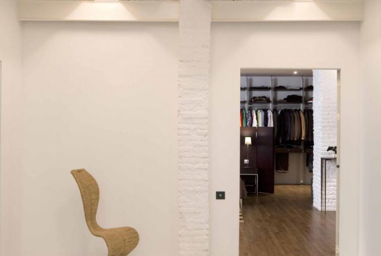
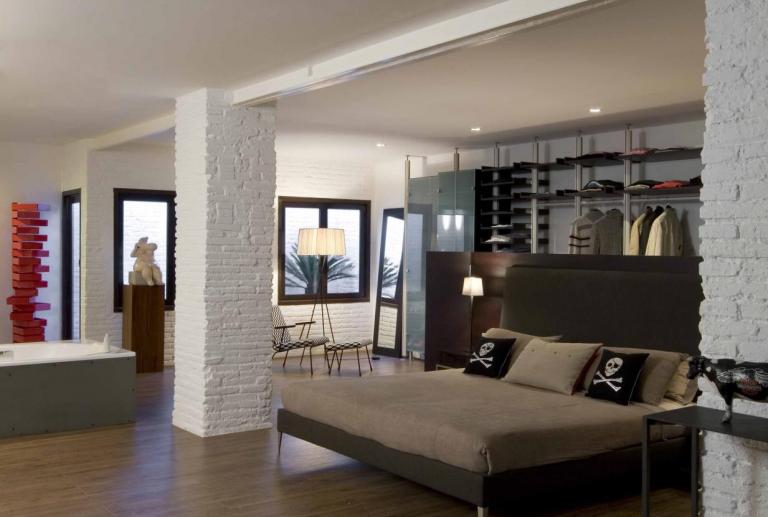
The distribution of the bedroom presented the same problem of the top floor: how to have a cozy bedroom, functional and well organized. The key was to locate the bed in the center, leaving behind the walk in closet of more than 10 linear meters, which covered the entire wall and gave depth and space.
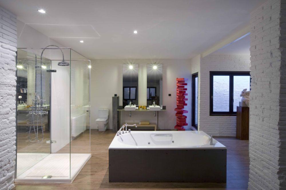
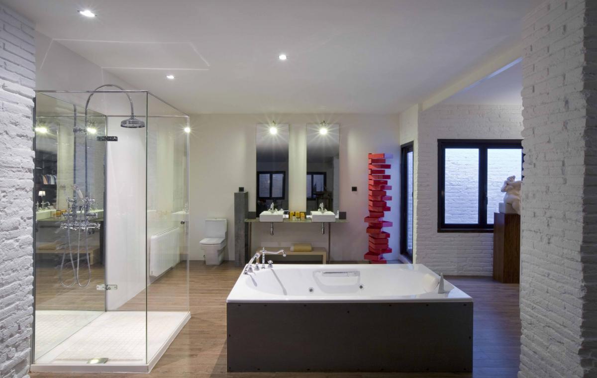
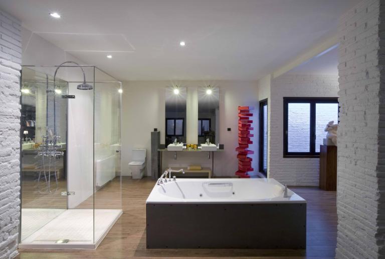
At the left is located the bathing area, with a bathtub, a shower and a sink disposed with the intention to show them as independent pieces, that have appeal by themselves, and not only as a bathroom composition.
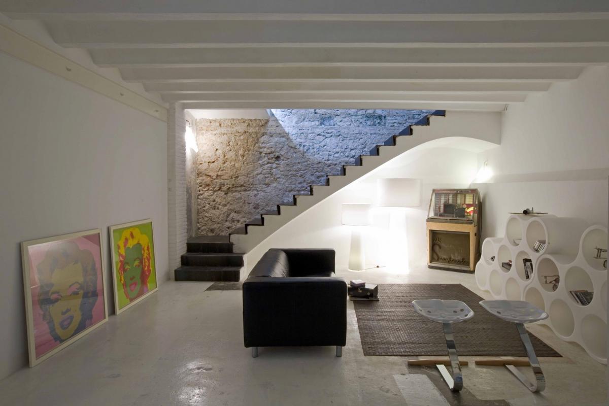
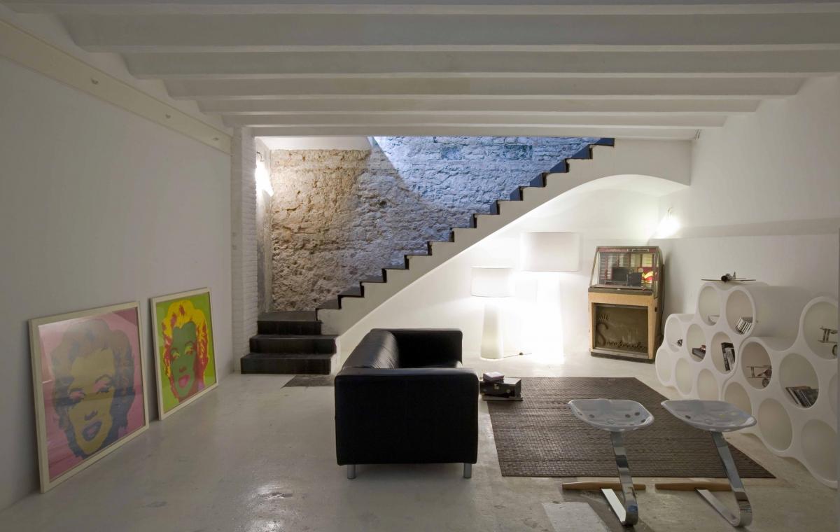
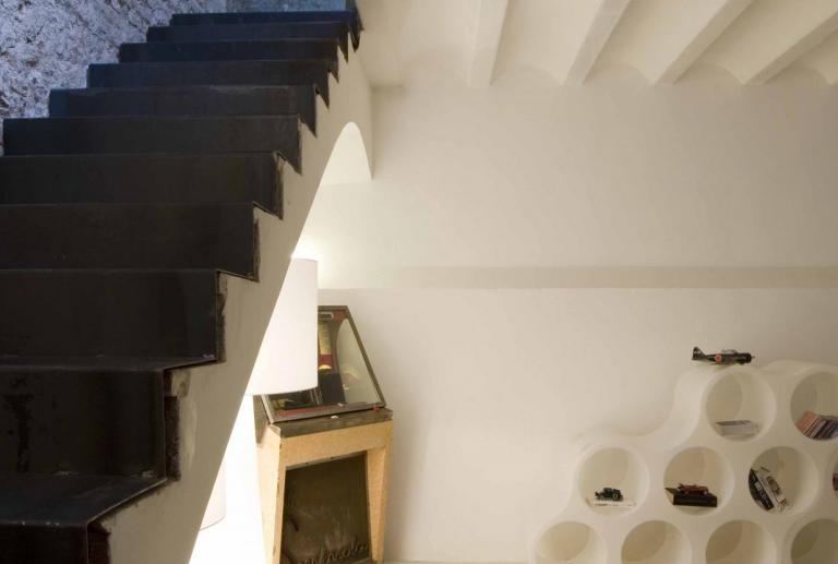
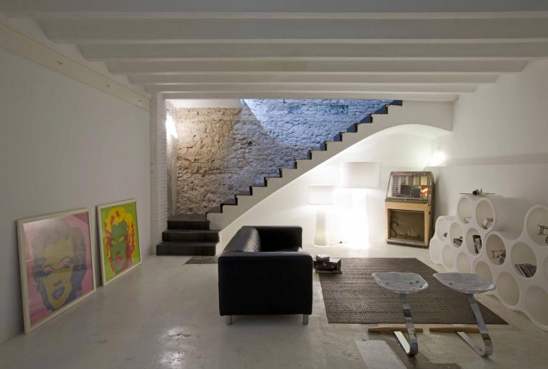
The railing of the stairs that gives access to the second floor is a building fence that was anchored to the original floor. The staircase was also preserved with a folded iron plate, so that from the side you could see the original staircase but with the surface well protected.
On this ground floor is located a more informal and lucid resting area, three bedrooms, one of them being a suite of more than 100 meters squared. It was decided to paint the entire place in white (The floor, ceiling and walls); to give more brightness and some skylights were strategically open to give light to the distributor area of the bedrooms.
The cotton lamps and Cloud shelves are from Cappellini, in Minim. White Medrazzo stools from Zanotta. The sofa is from the old housing and the ancient disk machine acquired in Almodena.
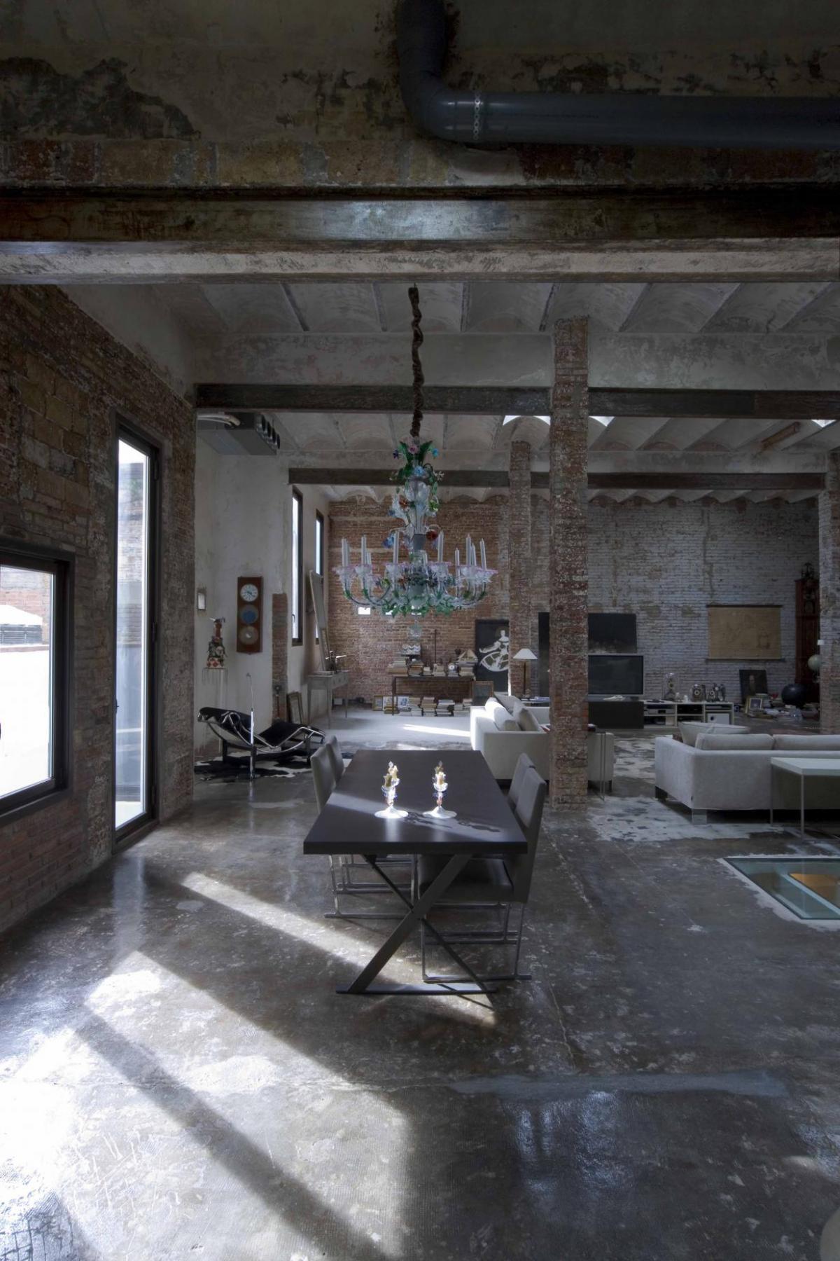
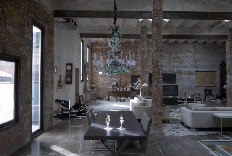
In front of the kitchen and enjoying the natural light, is located the dining room table presided by an ancient lamp of colored crystals. The table of the dining room comes from the old house and the crystal lamp was acquired in an antiquarian in Sant Cugat.
On the other side, is located another dining table from the terrace of the old house and that has been conceived as a multifunctional space to celebrate work meetings.
In this place, is placed the favorite piece of the owner: a Herley Davidson of collector. The table is from Gandía Blasco and the black Panton chairs are from VITRA, in Minim. The lamps proceed from an old factory. The bullfighter paint is from Ignacio Lecum.

Following the recycling line, the chosen materials were as cheap as possible. A lot of industrial elements were used: the cement floor was left as it was, the doors of the ground floor that have industrial look and other pieces were recovered from factories and demolitions.
The Low Pad black leather armchairs are from Cappellini and the lamp is from Minim. The painting is from Manolo Valdés.

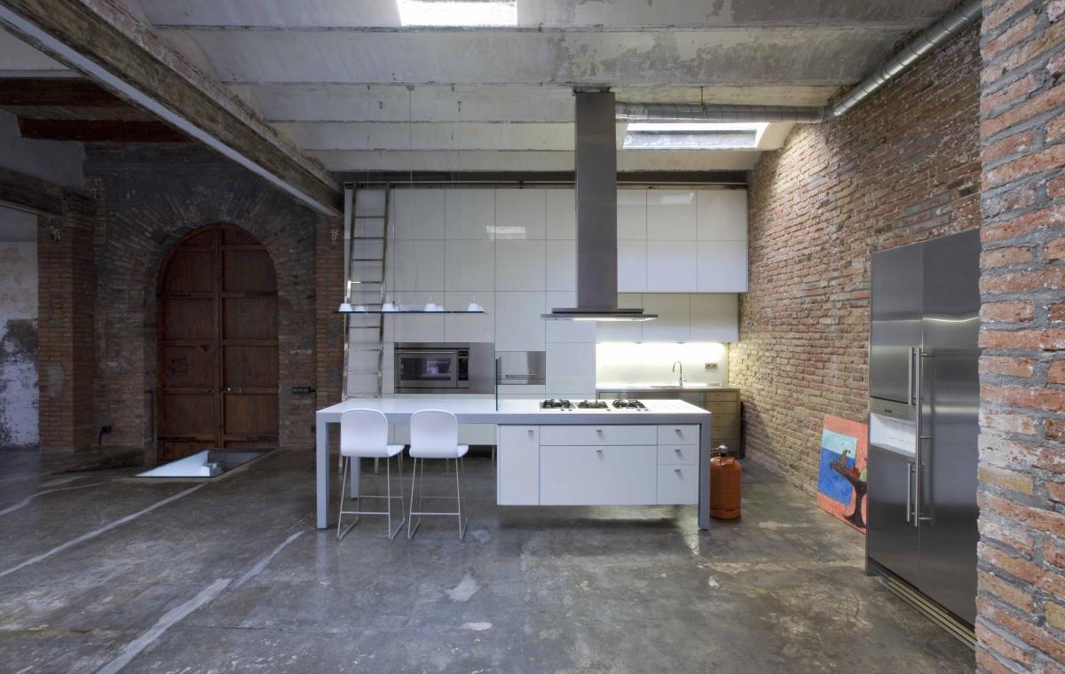
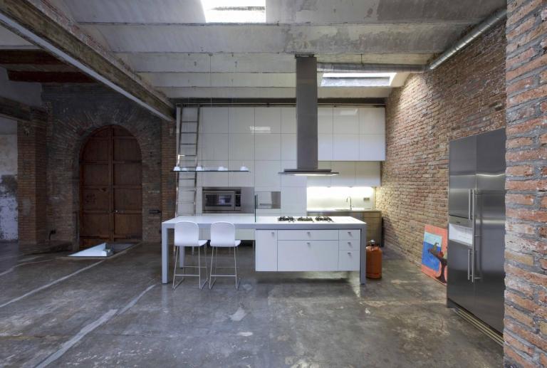
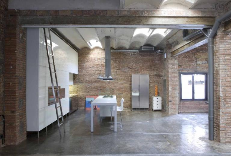
The kitchen is a good example of recycling and space adaptation too. The furniture is from the first original dwelling of the owner and went from being assembled as a closed kitchen to a new approach and use of a completely open kitchen exposed to the whole floor. The frontal wall has more than 40 doors, 60 x 60 cm, that draw a prefect puzzle of rectangular pieces over more than 5 linear meters of wall.
The furniture is from DADA, the Banco Island model and the columos Nuvola, in white lacquered color. In the island, the white leather Tate stools are from Cappellini.
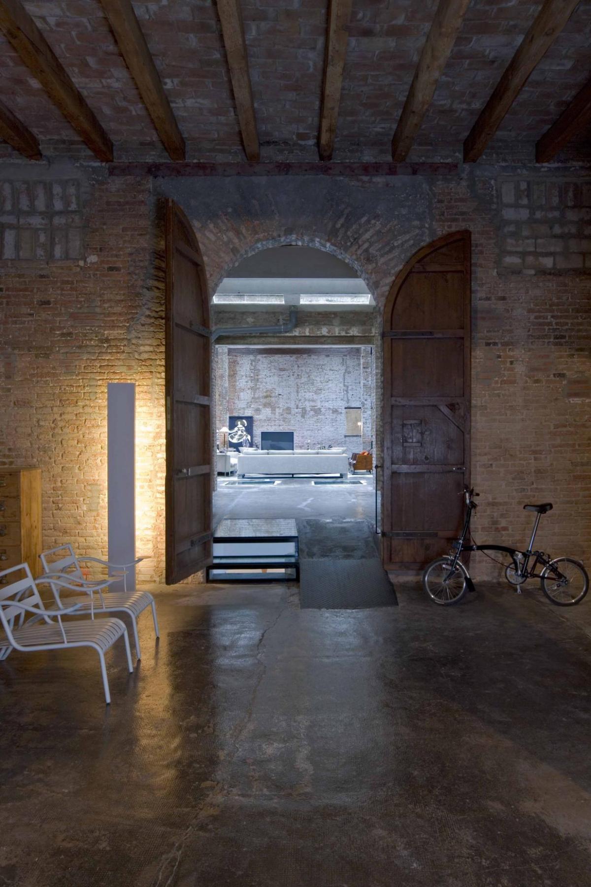
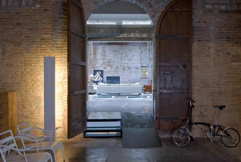
From the ramp in the central entrance, was disposed the big open kitchen and at the right the free access zone to the interior floor.
The door is ancient and it was adapted to the arcade that formed the entrance to the dwelling. The white lamp Notte from Viabizzuno and the white Thinking Man’s Chair from Cappellini, acquired in Minim.

The sofas, the central table and the module where the TV is located come from the old house. The deco armchairs are pieces from the antiquarian, as the console and the auxiliary table of both sides. At the back, the paint is from Miguel Macaya.
The Chaise longue is an original Eames.


