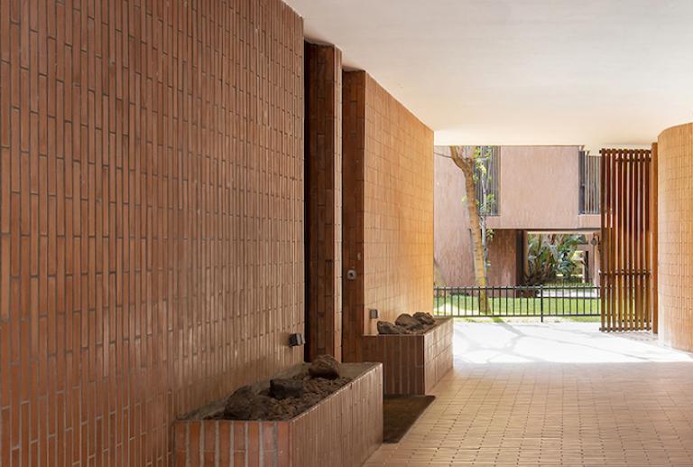
Inhabiting a Coderch / Barcelona
Integral reform of a house in the emblematic Banco Urquijo building in Barcelona, work of the master José Antonio Coderch, which recovers the original essence of each space with a contemporary language.
Winning project of the ASCER INTERIOR DESIGN AWARD 2021
In 1967 José Antonio Coderch designed - on behalf of Banco Urquijo - a group of houses on a plot of land located between Raset, Modolell, Vico and Freixa streets. Construction was completed in 1973.
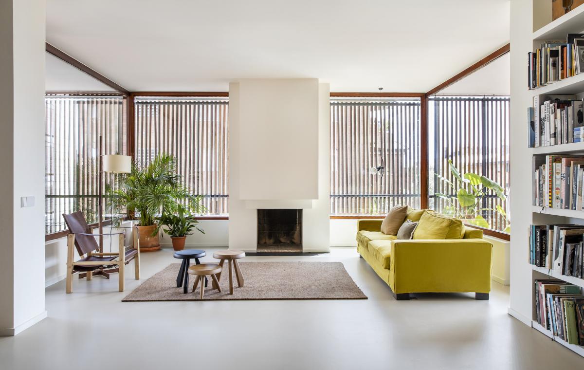
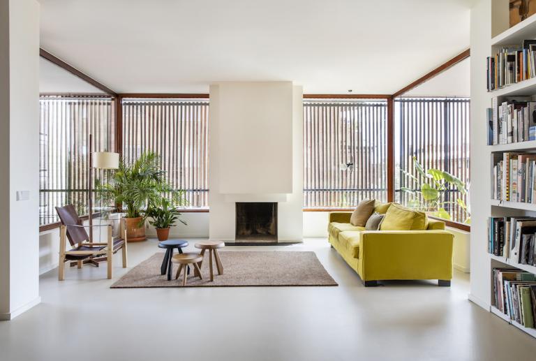
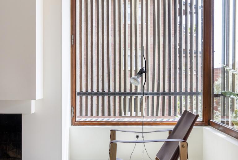
The set consisted of six exempt blocks with very characteristic elements: large planters on the ground floor, facades covered with ceramic tiles arranged vertically, corner windows and enclosures of vertical wooden slats to control the entry of light and prevent visuals direct between homes. Thanks to the shrinkage of the plants, it is possible to achieve great quality light and that it always comes from outside.
The vilablanch studio was commissioned to reform a house located in the emblematic Banco Urquijo building, which had a highly ornate aesthetic, closer to a flat in the Eixample than to a work by Coderch. The clients wanted to transform it into a contemporary home for a family with children, under a very clear premise: to recover the original essence of the Coderch project.
Regarding distribution, the reform had to meet two key requirements: have a day area with highly connected spaces that could be easily “disconnected”, and have 4 bedrooms and 3 bathrooms in the night area.
To remain faithful to Coderch's project, the first step was to look for the original plans in the Historical Archive of the city. The final distribution of the house arises after studying and understanding what the building was like and the original layout of the plant. According to the original project, the standard plan contained two houses of 205 m2 per landing, symmetrical. Inside, the hall articulated three differentiated areas: a day area occupying the central strip, a night area with several bedrooms and an area for domestic service.
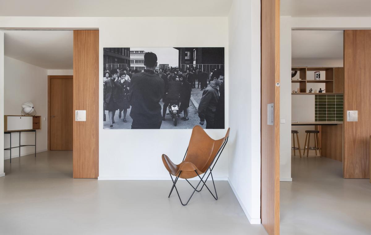
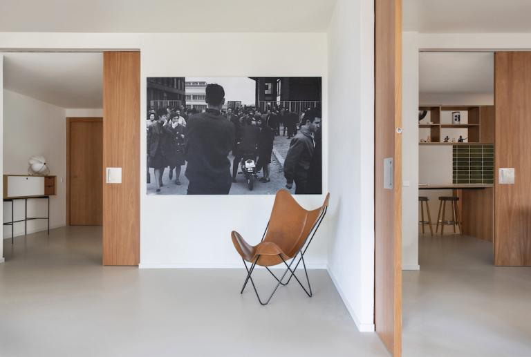
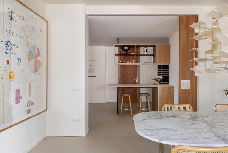
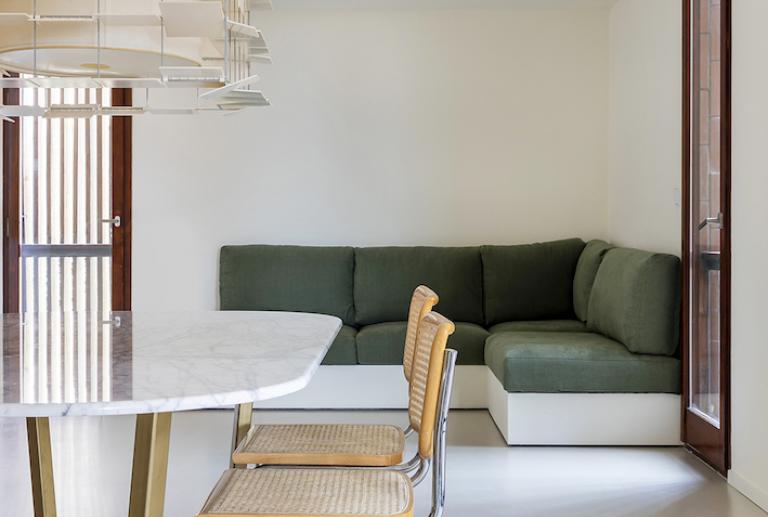
The reform preserves the original distribution in the day area, very highlighted by the terraces and façade openings, but creates a great visual and spatial connection of the three areas - living room, dining room and kitchen - through three sliding doors. A practical resource that allows you to keep the rooms fully connected or have more privacy, as desired. The fireplace and integrated bookcase that appeared in the original plans are recovered, and a custom bench is incorporated, also a very Coderchian element.
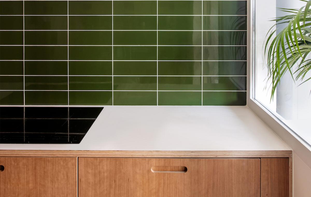
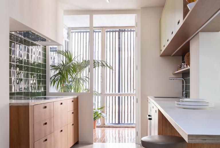
The kitchen, both in layout and in aesthetics, evokes the original one and maintains its gallery with natural light. The rooms - all connected to the façade - seek a distribution that allows to take full advantage of the exterior light, one of Coderch's main concerns. The interior cores, without light, are used for the bathrooms.
A very neutral and clean architectural box - that highlights the original Coderch woodwork - is created. Calm tones are chosen seeking to warm up the spaces and enhance the play of light and shadow so characteristic of the architect.
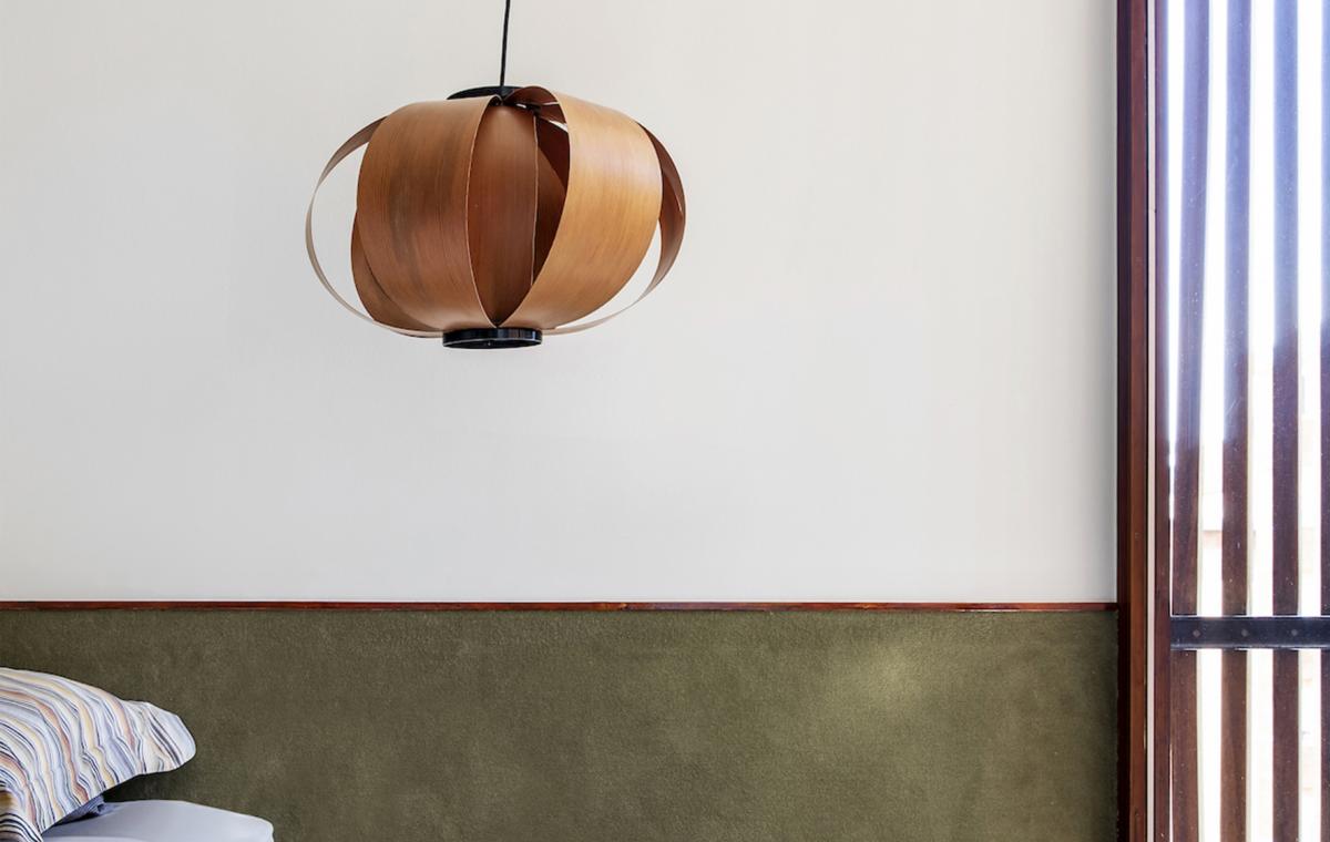
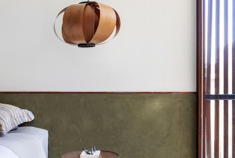
Underfloor heating with continuous flooring is installed throughout the floor, except in the double room where another Coderchian resource is incorporated: use of carpet that goes towards the wall, acting as a headboard for the bed.
Most of the original interior carpentry (facade windows, entrance doors and corridor cabinets) is restored. Wherever the carpentry was in poor condition or did not exist, new cedar wood doors are incorporated, seeking a finish and tone faithful to the original wood.
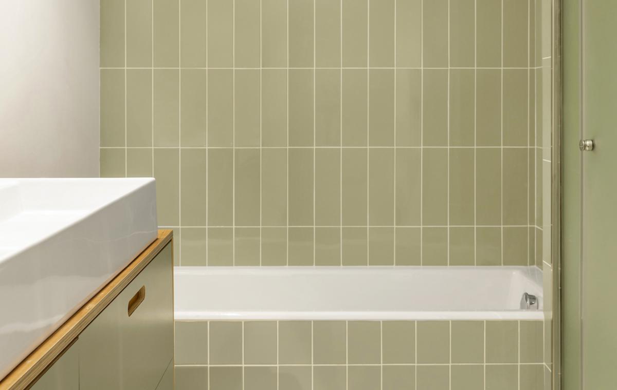
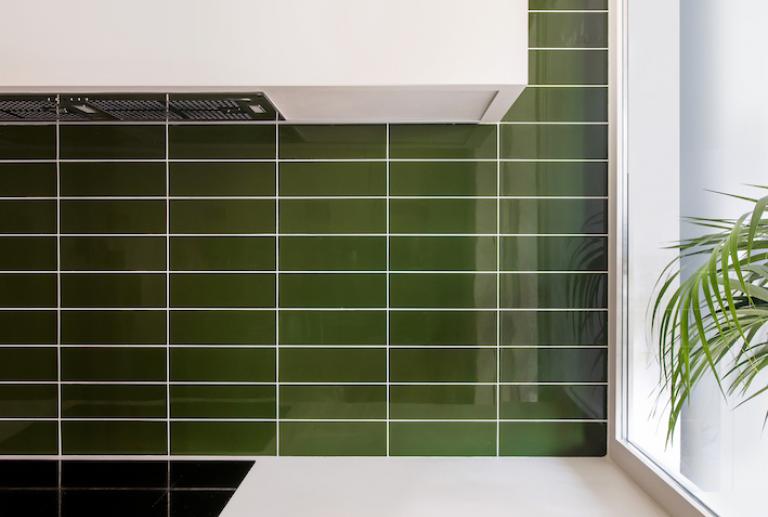
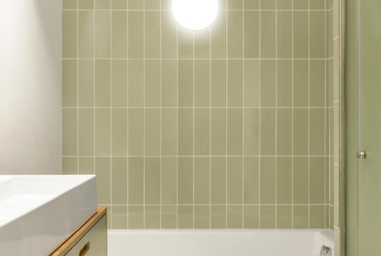
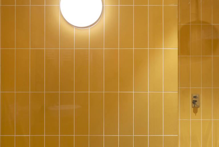
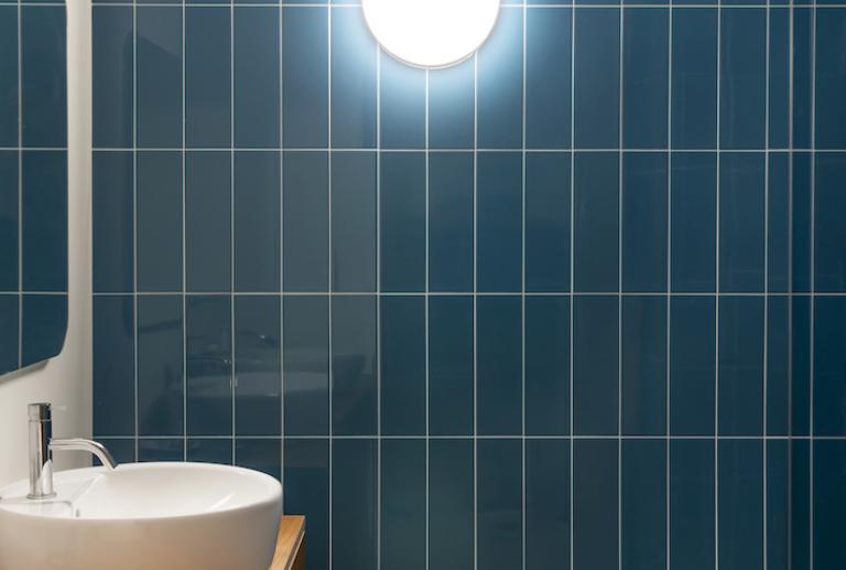
Customers wanted to add some color notes to the home. It is introduced in bathrooms and kitchen, through the ceramic tiles. Pieces - whose format recalls the pressed ceramic tiles on the façade - are deliberately chosen. Rectangular pieces in four different shades: a more sober one for the kitchen, a quieter one for the suite bathroom and two more cheerful ones for the children's bathrooms.


