Renovation of a flat in the emblematic building La Costa / Barcelona
The Vilablanch studio reforms a rationalist apartment from the 70s in Barcelona - constructed by MBM (Martorell, Bohigas, Mackay) - and adapts it to the needs of the 21st century.
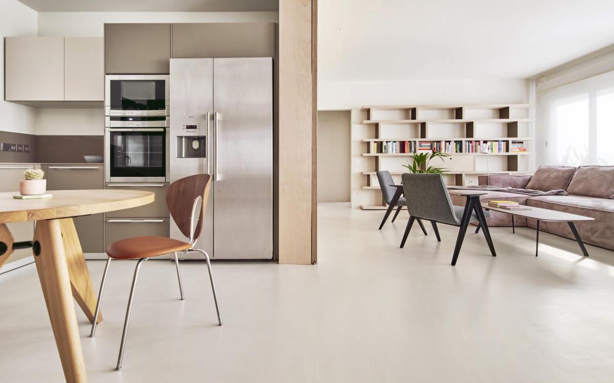
In a prominent building in Barcelona - built by MBM (Martorell, Bohigas, Mackay) between 1974 and 1977 - the interior of a house has been renovated to adapt it to current uses. With a contemporary language, the interior architecture project - carried out by the vilablanch studio - allows the spaces of this house, so representative of rationalist architecture, to be given new uses.
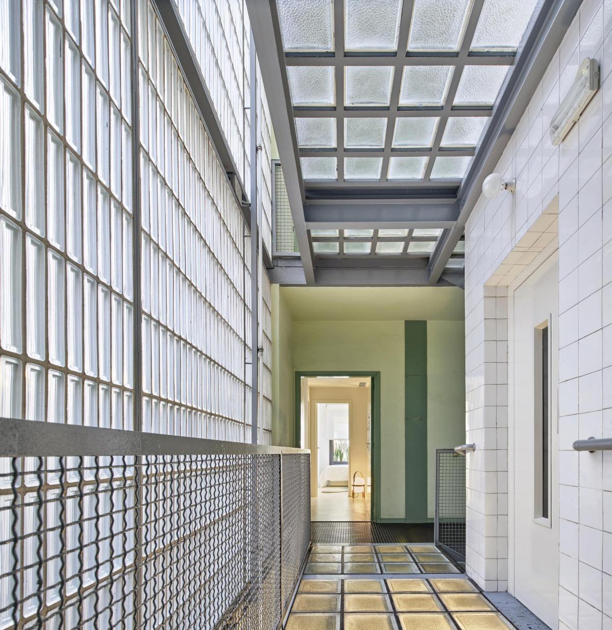
The building, considered one of the most modern in the city back in the 70s, is located on La Costa street (Barcelona), in the Sarrià-Sant Gervasi district, next to the Putxet Park.
Built under the parameters of rationalist architecture and in a period when architecture was open to new ideas, this work by architects Oriol Bohigas, Josep Maria Martorell and David Mckay, became an icon of modernity. Photographer Francesc Catalá-Roca shot it as the epitome of modern life.
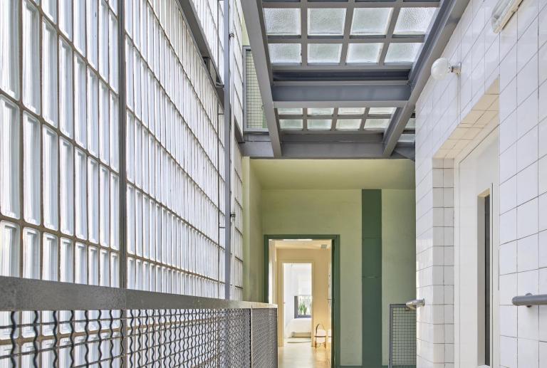
It is a modern building for its time, built with industrial, honest and functional materials: natural anodized aluminum windows, glossy white ceramic in the hall of the building, pirelli rubber flooring in the common areas, paving on the landings and on the exterior walls that make up the volume of the staircase and lighting through vertical fluorescent lamps strategically placed behind the upright structure of the staircase, among others.
The houses in the building are modern in their conception regarding the use of materials and light - in this sense, the large 170 x 170 cm windows on the façade stand out, providing cross ventilation and plenty of natural light. Its interior perfectly reflects the way of life of the 70s in terms of functionality.
The plant originally had a configuration adapted to a way of life that today has completely changed. The distribution of the house clearly separated the “to be seen” area (consisting of the living room, terrace, bedrooms and two bathrooms) from the “service” area (consisting of the kitchen, the laundry room and the utility room or iron ). The kitchen was closed, small and not visible from the living room of the house. It was registered in the service area, separated from the rest of the flat, and had three entrances, with the consequent loss of space caused by the doors.
The Vilablanch studio was commissioned to update a 105 m2 apartment located on La Costa street in Barcelona, for a hypothetical family of three children. The aim was to maintain the essence of this work so representative of the Barcelona architecture of the 70s, adapting it to the needs of functionality, distribution and comfort of today's life, with a contemporary aesthetic and a uniformity in the use of materials.
Regarding the distribution of space, the reform had to meet three key requirements: give more prominence to the kitchen, create a room for each child and increase the number of bathrooms to enjoy more privacy.
How to update a building so emblematic of the 70's architecture adapting it to the needs of the 21st century?
With a redistribution of the floor plan according to the new needs of the users (in this regard, the reform is respectful of the original essence of the house: betting on functionality), and the application of materials and innovative technical solutions that allow uniformity to the project, keeping its original essence.
Two key concepts of the interior architecture project: Connection and Uniformity
The interior architecture project carried out by Estudio Vilablanch followed a very clear strategy: connecting spaces and unifying materials, seeking to create almost a single space or diverse spaces with a single treatment.
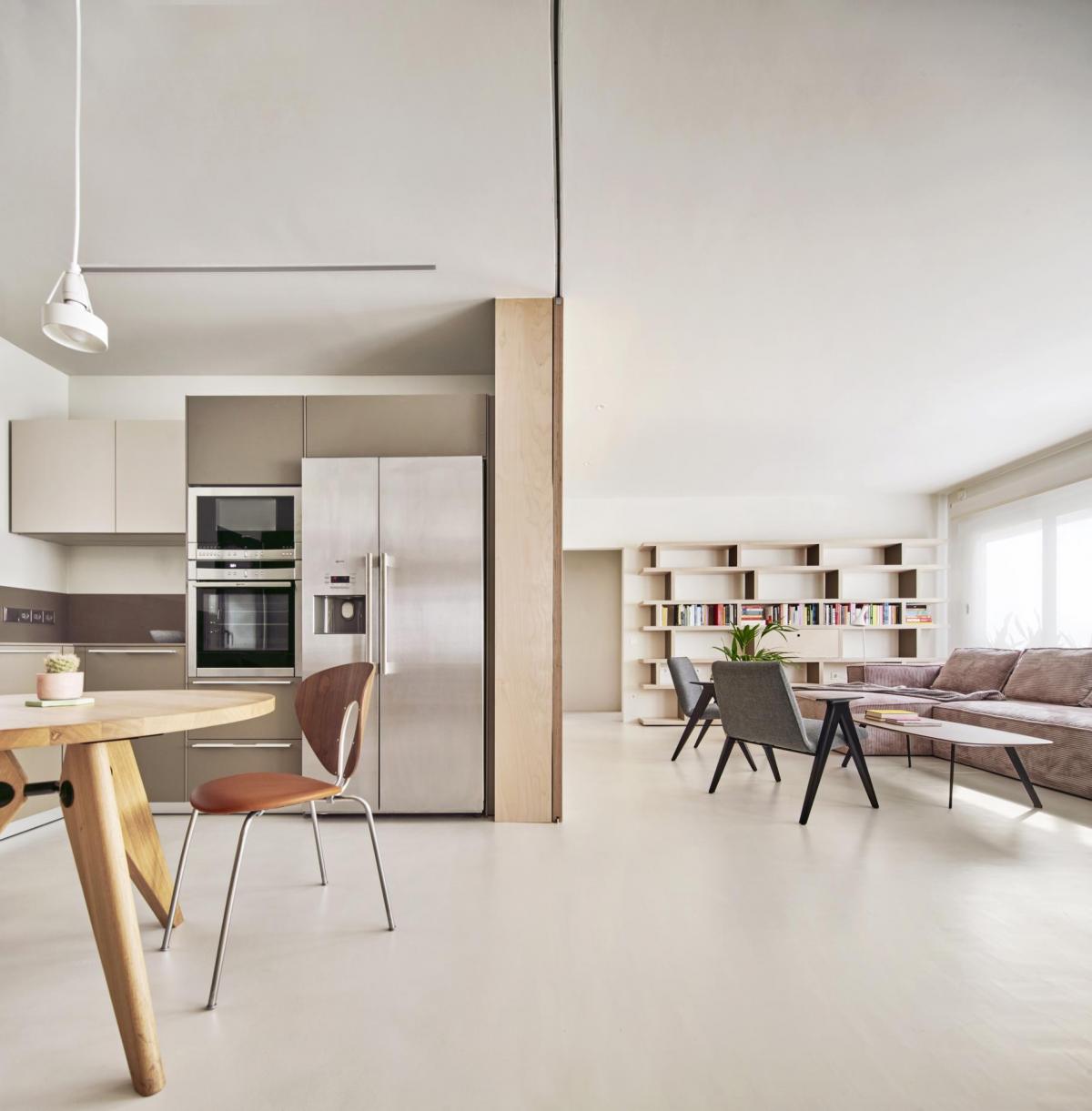
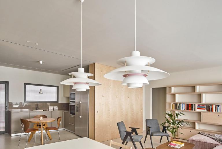
Originally, the apartment showed an anachronistic distribution in terms of the needs of today's life. Using a contemporary language, the reform has allowed the original structure of the house to be given new uses, creating large spaces for common living and more intimate spaces for each member of the family. After the reform, the categories of the different spaces are more diffuse, which provides greater flexibility to the house. Now you can work in the dining room while keeping an eye on what you are cooking, or enjoy a chat in the kitchen, while you finish preparing dinner.
The kitchen becomes the center of the home
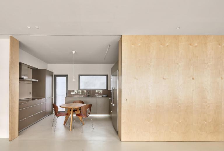
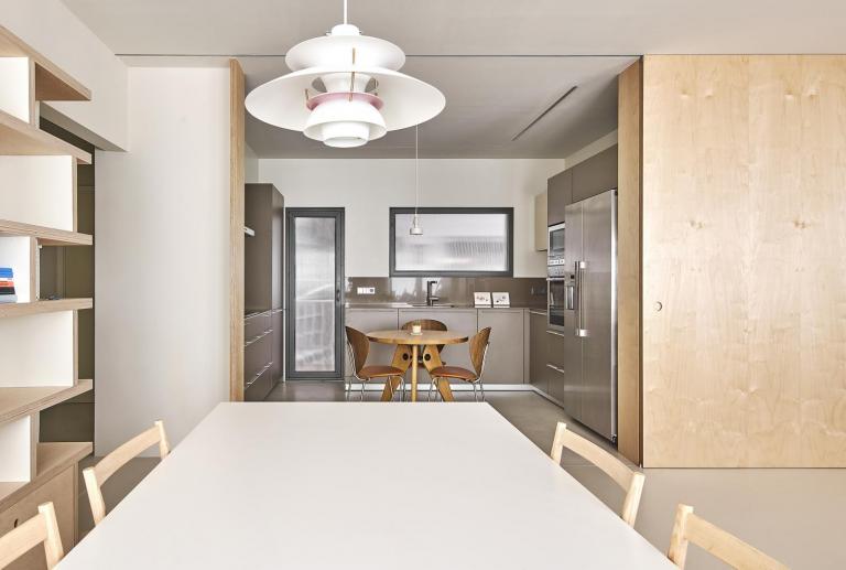
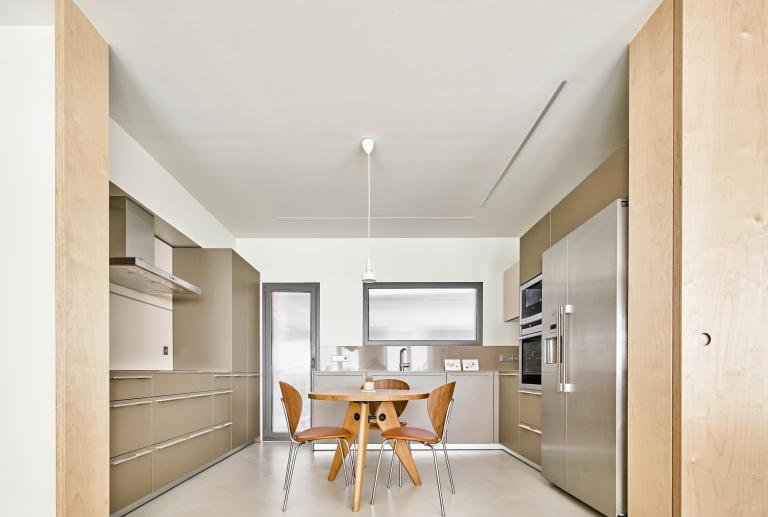
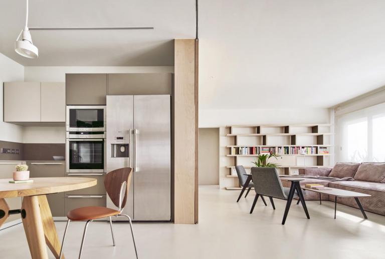
The laundry room and the kitchen come together to achieve a larger space that integrates kitchen and dining room. In addition, the three entrance doors to the kitchen are eliminated, one of which connected to the utility room or the laundry or ironing area. The kitchen opens to the living room to connect it to the rest of the house. A sliding panel that can be moved to both sides provides flexibility to the day area, by allowing three possible positions: the kitchen can be completely open, it can be left only with a step of 70 cm, or it can be completely closed, exposing the large living room TV screen.
More bathrooms for more privacy
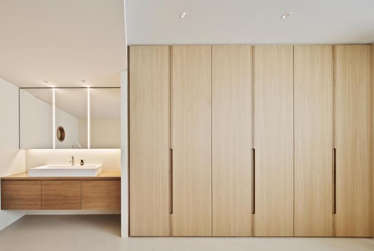
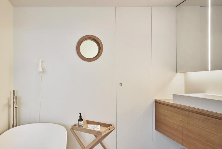
The house now has three bathrooms, allowing to speed up cleaning in the morning at rush hour. Part of the space occupied by the bathroom that was previously shared by the whole family has been incorporated into the main room. This has implied a major reorganization of this room, since the ensuite bathroom, as well as a shower, has a freestanding bathtub. Adjoining this bathroom, another has been created for the children and the bathroom at the entrance has been expanded and completely renovated for daily use by the family and also for guests.
A room for each member of the family
The old service room connected to the kitchen has been converted into a children's room, which is accessed from the distributor of the rooms. In this way, each child has their own bedroom and, the parents, the main room.
The day zone grows
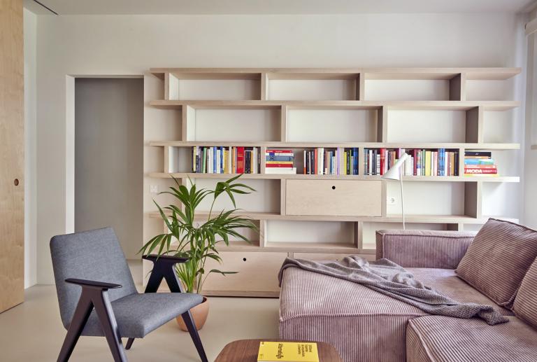
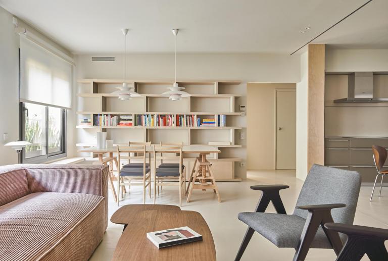
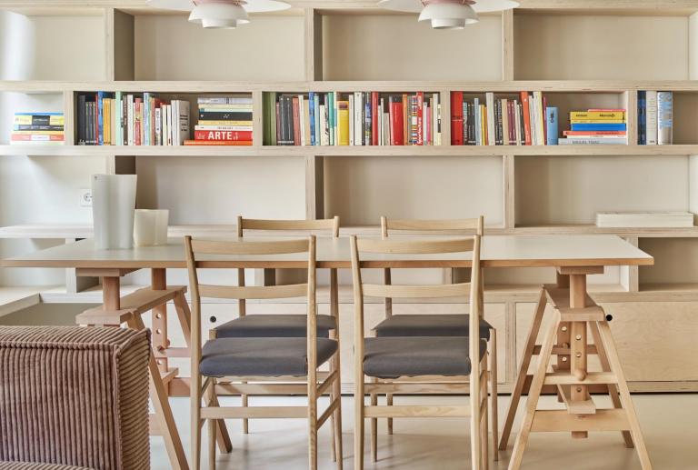
The decision has been made to make the living area more spacious, incorporating the space occupied by the old terrace. The living room has been converted into a comfortable and cozy room, connected to the kitchen through a large sliding panel. This panel has been made to measure in birch plywood by the Carpintek company, as well as the two bookcases and the bench that is located just below the windows.
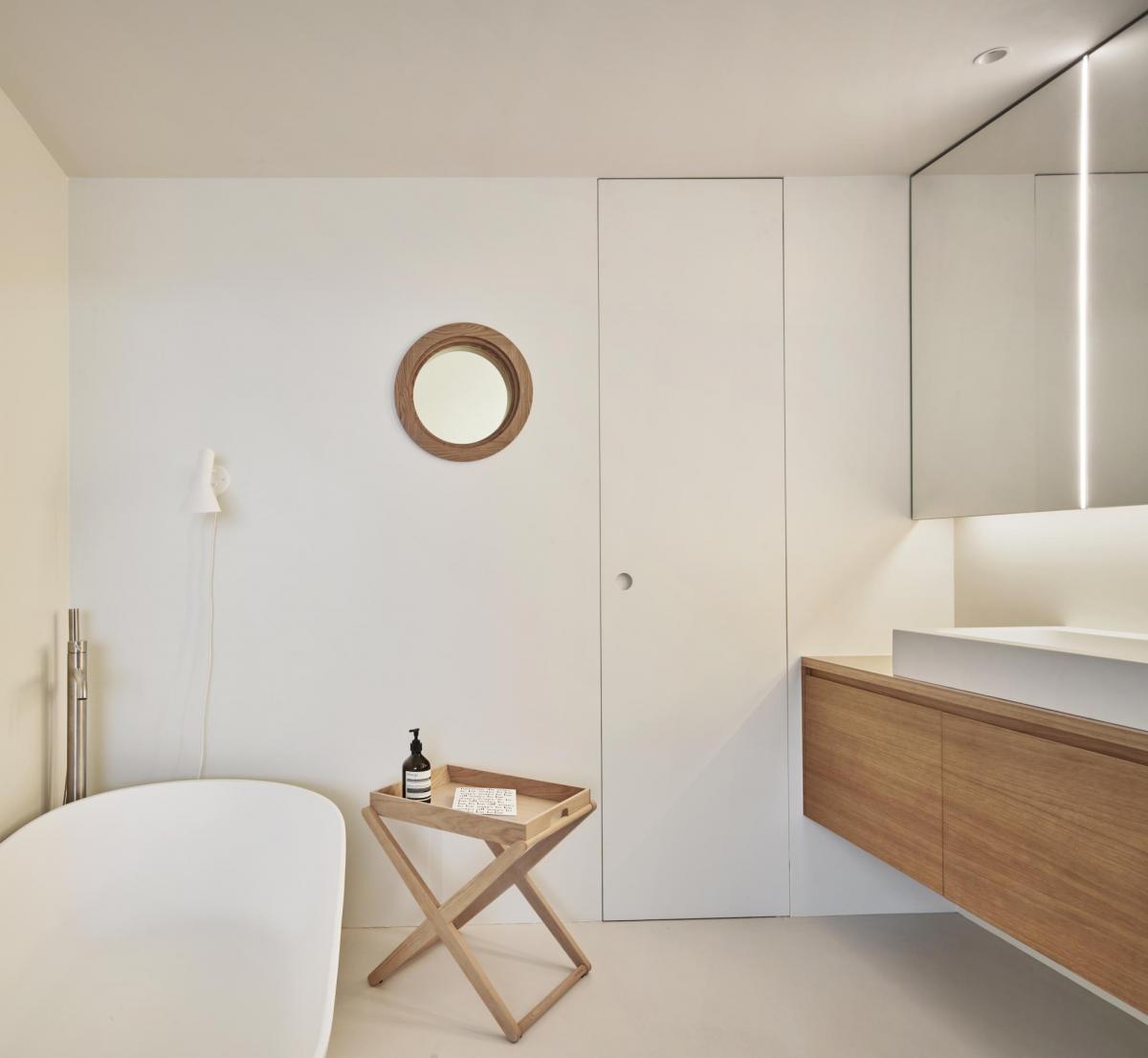
It seeks to unify all spaces with a single covering for walls and floors, in this way we achieve aesthetic continuity in all rooms. The material chosen is the Kerakoll continuous micro-resin in white.
In the original house, the spaces were more fragmented and the materials varied according to the areas and uses. Materials of different textures and colors coexisted, designed for the use of each space: industrial clapboard parquet in the living room, rasilla on the terrace and terrazzo in the rest of the spaces. With the new distribution, the laundry room joins the kitchen, the kitchen is integrated into the living area, part of a bathroom is incorporated into the master bedroom and the terrace disappears. It is necessary to unify materials to create a connection between the spaces.
Here comes the idea of using Kerakoll to cover materials, since it is a product that allows surfaces to be updated and, if desired, to do so while respecting their history. In this case, the continuous microresin modality has been used, which allows the materials to be given a second life, by preserving the original texture as a trace of the pre-existing.
Kerakoll has been applied to all floors, walls, doors and showers, but different micro-resins have been used depending on the material to be covered (wood, terrazzo, tile, walls, doors, wet areas such as showers ...). A special typology of micro-resins has been chosen to cover each surface, but always using the same color. This has made it possible to lose scale and gain a sense of spaciousness and connection between the different spaces. In addition, light has become more prominent and the entire house has been framed in the same image, but leaving the trace of the past latent. An imprint that also lives in other elements that have remained, such as the original doors with their knobs, the radiators and the window openings.


