Layers · History · Color / Barcelona
The extensive renovation of a Barcelona residence from 1901 creates a flexible plan inspired by Coderch's "La Herencia" an uses color to point out the different layers of the building's history. A clear commitment to reuse rather than demolish.
VB
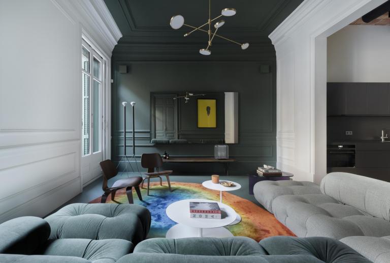
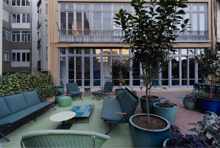
Located in the heart of the Quadrat d'Or neighborhood in Barcelona, this stunning home is situated in a modernist building built in 1901. Originally two separate floors, the property was combined into a single unit in the mid-20th century while retaining its two access doors. The house now spans 390 square meters on the ground floor, with an additional 65 square meters in the basement and 195 square meters of terrace. The property has also been enhanced with new neoclassical decorative elements.
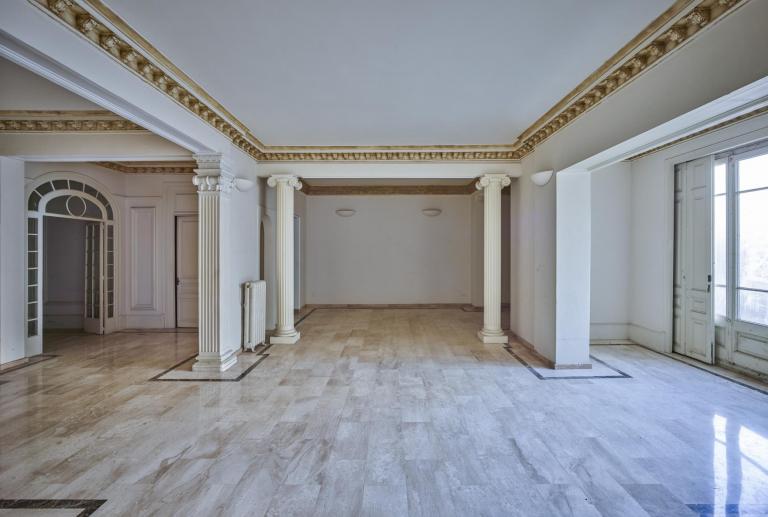
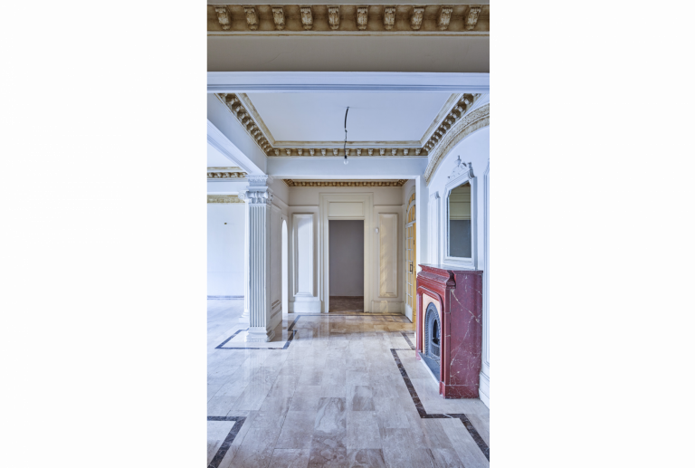
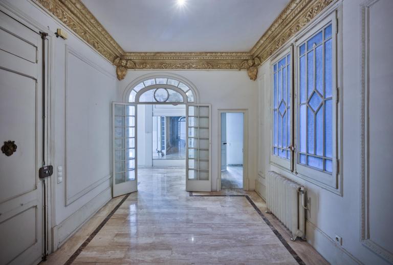
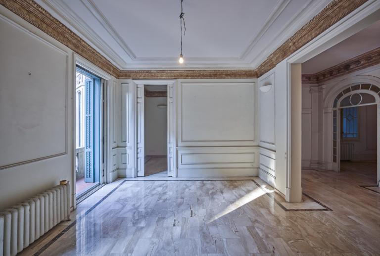
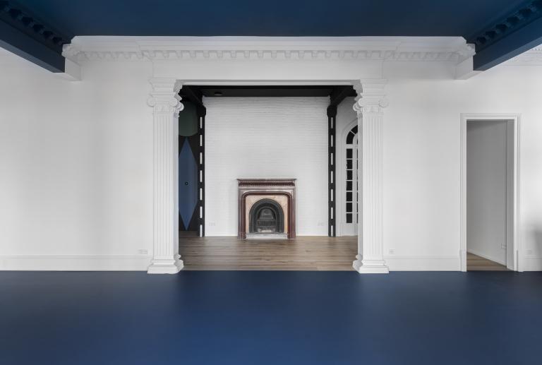
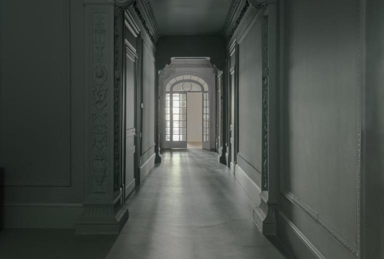
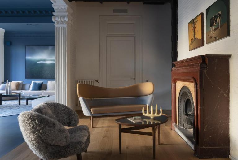
Upon entering the house, we were struck by its solemn appearance. The original doors and windows were preserved, along with the hydraulic floors and two rooms with a gallery. The modernist past has been eliminated from most spaces. Modernism was replaced by neoclassical elements that were added in the main bays seeking an image of luxury and opulence (travertine marble floors, columns, pilasters, medallions, and figures...). In 1955, when the building was reconstructed and the two main bays were merged, structural reinforcements were added to the secondary bays. These reinforcements were covered with a neoclassical style to enhance and beautify the transit spaces.
VB
The couple, with three children studying abroad, sought an apartment to start anew in Barcelona. A spacious family home that accommodates each member's personal space, even as they reach the stage of "flying the nest." They also wanted to be able to meet everyone, even with their grandparents, on designated dates. Likewise, they needed to be able to host family and friends when they visited the city.
When they discovered the spacious ground-floor apartment, they were intrigued by many aspects, but concerned they would feel like they were living in a vast "neoclassical palace" when alone.
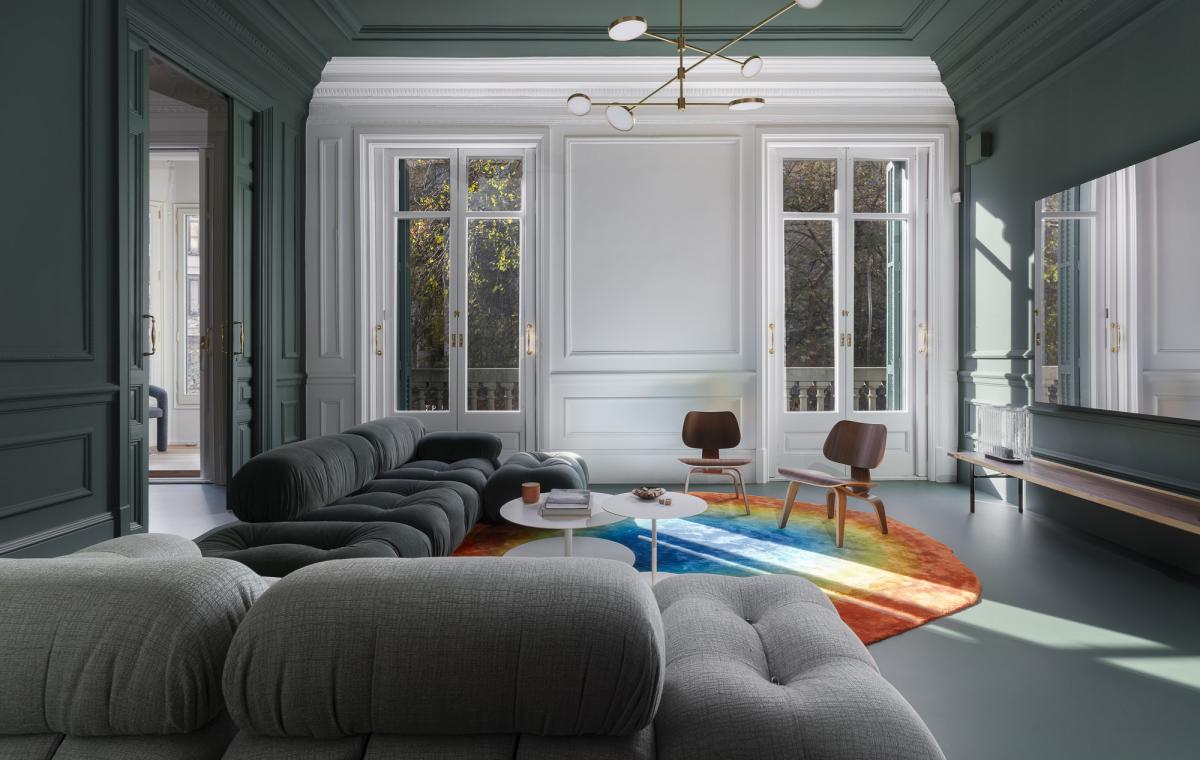
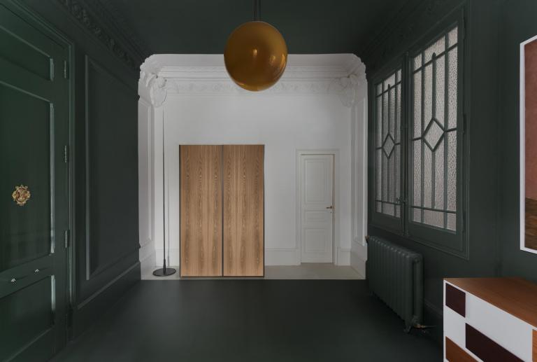
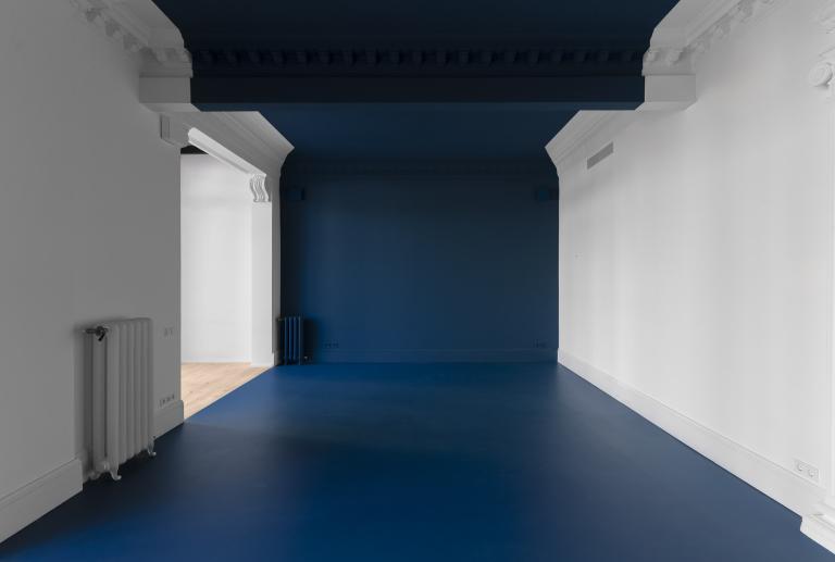
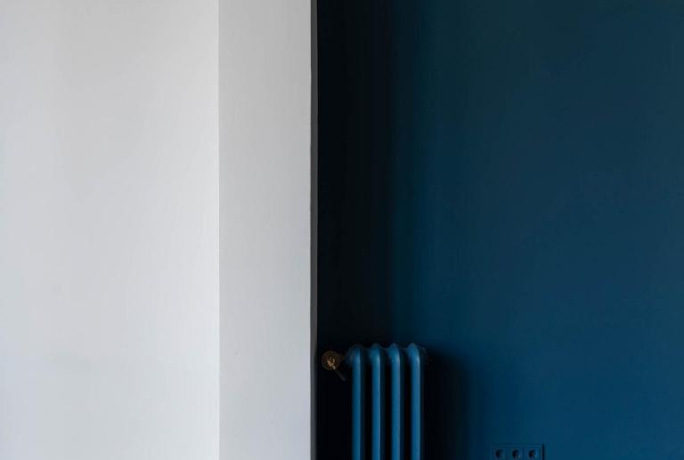
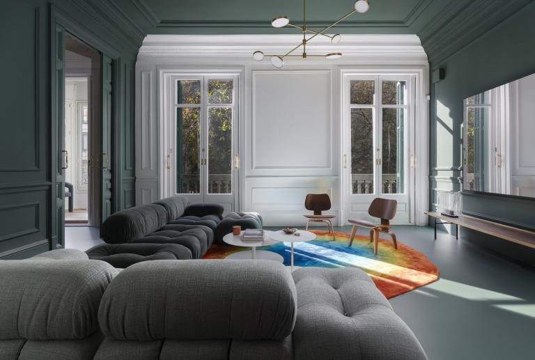
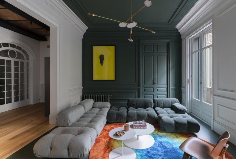
With a simple gesture of colour we point out the elements added 70 years ago in an originally modernist space and give them a second life.
VB
The challenge was huge. How to make the floor plan flexible to the family's changing needs? What should be done with the neoclassical decorative layers that were added to the original modernist home? Should we eliminate them all in a more radical and costly intervention, also erasing their history? How to transform this “neoclassical palace” into a modern home?
VB
The home, with a total of 650 m2, had to become a space that adapted to the changing needs of the family. We had to find a way for them to enjoy a spacious home for 14 people, when the whole family got together, or a cozy apartment for just 2, when the children were away.
Master Coderch's teachings made us wonder: if people's lives change, why must plants remain rigid?
The legacy of “La Herencia” by Coderch, in which the architect designs a flexible floor plan where the living space grows and decreases according to the changing needs of a family, gave us an idea to solve the best floor plan layout. way possible.
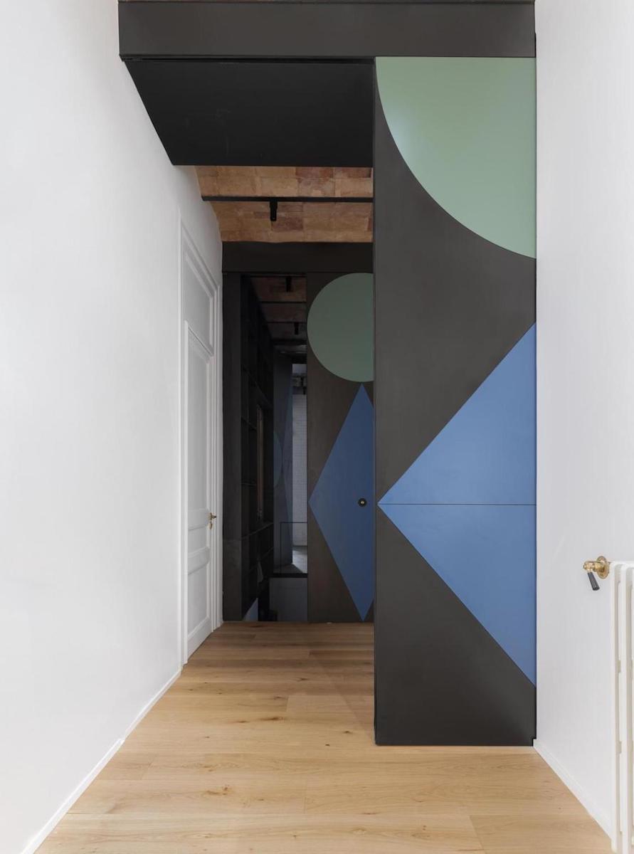
We have designed sliding, watertight doors with locks that can be used to open or close different areas as per the requirements. This allows the space to be configured either as a single 7-room home or as two apartments with separate entrances. Additionally, by opening or closing these doors, the intermediate area can be expanded or reduced in one direction or another.
The traces of the past are preserved,
adapting the space to a new way of living in the 21st century.
VB
We decided to approach the challenge with humor and honesty, by showcasing the history of the space, starting from its existing state. We chose to execute a bold and daring intervention that employs the use of color - or lack thereof - to indicate the various stages that the home has gone through.
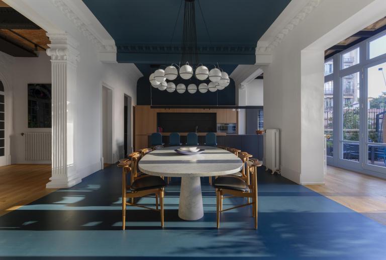
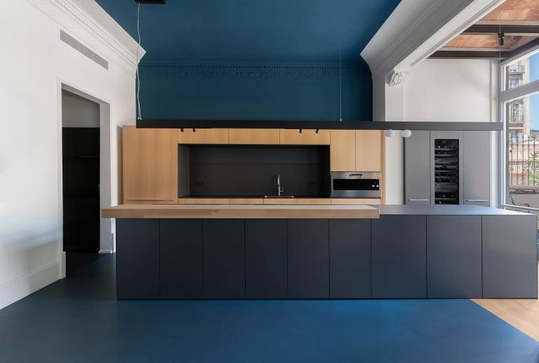
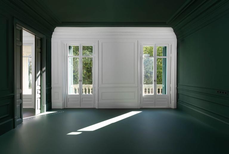
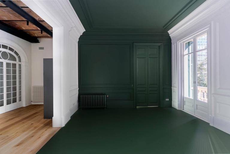
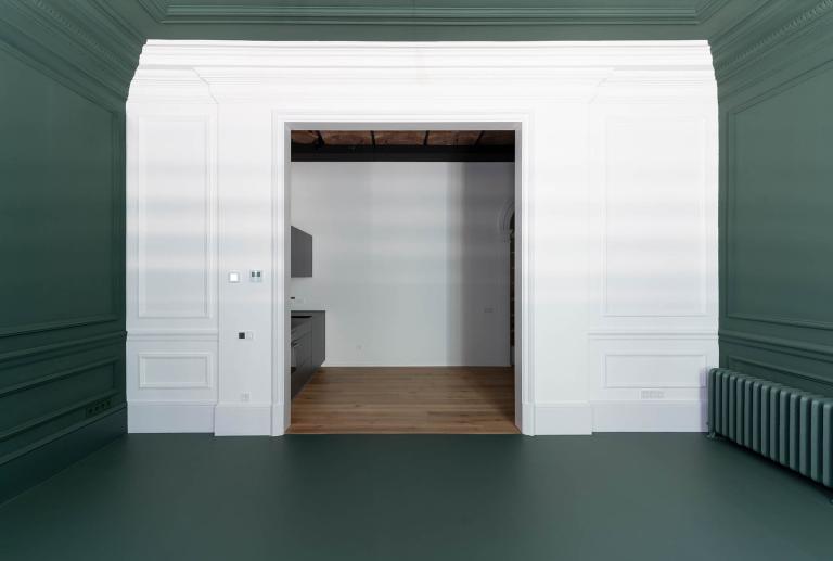
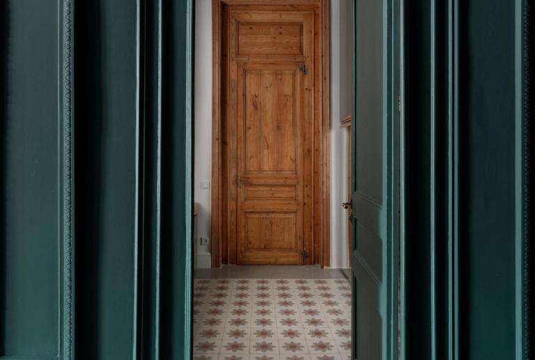
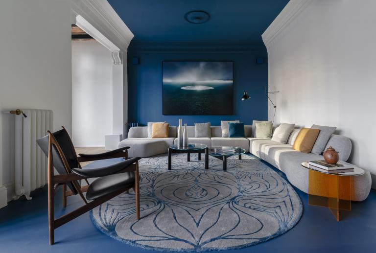
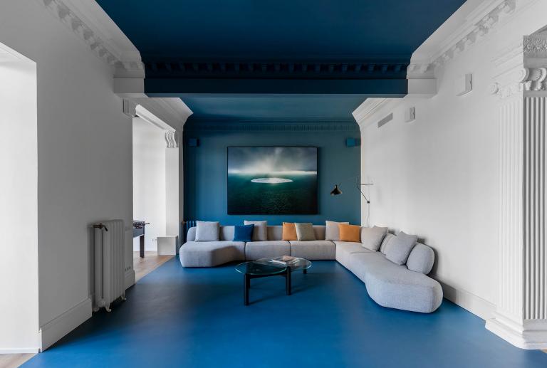
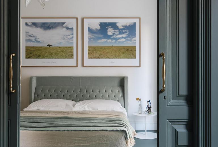
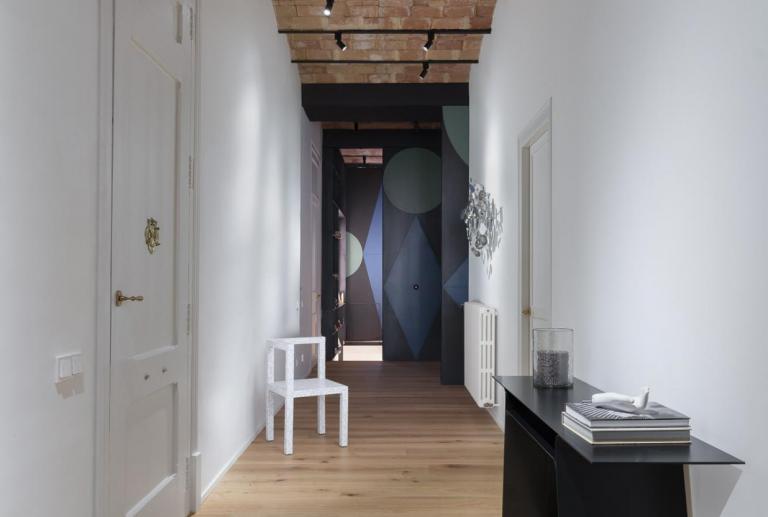
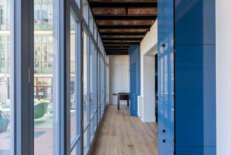
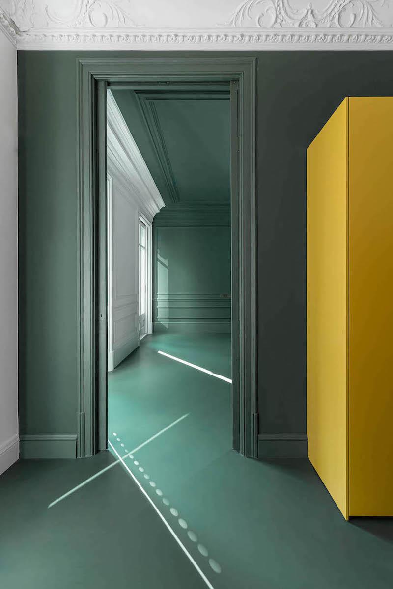
· The main bays of the house are wrapped in intense colored ribbons, creating a "marked" effect on the floors, ceilings, and walls perpendicular to the façade. The walls parallel to the façade retain their white color, which runs throughout the entire home. To indicate the added neoclassical elements, blue and green colors have been chosen, which match the tones of the original carpentry on both facades.
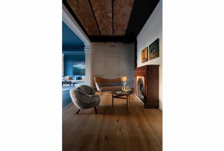
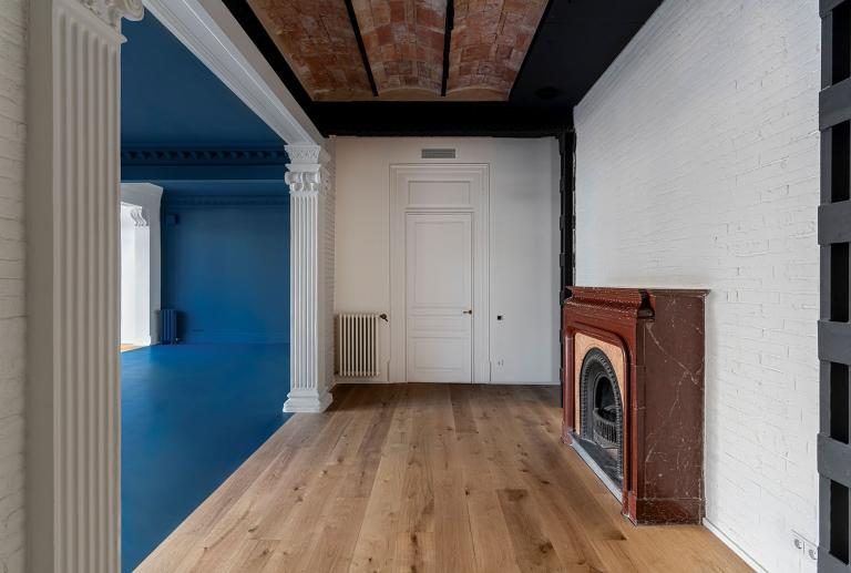
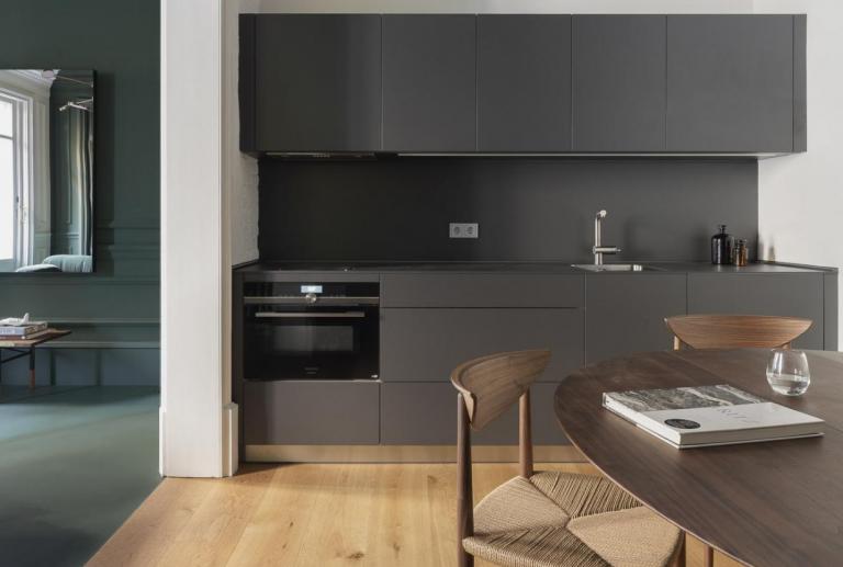
· In the secondary bays, where additional structural support has been added, the ornamental features have been removed to reveal the original structure. As a result, more industrial elements such as joist and vaulted ceilings, iron beams, and pillars are now visible.
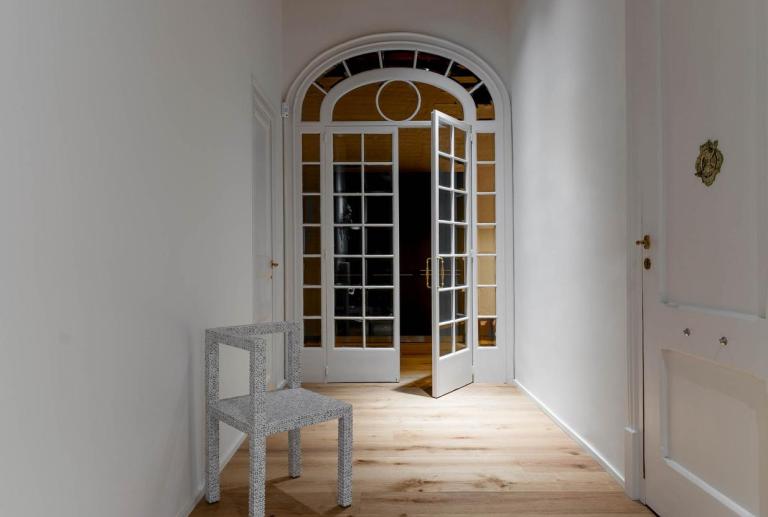
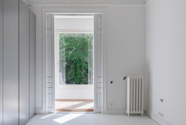
· The spaces that preserve modernist elements are painted white, covering the wooden carpentry and ceilings with original moldings.
Vilablanch develops a powerful and daring graphic proposal that runs through the entire home in the form of forceful cuts between color and white, resulting in a project with great personality and expressive force.
The intervention is based on a concept where the application of color is not just for aesthetics, but to create a visually powerful home. We found a great ally in Kerakoll to carry out this project. The intense colors in their collection inspired us to highlight the history of the space, which was originally modernist but had a false neoclassical personality. The colors also allowed us to wrap different materials like marble, wood, plaster, and iron with the same color. This approach gave a second life to the elements that were added 70 years ago, promoting reuse instead of demolition.
'COMING SOON', A LOOK BEYOND ARCHITECTURE
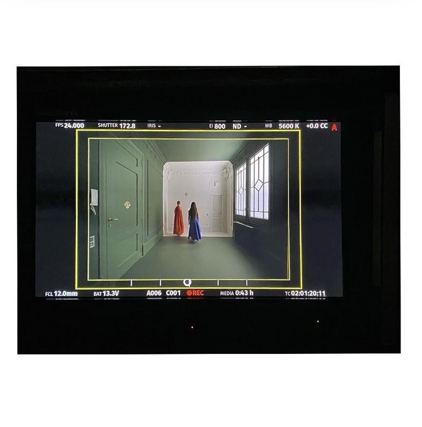
'Coming soon' is a short film linked to the "Layers · History · Color" project, which was created with the aim of showing the architectural intervention carried out in the home from a different perspective, but with the same beauty, daring and concreteness with which everything was executed. the project.
The work of the tandem formed by the vilablanch studio + the photographer and artist Jordi Bernadó, this audiovisual piece invites us to tour the space at a very specific moment: just when the work is finished, but not yet inhabited. That brief period of time in which everything is yet to come and everything is to be experienced.
The short film, with music by the composer and muisician Francesco Tristano, is a celebration of the moment 0. Without interruptions and through a single sequence shot, the different characters reveal the house to us, giving special prominence to the cuts, symmetries and continuities caused by the use of colors and its enveloping effect.
The images, with a great artistic component, are a trailer of the life to come; scenes of different moments that will occur between these centuries-old walls and that we will be able to share with you soon.


